Hit or miss? Well, it is just a matter of a single click. Click, did we say? Yes, your touchscreen tap is the call to action that indeed decides the fate of your website.
In fact, at the landing page it is the call to action button that gives momentum to conversion. Be it form filling, product purchasing, file downloading or newsletter subscribing, for all these actions you need clickable buttons on command.
Needless to say, it is important for the buttons to be clear, user friendly and attractive if you are looking for high conversion rates.
Designing outstanding buttons is also an art in itself. On the outside these buttons might look simple and easy, but in reality they are tricky as they do not follow typical design elements rather are conceived through the conviction on the underlying marketing theories. CTA buttons are governed on two aspects namely design and copy.
The copy element is when the instructions come into play through the text form like, sign up or get your free eBook etc. and design is the element that gives visual hint to the users in order to gather their attention and influence them to take the particular action you want them to take.
There are various ways to design buttons these days still you need to be meticulous and pay extra attention in their making so that your button design lives in context aptly.
Here, do you want to optimize your buttons to make them fit with the interface and suit the brand? Let us give you some quick tips on how to use effective principles for improving website buttons to keep those conversions on a roll.
Flash More
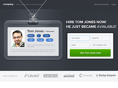
Although flashy bright buttons may not suit every website, but on a general note, these buttons amass maximum clicks. Bolder and brighter buttons have more visual appeal as they tend to catch attention with their stark hues. As you go for testing, increase the saturation of your buttons and then see the results; your clicks will rise in number.
Big Gets Big
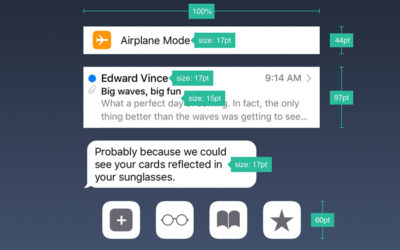
This is a great formula for button design, still ignored by the website makers. As a rule of thumb, if you have bigger buttons, you can capture the eyes of the audience better.
It has been observed that if you enhance the size of the CTA buttons, these buttons gather more attention and hence lead to conversions.
The use of web 2.0 buttons might have stopped, but by incorporating large buttons, of course, of tasteful size, you can make the people notice them and further persuade them to take actions.
Go With The Theme
As you game on contrast in the context of design take note that all the buttons should merge well with
the underlying website design. Remember to follow the embedded theme while designing the buttons as it
complements the overall design well.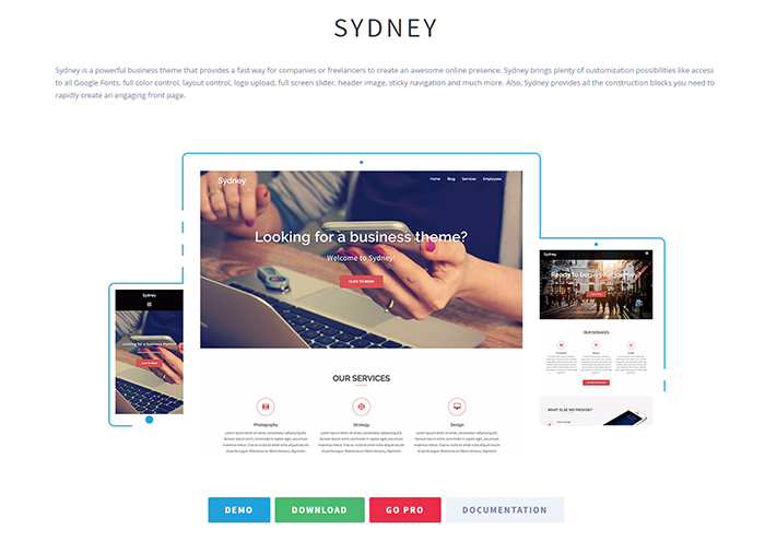
Going against the theme with a button on a different track just to gather attention is totally a wrong approach as the button will look awkward and will harm the design more than doing any good to it. Yes, it will ruin the design visually.
Integrate the themes, moods and motifs with your button designs as it will enhance the effect. Choosing elements from the base website, say, textures, icons etc. can create a pulling button design.
Small Can Transform
Never ignore the small details ever as these are the ones which amount to a big difference. It is these details that can help to jump the ladder from good to great.
Although simple, a button has certain subtler details which should always be taken into consideration. Minute things like slight gradient, thin border or faint pattern can transform the look of the clickable button.
These aspects not only reflect an eye for detail and professional approach but at the same time also increase the value of the buttons and make them highlight amidst the covered page more.
Contrast Is Cool
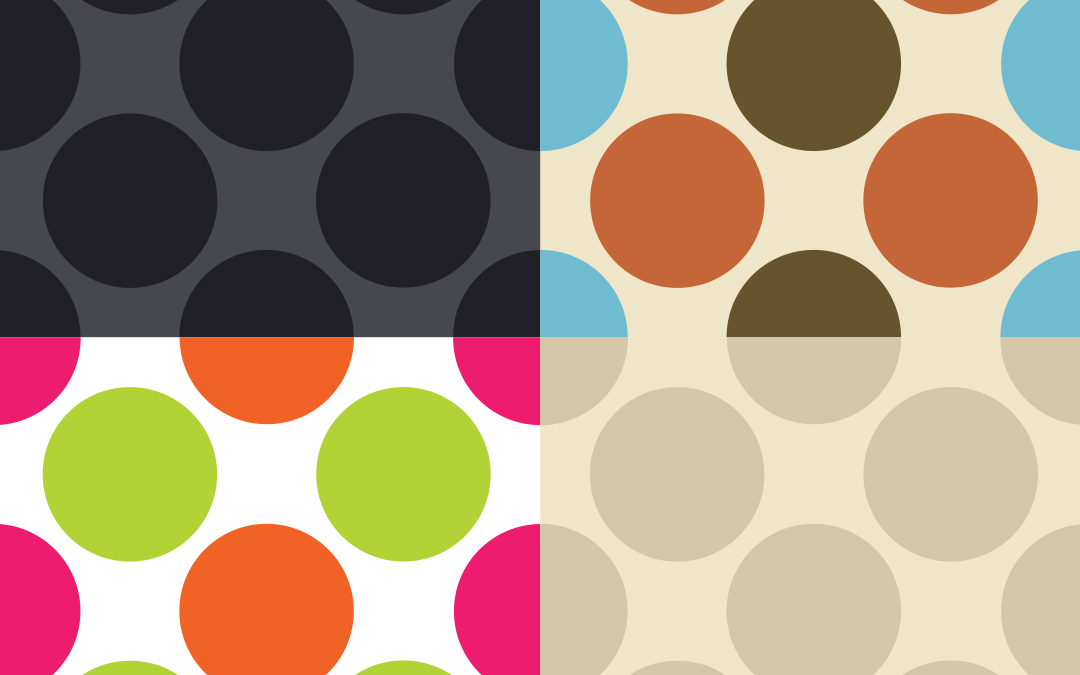
Working on the lines of Apple OS styling majorly for UI Element PSD’s, the designed buttons tend to get mixed up with the other elements present in the UI. T
his lack of clarity harms the power that the buttons possess and somehow diminish their significance. Remember to use whitespace, color, size or typography while designing the buttons to balance the visual weight with the surrounding page and add contrast with the rest of the interface.
Shape It Apart
As there are already several round cornered UI elements in a particular design, it is advisable to give buttons a shift, that is, you can go for circular ended buttons or change the shape of the buttons altogether.
Afterall, contrast is good! And this way you will bring the important calls to action to the notice of the users and prompt them to go ahead.
Best With Text
Designers generally tend to neglect the text in button design not aware of the impact they give to the clickables. Take note that if you want your buttons to boost conversions of your website do not overlook the text or copy of the buttons.
Texts like ‘buy now’ or ‘join’ have become a thing of the past. It is innovation that works best these days as people like creative button copies that also points towards the benefits or uses of the website/service.
Less Focus On Secondary Elements
If you are working on an OS inspired style or predesigned elements PSD then there are chances that your UI elements might be round-cornered rectangular in shape.
So, the right approach to adopt here is to ornate your elements less so that they are not much of a highlight and feel less buttony in appearance.
For instance, the tailored menus, segmented controls and other menu triggers here are likely to be round cornered, so if less of shadow, gradient, border and other elements are used it is possible to lessen their prominence and gather all the attention on button styles.
Surround In Style
If you want your button design to be outstanding, don’t limit your vision to the button itself as the details of the surrounding website also play a crucial role in the display.
Make way for the surrounding zone to point towards your call to action and put more emphasis on it. A good way can be using the common light source in web design to reflect it upon your button design so as to accentuate it at a high level.
Pay attention to the padding around the button as more padding will give it an isolated look and garner great attention from the onlookers. Different shapes such as arrows can be a hit puller of the audience and in turn, increase the conversion rate effectively.
People bank a lot on the trust and credibility factor, so if you use secure payment signs, testimonials, credit card logos at all near your buttons, it might end up into successful clicks.
Color Match Gets The Catch
If you have observed in detail you will agree that most of the buttons are carved with some border or stroke on them. Just like if your button is of a darker shade than background you can add depth to the design by including dark stroke of the general button color. However, if it follows the reverse then use a stroke of the strong shade of that of background color.
If you experiment by using the former on a darker background there are chances that the button might turn up to be dirty. Nevertheless, using latter can also go overboard in design and make your button look pop. So, make use of this general principle and give that edge to your buttons.
Tab On Blurred Shadows
Let us share with you a ‘Shadow Law’. According to this law, drop shadows can be the best feature when an element is lighter than its background. If the opposite is there and the element is darker than its background, use drop shadows just as a fine touch.
Much like the color matching strokes and borders, this can be used as a general principle valid for all the UI elements.
Keep The Commitment Low
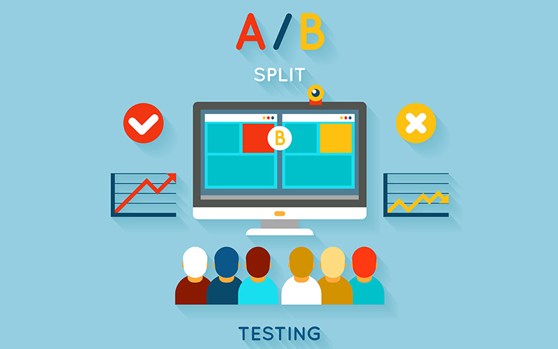
The calls to action buttons are the commitments that are made to the users. It is always better to be low key in commitments as they trigger different psychology and have more concerns. If the call to action button pronounces that the visitors are about to invest in their time and money it is likely that the visitors will not prefer such clicks.
For instance, there are two calls to action – ‘Start Testing’ and ‘Read Our Overview’, as per the analysis it is evident that users are more driven by the second and hence it scores more clicks. But why such preference? Well, it is all about commitment. ‘Star Testing’ gives the impression that upon clicking the user has to undergo a long process involving effort whereas ‘Read our Overview’ points out less time and energy on the part of visitors.
Code Sets Right
Generally, the word button brings to mind a graphical image just like link takes to text. But ace designers know that although the buttons look like images, they are built like links. Graphical buttons are difficult to handle as they are slower to load and aren’t much accessible to visitors with disabilities. Moreover, they are not even displayed in the email.
But code-based clickables encounter none of these problems. Buttons made with HTML and CSS are wonderful and there is absolutely no reason whatsoever to go for image buttons. Buttons rendered from HTML/CSS are called bulletproof buttons as they are compatible everywhere including emails. So, make sure you have bulletproof buttons if you are creating them to serve emails for your clients.
Sharp Iconography
![]()
Just like small details can highlight your buttons from similar UI elements, use of basic iconography such as arrows can add to the effect of a call to action and even give a clue as to what will happen when a user clicks.
Take, for instance, an arrow pointing in the right direction after text on a clickable will give the user an impression of movement or abandonment of page. A down arrow implies that the content will be revealed in progression as the page moves downwards or maybe some menu will open to going for other options.
Yes To Feedback
Now this is pretty obvious and always thought over in the end of the design process. Work through the core states of the buttons carefully to make sure that it provides the user required feedback in their context.
Users have a mental picture of the working of a button as they have been using it through its general states. Just create some basic CSS tweaks embellished with shadows, gradients and border and this will surely give user valuable feedback with the dose of creativity.
Ready To Click
Designers have to always strive through their own process. A lot of the time is spent evaluating, analyzing and judging as to what will work and what will not. This is right or that. Actually, this is where the thrill lies for a designer. Designing is all about fun and expert designers are great with it.
Buttons give visual appeal and being attractive and elegant let’s just say they get the job done. Keep in mind their major use, that is, what the user will get from clicking the button instead of what they have to do. Make sure it is relevant to the content they will receive.
The CTAs on your landing page is the key to unlock the secret of high conversion rates. Remember it’s not about getting the traffic rather making the traffic take actions.
It’s the click that gives the verdict and makes a big difference to the performance of the website. Rather than pulling the strings to get more traffic, be more particular with the buttons. You never know, even a small design or style change can go up to a great level in getting those conversions done.
Images Credit - www.dribbble.com
