Great interfaces drive usability and make businesses phenomenal. It is very important for every organization to work on the design elements of their online presence. And why not, UI design is everything that you see on your site or app.
So, it becomes all the more crucial to have a design that is simple as UI relates to arranging elements in the design along with the outer layer of a design. Thus, with this fundamental power, UI design can also become the sole reason behind the success or failure of a website or an application.
UI design concentrates on what users want and ensures that the interface has all the features that are clear, functional, and easy to use for the sake of performing actions. It consists of arranging element input controls, informational and navigational parts etc. Unfortunately, there are various mistakes that every designer commits but should be avoided.
If your client instructs you to design a website, which must be executed so well that it generates a great reaction and has a low dropout rate; it simply means that an attractive UI design with perfect usability should be delivered.
To accomplish this target, a perfect balance of both these aspects should be maintained. In this post, we shall be talking about some of the common flaws which every designer leaves while designing and hence should be avoided if you want your design to be stellar-
What is the secret of Great Design?
Click Here, Click There
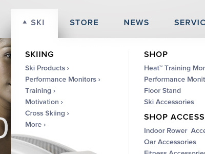
It is seen that a perfectly designed page has very systematic links attached to it. There are many websites that cause a click overload to take you to the page that you intend to visit.
A user will become frustrated if he gets 3 clicks on the way to reach the required page. Designers should work on minimizing the hurdles on the paths that lead to the pages; making the way as shortest as possible.
A suitable method here is to give pages/subpages on the navigation menu beside the main pages with clear buttons on the homepage.
Random Design
A
very common mistake that designers make is going haphazardly with the design of the website or app. Being
orderly in design means to have all the elements and actions that act and look the same and create harmony
together in the layout.
For instance, if the first h2 subheading is white and in the Times New Roman font, with 16px font size and bottom margin of 32px, then the rest of the h2 subheadings must stick to these dimensions too.
You need to plan well in advance if you want your design to remain consistent in the designing stage. So, to be organized, frame a list of all the actions and then segregate them into groups of similar actions.
Then, think about each UI group of elements and how to align them with each other. Also, work on design elements such as fonts, styles, colors, hover effects, and wording to blend everything in one design.
Resolution Blunders
Have you ever encountered a page that took almost 10-15 seconds to load? Well, we generally assume that there is a problem with our network as websites don't prolong that much in loading.
But this is a false assumption. Often high-resolution images cause poor page speeds and thus a user ends up leaving the webpage and site completely.
As a designer make sure that the images on a website or an application are compressed so as to reduce the load time.
Color Chaos
It is crucial to select the right colors that are compatible with the design. While selecting colors you must think about the client's audience and the brand hitting the market. You need to co-operate with the users’ color blindness.
It is always advisable to include a high contrast in color. Use the same color code corresponding to the function, which means have the same colors for the same functions.
Another faux pas that is made is the number of colors that are used while designing as it generally turns off the user. Remember colors are not the sole medium to highlight the difference.
Absence of Feedback
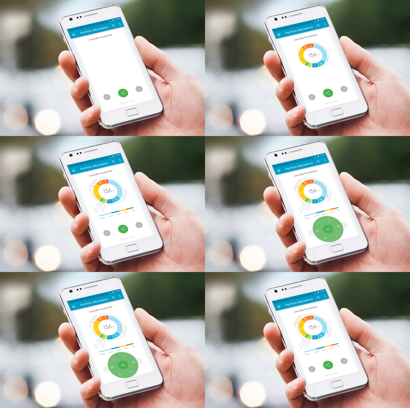
If you are a tech lover and are always eager to try new mobile applications, it is a possibility that you might have come across some apps that leave you confused as to whether or not the app is working or if it has stopped responding.
This generally happens when a loading screen is displayed on the screen with static icons but no message whatsoever. It has been seen that users feel more satisfied with the appearance of a small message that says something like ‘please wait while your account is being set up’.
This informs the users that they are in between the process and that they have to wait for it winds up. Nowadays, the loader icons have been modified with spinners and moving circles and many others to deliver the same experience as a message would have done.
Thus, it is important to design from a user’s perspective rather than a designer’s perspective. The designers must keep in mind the response that the user will give.
Complex Navigation
Even if you are a big shot retailer with several pages of content or your company might have massive audiences and ample pages of services. Still, it is not possible to upload all the pages on the menu of your website.
Designers can face a situation where the content is elaborate and the navigation is complicated. To sort this out, have multi toggles, slides navigations and many such ways to bring out a systematic look at a detailed and content dense website.
Structuring the content will give you more space and hence there will be more visual appeal to the website.
Killing With Text
Another feature that frustrates the users very much is having a plethora of text. Chances are that they might get bored with this overdose of paragraphs and words, or they will either abandon the page immediately without making any effort to read, or might even read some and leave without finishing it till the end (of course, who has the patience?) Yes, this can make most of the traffic go away.
So, it is better to stick to less is more when it comes to words. Go for less text and more visuals; pictures are any day capable of telling much more in the design of a website.
Make full use of subheadings, headings, boxes, and bullets along with the graphics to create an impact.
How to build your creative confidence?
Neglecting Other Devices
This is actually a crime in today’s world. But, let’s face it, this world is not perfect and some of the novice designers have the tendency to ignore the fact that majority of the users browse the web only with their smartphones.
Or it can be that they don’t want to invest further in building a responsive design. Whatever be the case, it is high time we should put full-stop to it. For professionals, anyways, this issue of not considering multiple devices will not happen anymore.
Lousy Headlines
Yes, images are great at capturing a user’s attention but a user generally places his eyes at the upper left corner of the page, and then following the readability pattern moves on to the next section.
So, be particular with headlines and make them attractive. Ensure that the headlines are concise, relative, and to-the-point. Being relative means that it should connect to the users besides making it understandable and clear.
Poor Response Time
Mobile devices require responsiveness for efficiency, which otherwise is considered a big spoiler for design. In today’s time, there is stiff competition among websites that are striving to enhance the responsiveness and thus imparting user engagement.
A simple and witty design is always good at accomplishing tasks. If you find that an application or website takes a lot of time to load, it is probably losing out on business too.
Don’t use dead weight elements and objects on pages and keep that loading speed optimized.
How to think like a designer?
Shouty Capitals
All caps text i.e. a text where all the letters are capitalized is good for contexts that don’t have much of reading like acronyms or logos. But if your message has reading involved, don’t force users to read with all capital letters.
It is seen that an all-capital print reduces the speed in reading as against lower-case type. Even the majority of the readers consider capitals to be less legible. Lowercase print imparts good speed because of the characteristic word forms rendered by this type.
This allows the word to be read by units whereas in capitals you have to read letter by letter.
Crappy Forms
Bad sign up or order forms are definitely crappy forms. Forms should be designed in a manner that they are easy to fill out and are error-free. Be particular to add numbers or a timeline with divisions so that the users are aware of their position in the process.
Also, when the users press the ‘enter' key, make sure that the submit button gets clicked. Do proofread the form to spot any errors. For example, fields shouldn't vanish if an error message is displayed for an item being incomplete.
Users generally leave a form if they have to go overfilling the details all over again after the error message. Lastly, check and remove any extra fields that are just adding to the task and are a complete waste of time.
Other Mistakes
Horizontal scrolling should be banned. Users having an average-size monitor with average resolution should not move left and right to view the contents of the pages.
Make designs with fixed widths that can adjust into smaller monitors so that horizontal scrolling is no longer a problem. Using invalid XHTML and CSS codes is also a big blunder that affects websites appearances and functions.
Hiding contact information will leave a wrong impression on the users as they might want to contact you with questions or comments. At least include a contact form or make your email address clear so that the visitors can find it easily.
Page titles when used poorly defeat the purpose of describing the contents of the page. A vague page will lose traffic and divert all the visitors to a competitor with better use of page titles.
Excessive advertisements are a big turn off as they give an unprofessional impression to the viewers and thus cost the business negatively.
Wrap Up
For customers, interface is itself a product. Powerful interface designs are those with perfect blend of appealing visuals and engagement, that too, with the help of simple use and clear navigation. A great UI design should refresh the customers with its amazing features. It must generate trust so as to boost conversions. Keep all these mistakes in mind while designing and soon your top-notch designs will rock the market.
