Are you one of those designers who consider the text as an afterthought in the design process? Well, then it’s time to rethink. Text should be your priority. Readability must be a top consideration when it comes to designing. If text isn’t clear then the very purpose of designing is defeated.
Readability is a major aspect of design usability. Readable text determines how users understand the content. Poor readability hampers the quality of the content. However, if done perfectly, readability offers great scope to absorb information in the text. After all, you want your users to process the content correctly.
Generally, it is seen that people view white space as wasted space. But what they forget is if we fill content and imagery everywhere on the page, there won’t be any rhythm or path left. The tough part of the game is that even if you follow set principles, those pesky digital ads, popups, and clickbait can prove to be very distractive for the main content of your site. Now, who said readability doesn’t have its fair share of hurdles?
Below are some tips that will make your text easy to read-
The Meaning
First things first, what is readability? We need to understand that readability and readable or legible text are not exactly the same. If someone can spot letters, text is regarded as readable. This does not imply that words are easy to grasp; they are just clear.
Readability refers to the effortless way of reading the text. Understandability is a major component of readability along with quick identification and pointing of lettering. Readable text should be easily scanned from a distance.
Readability also depends upon words and how simple they are to comprehend. Some experts even believe that text written for general reading should not cross the eighth-grade level to heighten readability.
 The Terms
A lot of key factors are involved in the readability of text. But there are few terms that must be clear before we proceed-
Hierarchy
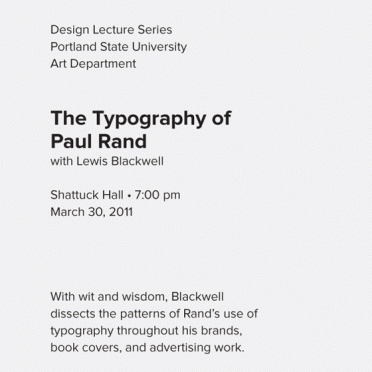
Every typographic design requires hierarchy. Hierarchy determines how to navigate through content. It tells the user where to start reading and what to scan through.
It separates headers from body text. Yes, different colors of text boxes can be used to distinguish headers from the body text, hierarchy points to varying size of these elements.
Hierarchy predicts how scan friendly a page is. It is a significant technique that should be followed to attain readable web typography.
Contrast
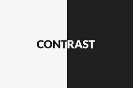
Contrast is an important factor that influences the readability of the text. Great contrasts will make the text a treat for the eyes, convenient to scan and generally more readable whereas poor contrast will put user's extra focus on the body text and will make reading a tedious task altogether.
Line Height
Line height is a term used to explain the space between the separate lines of text. Line height is another core factor in the readability of body text and even headers.
Apt line-height is crucial in web design as it makes the text more scan-friendly. Line height that is too short will put a lot of stress on the users' eyes while reading.
On the other hand, if it is too much, the text will appear like separate units instead of a grouped body as a whole.
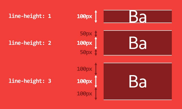
Image Credit - Link
Letter Spacing
Just like line-height, letter-spacing also influences readability in web typography. Letter spacing, as is clear from the name, is the space present between each letter in words. In print designs, negative letter spacing is a common practice to experiment more with the layout, but should never be incorporated in body text. For any text, legibility stands no chance without letter spacing.
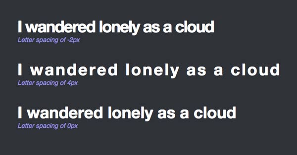
Image Credit - Link
Line Length
Line length is often left behind in web typography but should not be ignored.
Line length stands for the number of words present in each line. A perfect line length permits the reader’s eyes to shift from the end of one line to the beginning of the next very smoothly and instinctively.
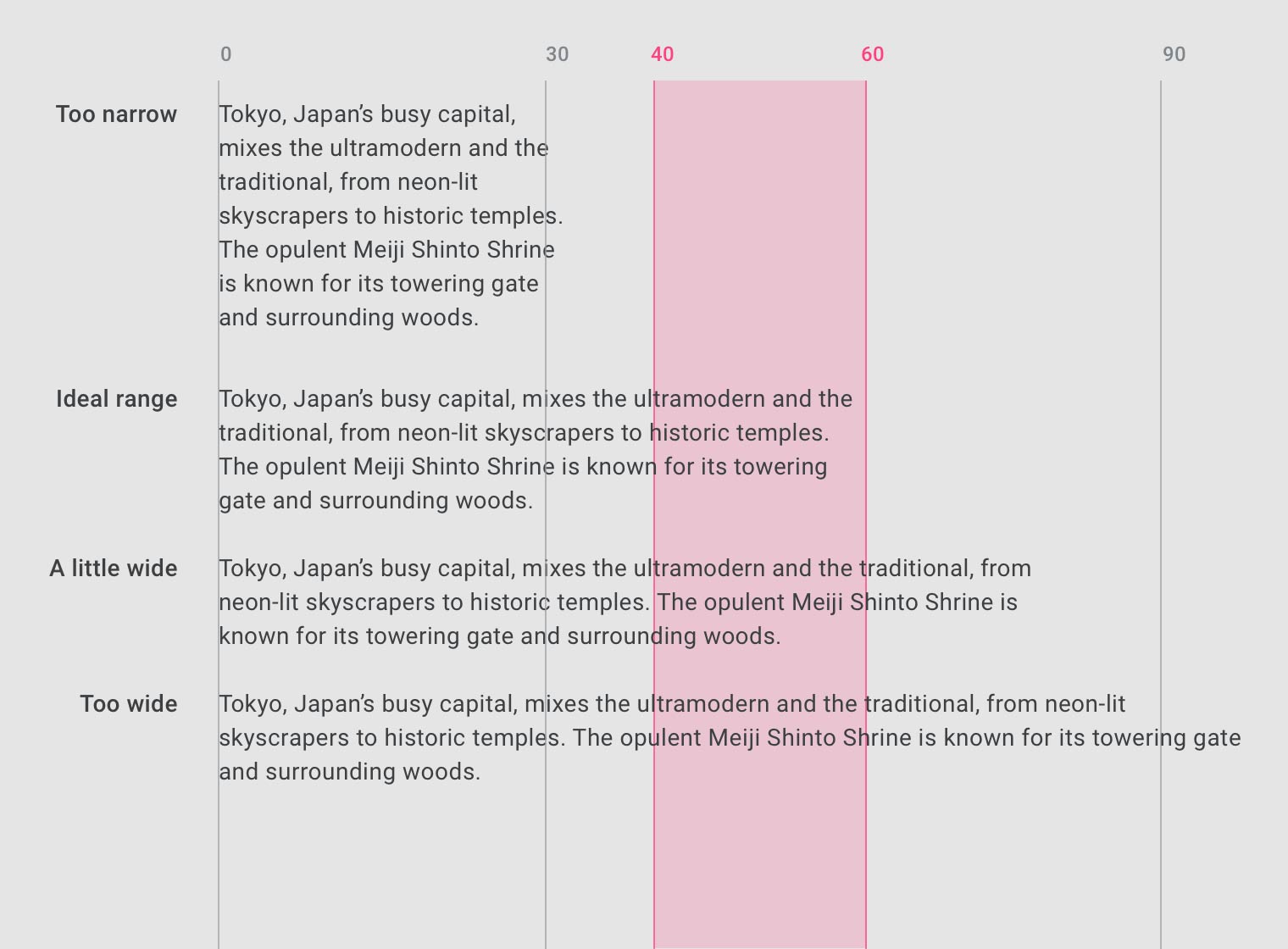
Image Credit - Link
The Factors
Grab with Headers
Headers are undoubtedly a major component in typography, be it web or print. An important part of text hierarchy, they play a key role in scan-friendly content.
Firstly, the header size is pivotal as the size of the body text. Enlarged header with too much content can disturb the balance of the user while reading and even lose their attention.
It can affect the path of the content and make the readers lose their focus. Headers too petty in size can also destroy the hierarchy of the article.
If the header is too small, it will not catch the user’s eyes as it should. Further, it is crucial to give sufficient space between the header and body text.
User-Friendly Text
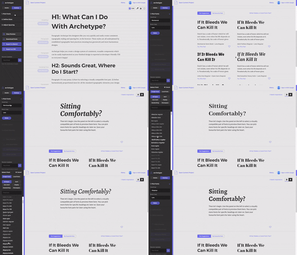
Align the text in a manner that makes it readable. If you want your copy to be user-friendly, make valuable use of headers, hierarchy and focus points to navigate the user through the content.
Your header size and position, body text size, text contrast, text line height, and the way focus points stand out, all pinpoint how scan-friendly your copy is.
Focus points are various elements or objects present within the design that grab or are meant to grab the user's attention. This includes a header, a graphical element, a button, and many others.
No Mumbo Jumbo
Get one thing straight; people don’t read on the web, they can. So, write in a way that enhances clarity. Stay away from lengthy sentences or heavy jargons that are difficult to understand.
Whenever you are writing for a specific set of audience, there are common terms that must be checked through usability studies.
A common tendency is to include terms or acronyms that are relatable to your working group but go completely astray to your audience’s mental model.
Crisp Content
When you come across projects where there is an overload of content on a page, try to sort it.
You can do it through visual design by means of adding space, background color, dividing lines, indentation or typographic elements, etc. or through formatting content i.e. grouping similar information together; all these forms enhance understanding and change the impression given by a long, time-consuming portion of text.
Apart from words, features like diagrams, charts, tables, and call-outs can also highlight major takeaways or calls to action for your readers.
White Space
In content dense designs, spacing allows the readability of content. White space relaxes the tension created through text and lets the user’s eyes navigate through the text. It also creates a gap between the elements in the design i.e. the graphics and text. White space renders the layout as clean and organized. The user’s eyes can travel from one text element to another text element without much hassle.

Image Credit - Link
Trace the Pattern
There are various scanning patterns when it comes to readability. Some well-known ones are F-shaped pattern and the Z-shaped pattern for scanning on the web. Recognizing how the eye flows across a page can make you decide which information should be put on the upper left and above the fold, as generally, that is where the gaze goes first.

Image Credit - Link
Elements in Focus
Another point is uplifting certain elements within the body content. This can be done by marking links, highlighting the main text and displaying quotes. Don’t forget about the focus points. By bolding these objects, you give focus points to the user.
These points and objects don’t make the text boring. Scan friendly text is quite significant to the layout. By giving these focus points, you make the body text score high in scanability.
Highlighting important lines of text catches the user’s eye immediately and thus is a key element in laying emphasis.
Clear Graphical Display
Every text body is balanced with the help of some visual support, as an image, icon, graph or illustration.
Placing the graphic on the page is a task in itself. We need reasonable space between the graphic and text. If the graphical element is an image, then it is suggested to use a clean border so as to separate it from the text.
Borders dictate the user’s eyes and are useful for raising the style quotient of the content.
But remember not to go overboard with borders. Try to use a simple color palette and don’t make it too large in size. For graphical features like icons and illustrations, prefer space as the sole separator from other elements. The content should flow subtly around the graphic without spoiling the text.
Margins in Support
By now we know that the white space captures the user’s eye to the text. It charges the eye to focus on the text. Yes, white affects the flow and readability of content and margins are one of the best white space elements that unite text elements. Margins on both sides will make the user’s eye shift towards the main content of the article.
Margins also sustain the article by distinguishing content from the rest of the design. Text shouldn’t be lost in other layout elements (typically for long articles). Margins mark the territory of the article and set the text bodies apart.
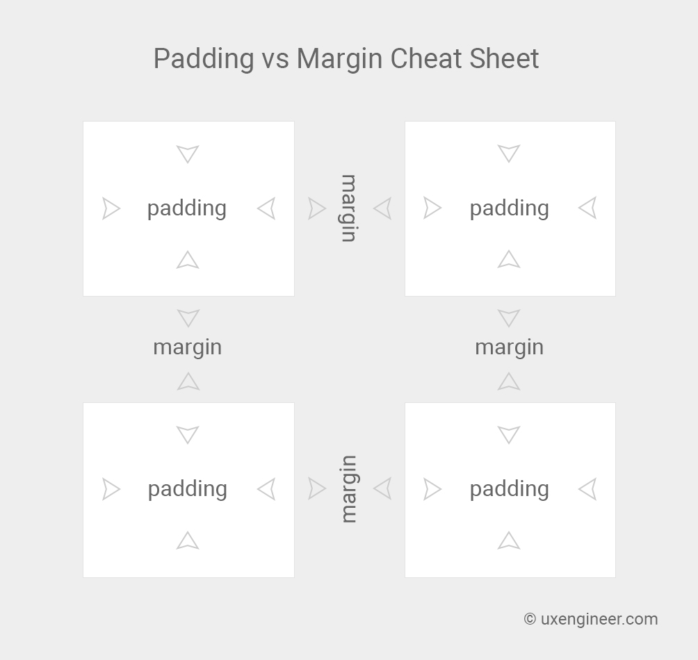
Image Credit - Link
Colour Contrast
Use contrast that matches the readable range. In the case of background, choose colors that are subtle in tone and duller than those of text. This will automatically attract user’s attention on the text and will not divert him to the background.
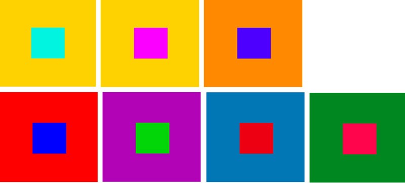
Image Credit - Link
Optimum Status
No compromise should be made with optimum readability. Always follow some basic guidelines for the written content of a website.
This way you can place a suitable number of characters per line keeping in consideration screen size and device for which the content is required. Once you have zeroed on the length for a line, you can easily predict the size of the text. Start by evaluating how wide the body text frame is based on the device for which it is meant (i.e. desktop, tablet or mobile size).
After calculating the width, content adjustment is a cakewalk, taking in view the suggested count of characters. For instance, for desktops, the suggested number of characters per line lies between 55 and 75 (with spaces). Talking of perfect character count, it is 65 characters in each line. In the case of a mobile device, the standard is 35 to 50 characters per line of content.
For enhancing readability, even more, give extra focus to both the number of characters in each line and the line spacing. In the case of leading, concentrate more on the body text size and the preferred percentage, paying attention to the device for which the content is originally meant. Remember that both hard numbers and ems determine to lead.
The suggested percentage for desktops is 1.5 times the length of the body text. As in the case of mobile devices, you can apply 1.75 and 2 times the ongoing size.
Takeaway
There are readers' goals for every page. As a designer, you have to make sure that you are conducting a smooth communication process for the visitors of your website. Skimming is the order of the day and too much information can do more harm than good. Design for readability or else get ready to lose traffic on your site. Lay stress on brevity and clarity of the content. Don’t make the users think too much. A clean layout can be a scannable layout only if there is strong readability. Hope you will make good use of these tricks and make the users flow with the text.

