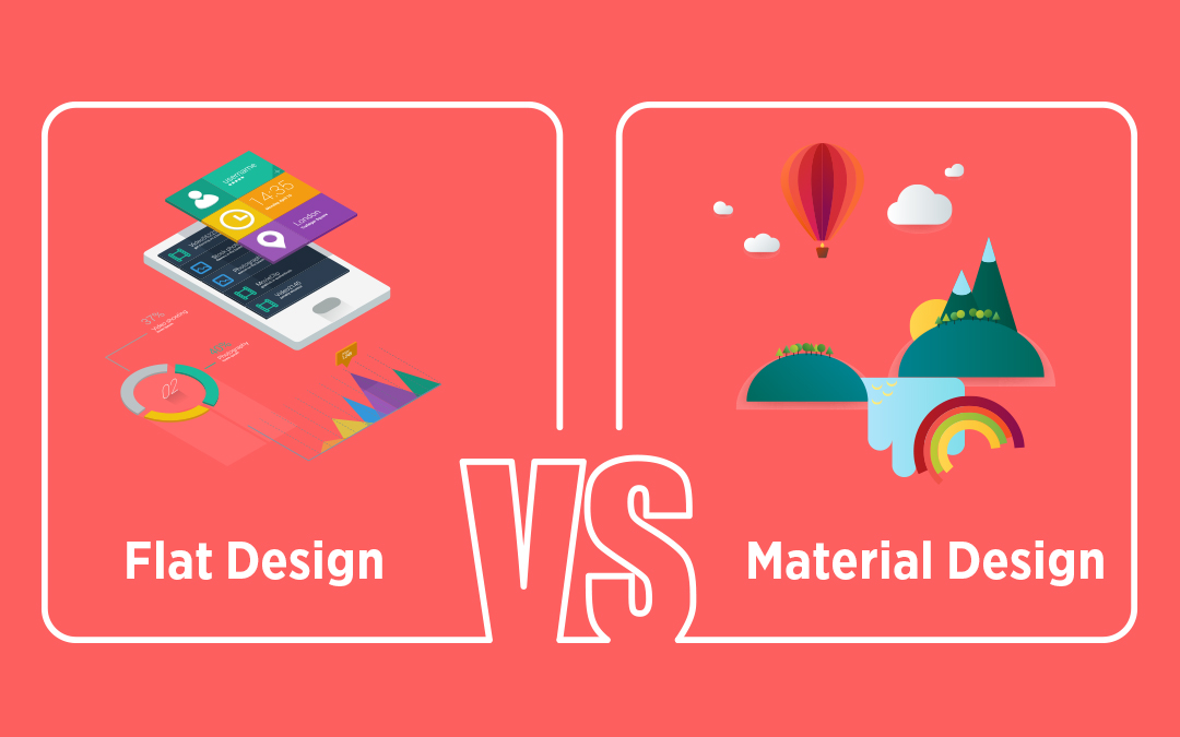
Design is much like the bait in the web world. Well, in a way, a perfect food for thought or rather here you can say call-to-action. At HealXRlabs, our web design ninjas with their whirlwind of ideas craft unique designs. We offer excellent design solutions on the platter after taking into consideration all your needs so that an optimal web design can be put forth. Our designers set the hook with an eye-catching digital canvas, which in turn entices the customers. As we take into account the nitty-gritty of design aspects, one question that usually surfaces is the choice of flat web design as against material web design. Now, in order to select, it is imperative to know the difference between the two systems as then only one can decide the suitable option. Both the types serve their own purpose.
Although the differences are slight, still you can’t ignore them and mix one for the other. To begin, flat design is like an evergreen trend that is meant to stay and is without doubt a designer’s pet. Taking in the change came- Material Design that broke the pattern and monotony and further, caught up all the rage. And that’s when the conflict between the two started. So, here we approach the big question, is flat design better or material? But, wait a minute; for that first we must know how they are different? Or how much different? Let’s get on with the basics-
Just The Start - Skeuomorphism
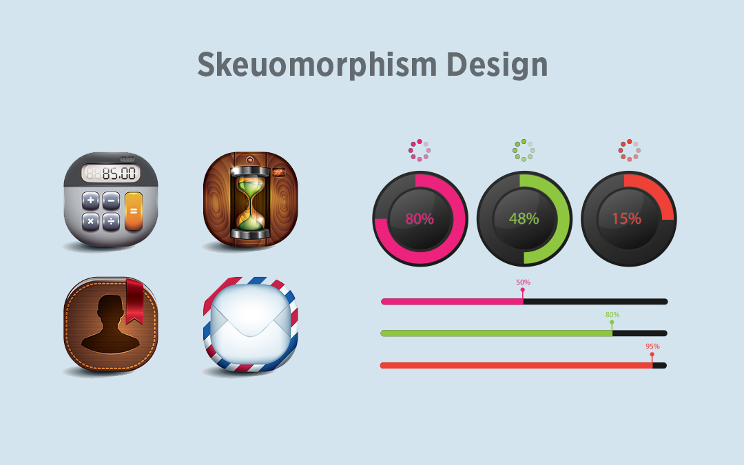
Skeuomorphism, here, implies being somewhat similar to the physical world. Real world attributes are replicated with the help of online tools; let’s say, for instance, synthesizer programs are made to imitate the look of keyboards. Skeuomorphism bought an end to every designer’s search when it first showed on Apple’s products. It made the design world go several light years ahead with its touch screen phenomena. Physical buttons got a good replacement with smooth glass screens, doing away with pressing or clicking.
But then the creators went in search for a system that gives priority to usability rather than the much hyped decorative elements, so that it helps in achieving efficacy in loading time and content generation. Being far way from digital usability and following the lines of mere imitation, skeuomorphism took a back gear as it had become very tedious with its over-decorative and over-natural elements. This is when flat design came into picture and dominated its way in the digital interface. The approach was less fancy, but more user-oriented.
Flat Sighted
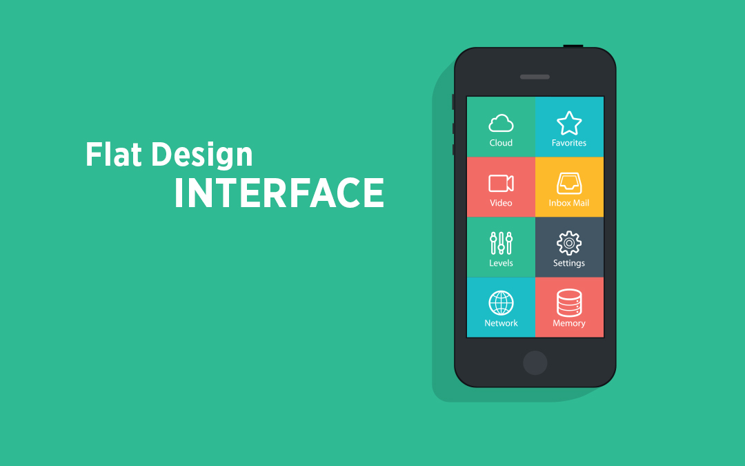
Flat design includes basics at its best. It keeps aside the over stylistic options like the illusionary three-dimensionality with drop shadows, textures and gradients and presses on interplay of colors, icons and typography. It brings a fresh feel to the design world placing it far from the realistic visions of skeuomorphism. People are wise enough to understand the elements of design. By now, they are fully aware that a tri-dimensional button symbolizes for button, even a simple rectangle is clear to point towards the call-to-action. Hence, we can say that skeuomorphism has become an outdated trend.
Flat design revolves around raw functionality. It is devised to bring into use internet’s unique properties and take into focus user’s needs, all with a simple straightforward approach so that the usability quotient is kept high. Thanks to the simple icons and compatible color schemes, viewers can easily know the purpose merely by looking at the colors and pictures alone.
There is no need to create a copy of any sort. Further, it shoots up the loading time and brings a wonderful appearance both on high and low resolution screen, thus, scoring more in terms of user experience. Both the designers and users are up for gains.
Positives
- Flat design abides by the limits of the screen and works in sync instead of taking onto another game altogether.
- It chalks out the required designs and removes the extra graphical and animated elements thus reducing the loading time considerably.
- Cutting down skeuomorphic elements can also quicken the content browsing process.
- Deletes the vague design choices thereby enabling quick site design.
- Flat design’s simple and straightforward sites are always compatible and open in responsive medium easily.
Negatives
- This system limits you in colors, shapes and iconography owing to its simple approach.
- If taken out of proportion, all the effort will result in a dull, featureless and ordinary looking website.
- Sometimes some apps or sites demand complex visual designs so as to enable the user to understand the process. Now, this is one major flaw in flat design. Another issue which is regularly faced is the lack of drop shadows and raised edges, which makes it difficult to distinguish between clickable buttons and static vector graphics.
- Having a presence at every place makes it a challenge to design an original and unique flat site or app.
- Talking in terms of innovation, flat design is clearly a mid-2010s style and will outdate your site if you don’t modify it any time soon.
Functional Always
In spite of all the limitations, one thing that makes flat design the bright star is that it never sacrifices functionality going overboard with features. Visual appeal doesn’t blind the major focus, that is, user experience. Looks are not given the prime importance as decorating will not fulfill the entire purpose of the website. It’s the function that matters. It is not a rule that only fancy buttons can sort out the navigation issues. Simple and elegant buttons, which are not a major distraction, can also suffice the role.
Match With Material Design
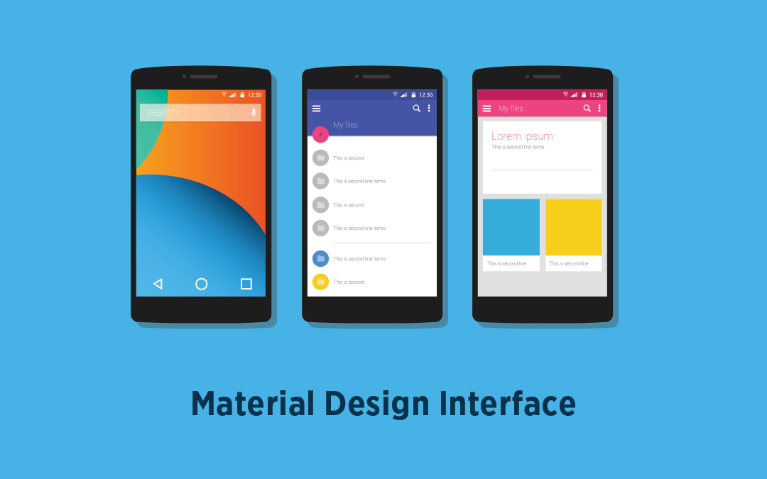
Experts argue on the dynamics of flat design stating that the system’s simplicity has gone way too far and it is wholly solely governed on basics, by way of eliminating all the traces of skeumorphs. The solution for this drawback came through material design. It included the layers feature passed through countless image editors and additionally separated them through drop shadows, animations and bevels. It thrives on our ability to understand depth and place it in the right extent and direction.
Those who don’t know, material design is the design system created by Google and is a great milestone in the design world. It encompasses unique elements and features, the major being the presence of Z-axis. Actually it adds some dose of skeuomorphism in flat design, thereby resulting in a bunch of two-dimensional planes that hover over each other at fixed elevations.
To get an idea, think of a piece of paper that is flexible and can be molded into different shapes, can expand and contract. Further, place few of them on top of each other so that they float and draw a site element on each one. This is what material design is all about. It follows a fixed rich set of guidelines and design principles that considers all the factors namely color, weight, usability, depth etc. Material design is kind of a reliable framework crafted for the future designs.
Beating the flatness and plain style, it is made for greater adaptability, multiple environments and also for different shapes, example, Android Wear watch. This all-in-one concept is gradually gaining popularity amongst designers. Material design has become the force behind Android apps and is extending its use in Wear too. Should iOS resort to this system or not is the hot topic amongst designers, with some backing for Google and its unique look while others taking it as a struggle with the rest of the operating systems.
Positives
- The three-dimensional set up makes the programs more interactive, such as, the drop shadows point towards layer pattern.
- No need for any guesswork as material design follows a detailed set of principles based on design.
- If you are looking for responsive platform, that is, website as well as Android app then the material is ideally compatible across all devices, which furthermore will aid functionality and empower your brand.
- If animations is what you want then material design is your call as it contains built-in elements which otherwise would have to be made manually.
Negatives
- Material Design is Google’s baby. If you don’t want any validation from Google and want a unique identity for your site or app, it will be a cumbersome process to undergo.
- The applied framerates may not be compatible with all the systems. Thus, improving the usability goal can be a major challenge for the designers wanting to do so.
- Animations can suck up mobile user’s batteries
- Putting compulsions on developers with regard to the guidelines can affect individual creativity and hamper the development of animations and other features.
Flash With Meaning
The design principles in material design impart clarity to the functions of the elements. You can easily distinguish clickable elements from the non-clickable ones, buttons from decorative features. These details have been ignored and not mentioned clearly in flat design and are too garish in skeuomorphism. Users are pretty used to certain functional design elements from quite some time now and don’t need over realistic quotations to know the working of the object.
The Difference
- Material design has a greater scope than flat as it uses Z-axis. It somewhat unifies the digital and real world together. Even though it bears resemblance to flat design in aesthetic terms, material design adds a greater dimension in design through Z-axis.
- Another point that castes material design in great favor is its high responsiveness. Material design goes in flow with the user’s action much like the pattern followed in the real world whereas flat is more reclined via black and white digital communication. Enhanced interaction adds superiority towards material design.
- Flat design gets a high score in terms of ease and speed. Owing to its complexity, material design consumes much time and is complicated to develop. Flat design is smooth to implement and has a very less loading time. However, if you are going for a complex and detailed system, the time and investment involved in material design is worth the cause.
- Material design has a dependency on skeuomorphisms. The hyper realism associated with skeuomorphism is too much for the modern devices to bear. Flat design is safe on this ground and keeps complexity at bay, focusing more on realistic patterns that increase performance and functionality.
- Skeuomorphisms have not left the design battlefield completely. Material design builds on its base by merging Physics and aesthetics together. The end result is a clean efficient design version that is harmonious with the real world.
Final Word
Material design doesn’t fall completely apart from flat design. Both work on the same lines- clean and minimal. Come to think of it, material interfaces are actually flat interfaces cut apart. Although material design’s animations have gathered in lot of praise, but ultimately they are just to make the design more user-centric. It is not written on stone that you have to use either of the two. You can combine the aesthetics of both the systems by giving an extra edge through material on an otherwise flat design.
According to me, flat design is pure and practical. If you are planning a site that is plain and targets more on usability and technical control, flat design should be your pick. If animations or motion graphics do not interest you and your prime requirement is simplicity and user friendliness, then flat design definitely should be on your mind. However, if decorations and fancy looking elements along with animations are your criteria, go for material design.
