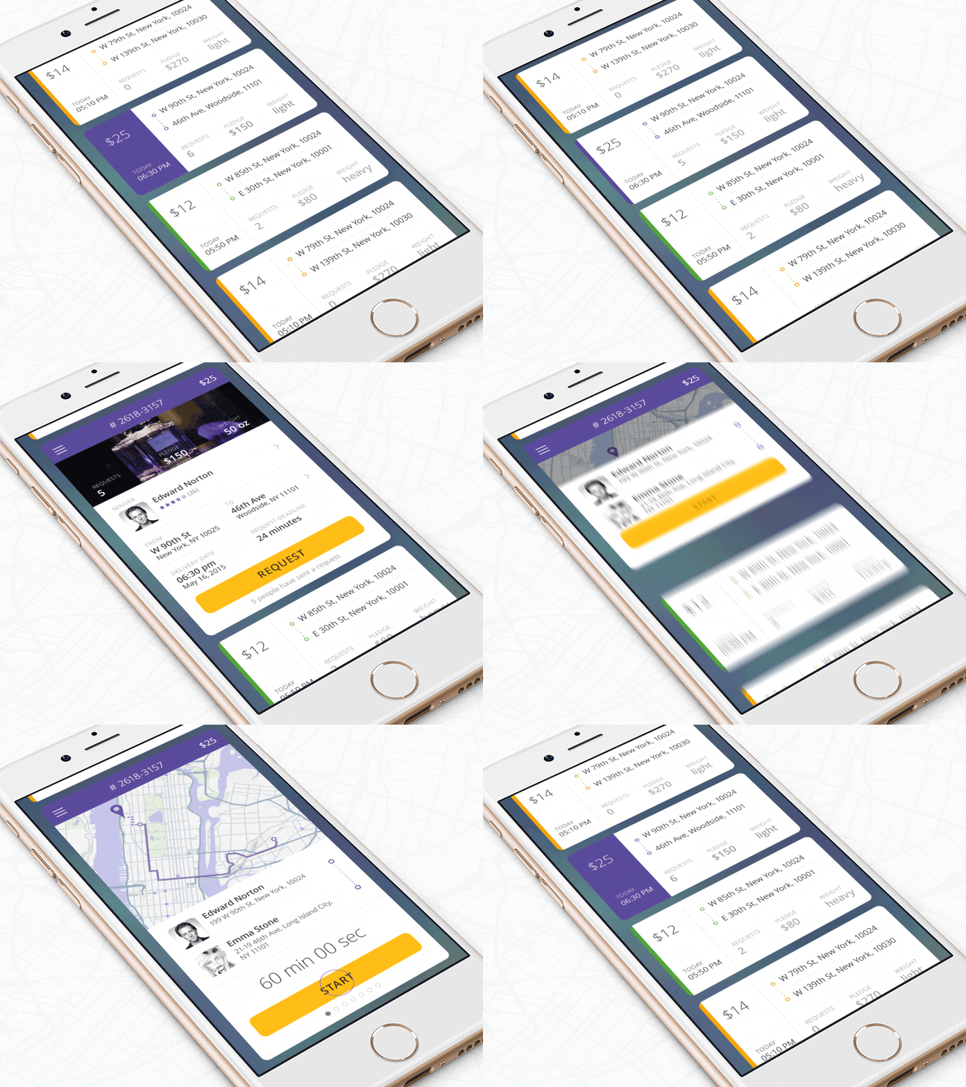
Be it social media sites or online stores, cards are becoming a rage in web & mobile UI Design. Web and mobile apps are shifting from pages to absolute personalized experiences. This experience is derived from the aggregate of many separate pieces of content. And of late what is adding edge is the creative concept of cards. This concept serves a major advantage as it is suitable for all sorts of screen sizes. Cards can be implemented in various shapes, forms, and colors, but normally they consist of an image or icon along with some basic information like title, username or sometimes even text.
The most popular website that uses card-based design is Pinterest, however, as of now, there are other sites which are increasingly applying this design pattern and are scaling high. When users browse a site integrated with this design technique, what catches their eye first is the cleanness and well-structured planning that frames this simple and classic approach to design. Want to learn more about the card-style interface? Great thinking! Let us help you know this popular and user-friendly option better-
The Tempting Touch
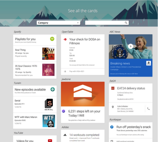
Talk about practical and fluid results; card design is just your game. Here are some reasons why it is awesome for website design:-
1. Structured
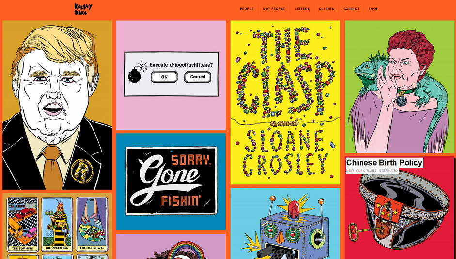
Cluttered websites are a big pain for the visitors. Providing a relief comes to card design which uses excellent approach while organizing content from several sources. This can be visually stimulating both for the user and designer.
2. Responsive
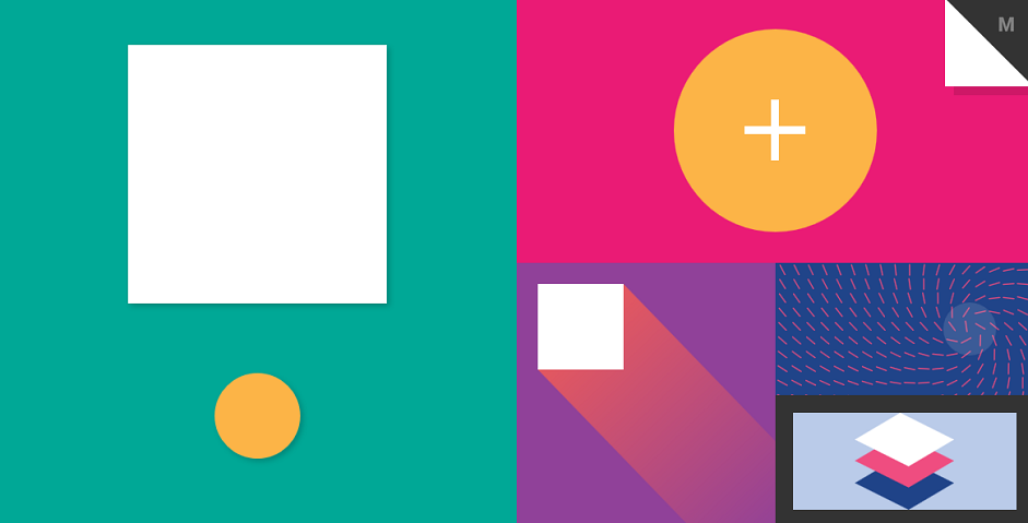
Sites are not limited to the look-and-feel only. It is important to set the standard with its performance across different devices. Cards are designed to fulfill this target. They take care to reposition and reorder the content quickly and that too as per the size of the screen.
3. High Readability
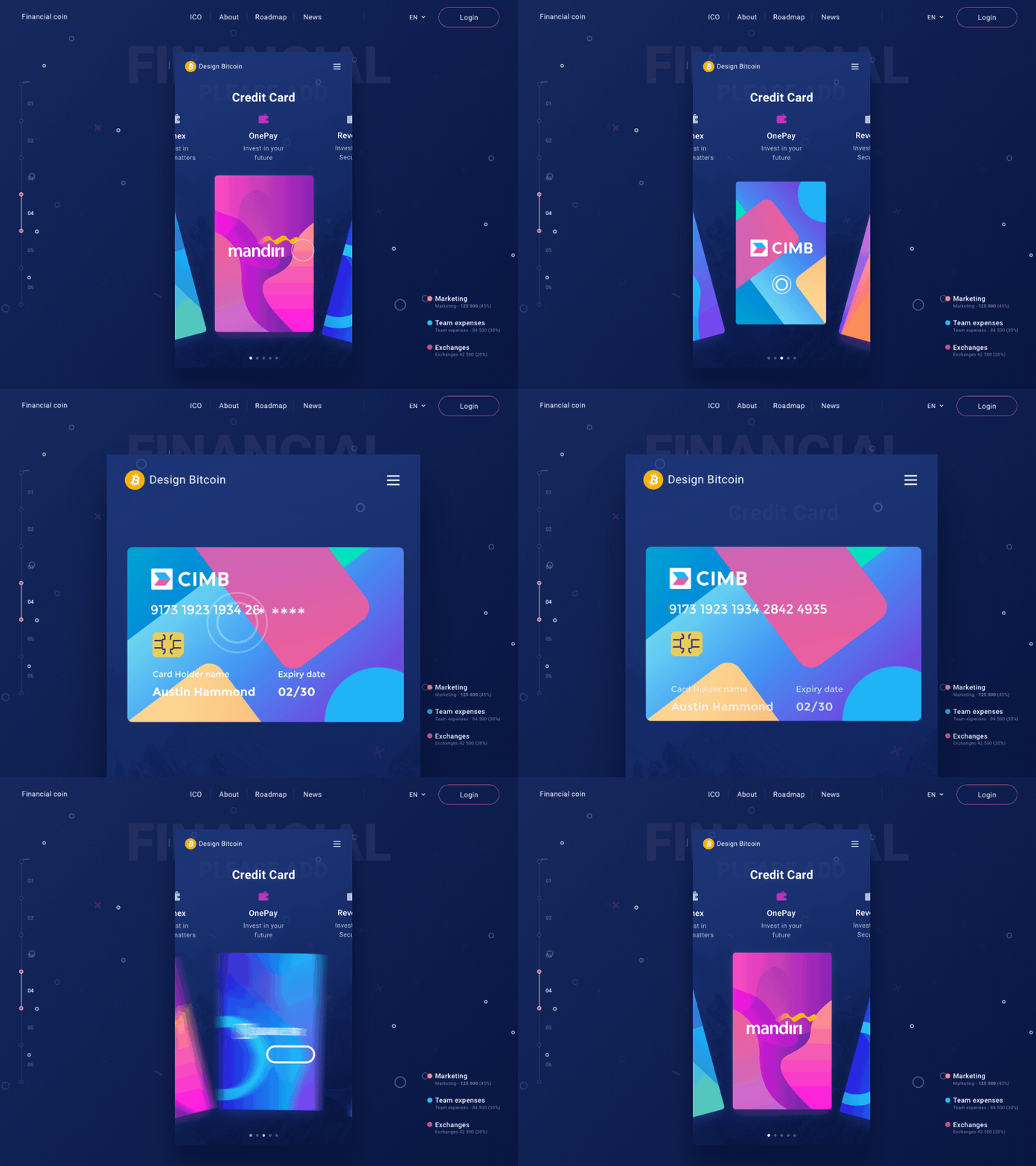
One of the significant features of cards is that they are not loaded with information. This not only makes them look attractive but also ease the task of readability while browsing.
4. Social Media Factor
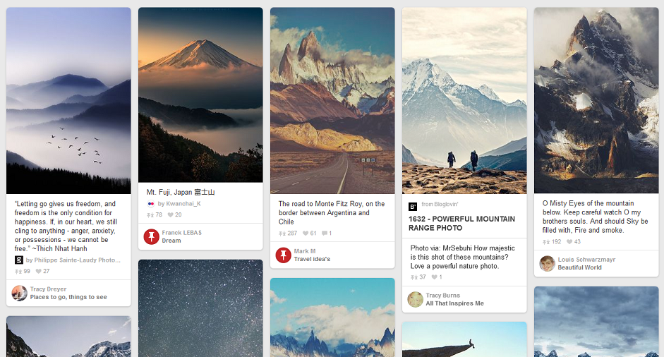
Social media sites have become the order of demand. And why not? They are fast, convenient and accessible. This is where it strikes a connection with card design too.
5. Equality
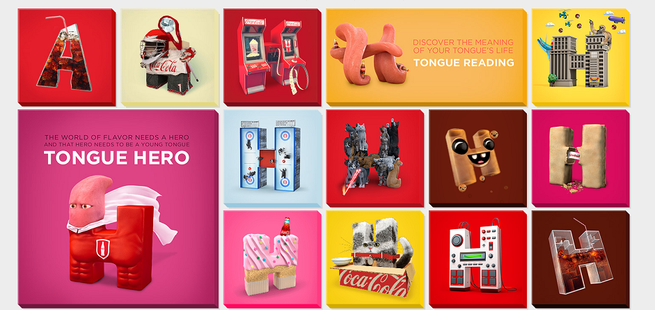
The best thing about card design is that it works rank-free and everything is equal here. Each card is of equal importance so there is no need to go for ranking of the same.
6. Flexible
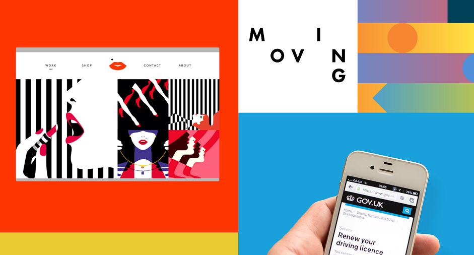
Card design has a universal appeal to it. It can work for any type of content you select to add to your website. It is not bound by any specific rules in design style, allowing ample scope for creativity.
7. Great Source of Information
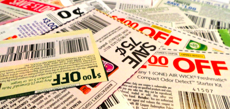
Cards have long served as a great means for information dissemination. In 17th century, trade cards were a pretty good medium for the people of Johannesburg to find businesses. It’s been hundreds of years people have been giving away business cards to the potential clients and for the purpose of recognition. Even our wallet is full of cards. These are great for communicating stories. The same is the case with commerce in which cards ruled the market in the form of coupons or stick outs. Indeed, for web & mobile UI design cards are incredible style pattern that present information in an attractive way.
8. Manipulate For Good
Another trait that makes cards desirable is that they are manipulative in nature. Just like in the real world, they can be turned over, folded and expanded, even stacked, sorted or grouped together. When designing for screens, all these properties can be fully utilized. Also, animation and movement can be an add-on that can give the hint of what is in front and that on the reverse or whether the card is folded out. We can integrate multimedia content, photos, videos, and music easily. Cards are in fact the perfect choice for mobile devices and varying screen sizes. On mobile devices, cards can be stacked in the form of a column and get a height for the view.
9. The Grid Style
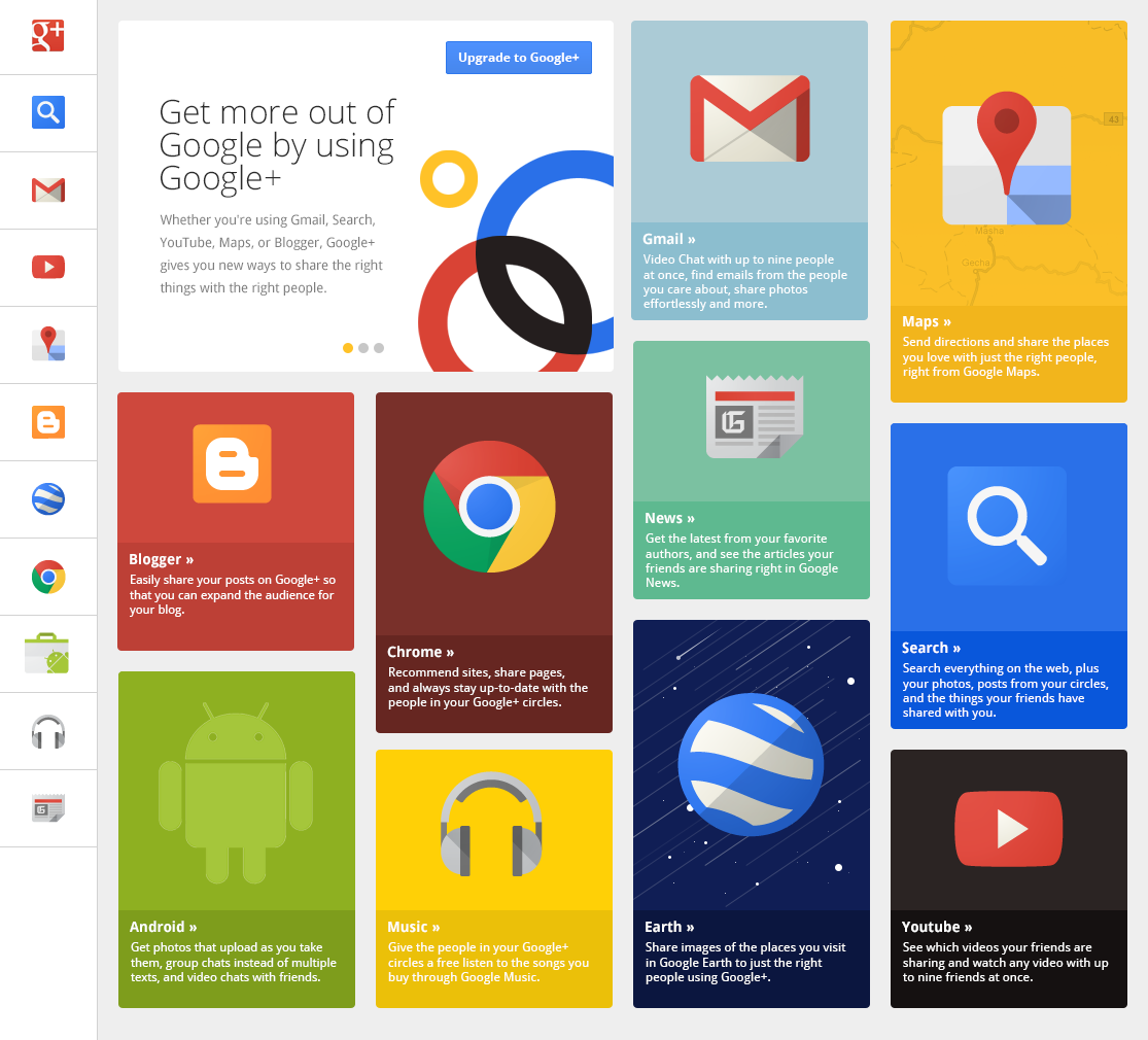
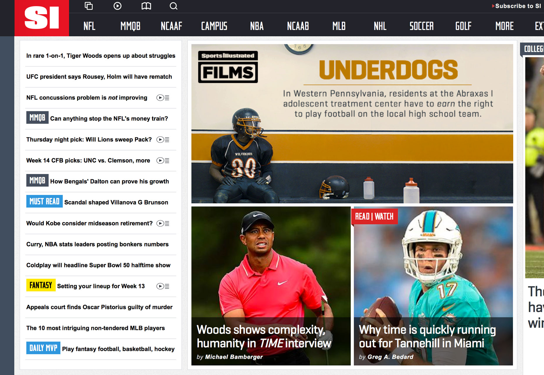
The most obvious part of a card-based design is the grid-based pattern. Actually, every edge of a card is the edge of various grids in a bigger, structured system that results in better consistency and harmony for the presentation of the website. This is a great advantage for the information architecture of your site. Information architecture is the logical order and flow in which the visitors grasp site information in compliance with the goal of each page and site. It is a card-based design that guides the visitors’ eyes by laying emphasis on consistency. The arrangement is useful to stress important information and direct the attention there.
10. Image Friendly
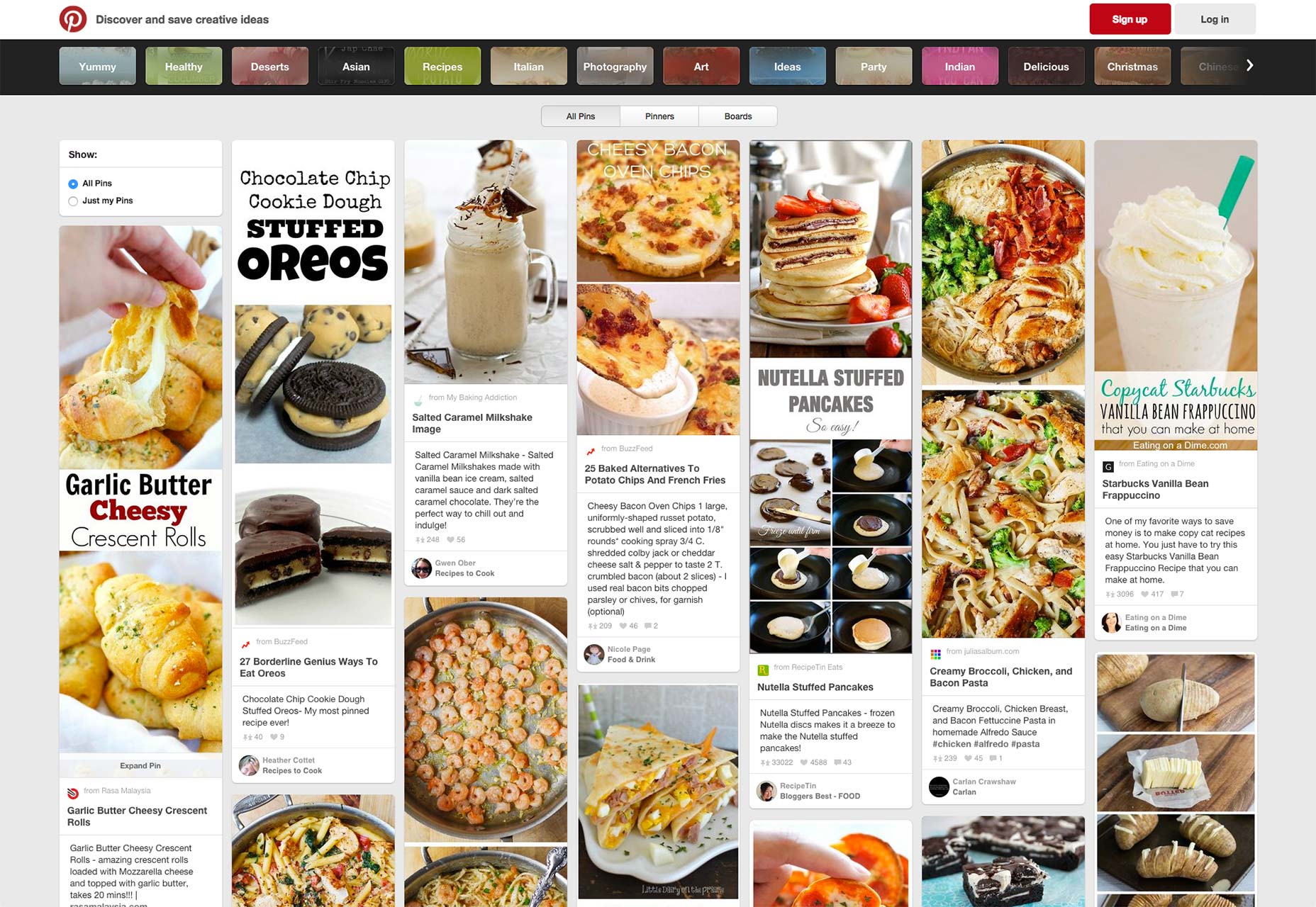
We, humans, are visual creatures. Card-based design can be good proof to this one as it relies heavily on visuals and any other copy on the page is given less importance as compared to visuals in the information architecture. Being image dense is actually the USP of card-based design as it elevates the overall appearance of web & mobile UI design. For instance, both high-quality pictures and human faces in images can enhance conversion rates. Simply put, the grand emphasis on images makes card-based design a blessing for the website.
11. Great UX
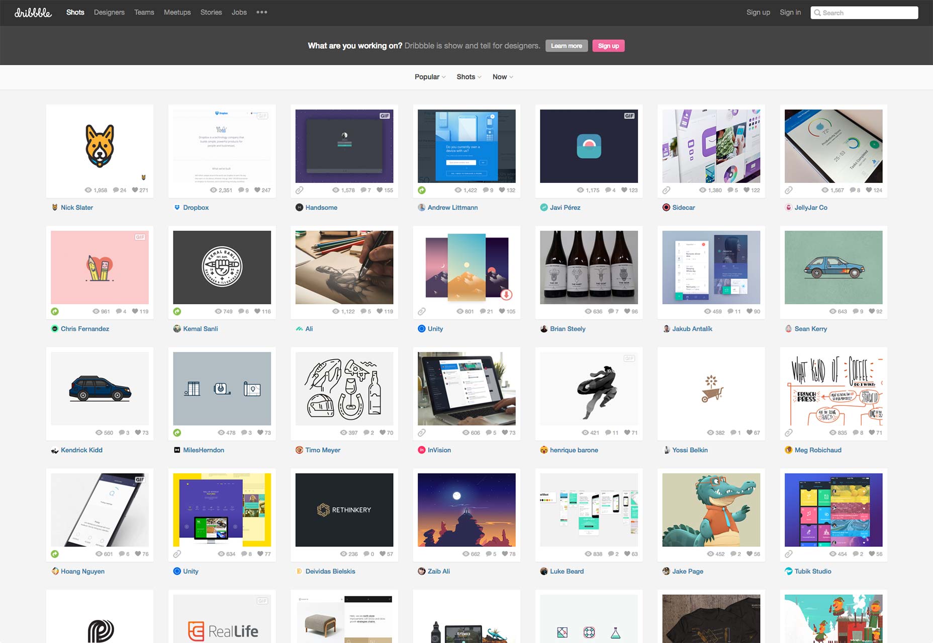
User experience is the reason we design. And this relates very well with the card-based design and will do so in the future as it arms user experience tremendously. This, in turn, encourages the visitors to keep coming back to the site and thus, spend more time which ultimately leads to conversions. A superb user experience is such in which people can figure out the way in your site without any chaos and all the actions can be taken immediately without much trouble. The card-based design is a good platform to put forth illustrations, graphics, and images in the most suitable way. As images capture attention, UX is increased when visitors immediately peruse the cards in the grid design to judge which is of interest to them. As soon as they decide the card of their interest, they can quickly click on the card to have a closer look.
12. Not Just a Trend
It is generally seen that some design trends turn into fads which make them easily forgettable with time. However, card-design is here to stay for sure. Owing to its great benefits and practical uses, there are chances that its popularity will increase as time wears on. Yes, it has staying power. Meriting on consistency and drawing much from images, the card-based design is a vital force in enhancing user experience as it makes the site extremely user-friendly. Cards are no way old now; in fact, they have been totally reformed by our innovative designers to make the websites more enticing.
Win With Design
Below are the ways in which you can get an effective card-based design:-
Primary Black and White Outline
Always start with a black and white wireframe for the design. Keep the objective of the card in mind and accordingly make the parts clickable or tappable. Decide on the elements like spacing, images, and typography so that the card can be viewed without any color or embellishment. Consider it as the ‘playing card’ stage of design. Plan on the usage of elements, the clickable areas for action and on the options to go back or advance. Remember if the outline doesn’t work in black and white, the final design will fail to work too.
Ample Spacing
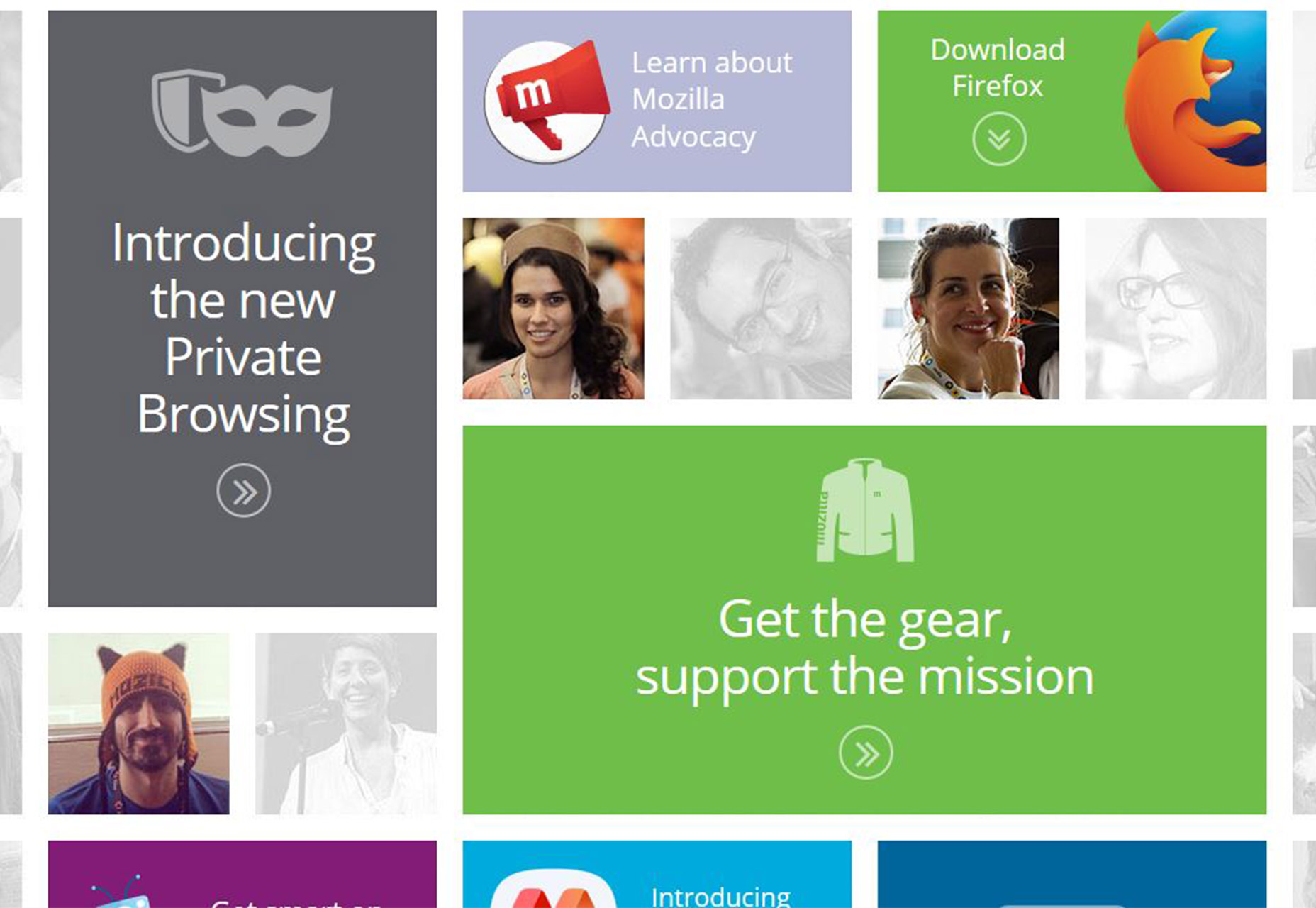
Card-design can be challenging in term of the organization as you want an all-encompassing design without any clutter. Now, this is where white space can be made use of. And believe me; you will like more of it in design at first. The inclusion of white space will give a breather to design and make the card appear more spacious as well as easy to read. In beginning, you can start with twice the space you normally put between elements. Make gutters extra wide and go for huge gaps in line spacing. The ample space will make the design open and organize the content well; you can easily dive into the layout.
The Natural Wonder
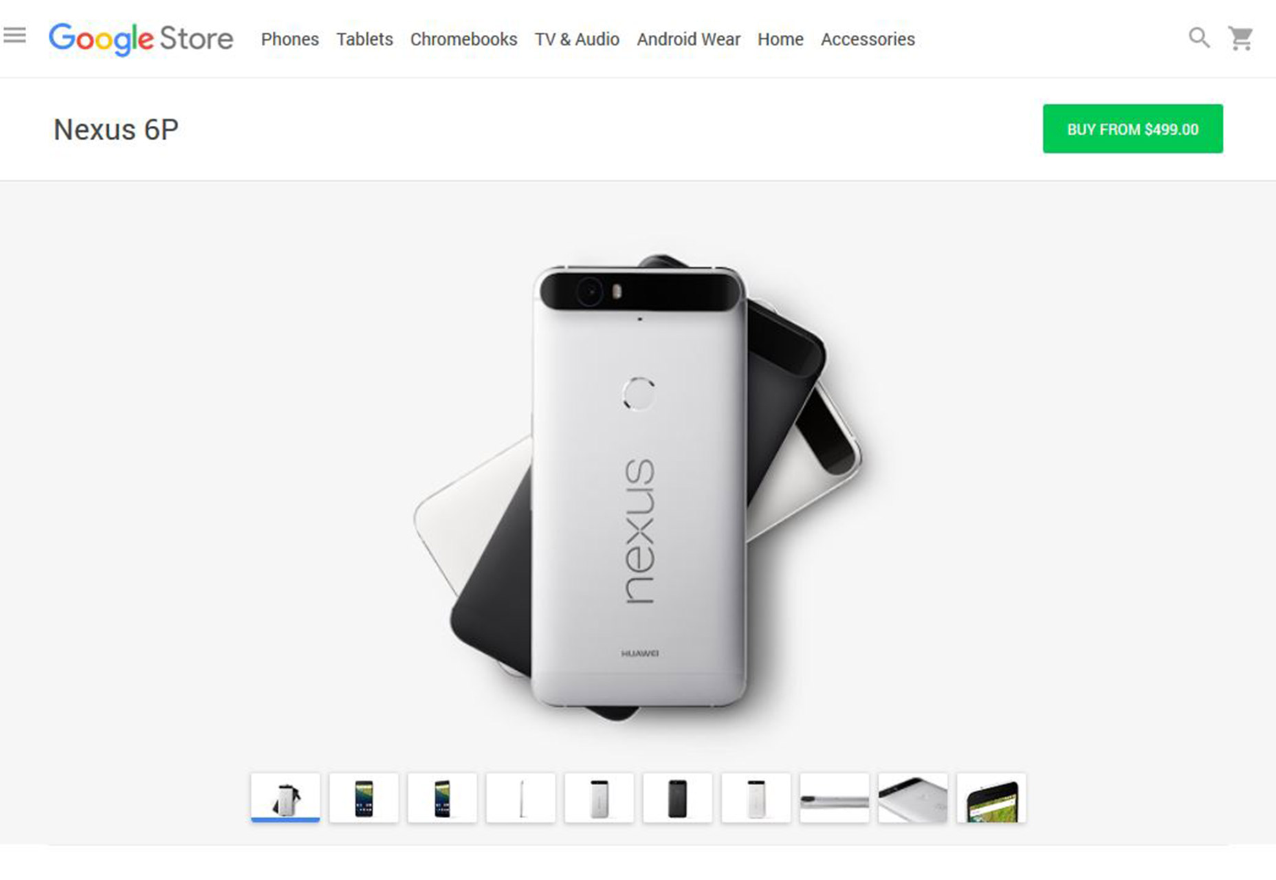
For color and shading in design, try to keep it natural looking and as close to reality as possible, especially in shadows and styles. Use natural outlines and shadows for creating color. Foresee the look of the card; the user should feel as if he or she is holding the card there and then. Remember lighting should cast some shadows to the back and bottom. Also, the darkest part of the layout is more likely to be at the bottom. Make sure to not put content in the areas that are used while holding the card. Further, touchpoints must be the focal points and should be easy to interact.
Simple Layers
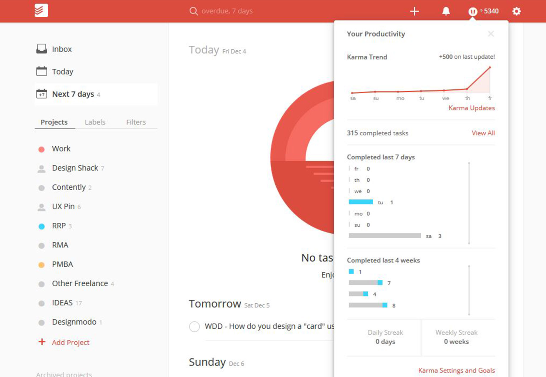
Keep the material design guidelines in mind while designing layers in card style. Understand that the background of the application is much like the flat, opaque structure of a sheet of paper. The application mimics the properties of paper in terms of its ability to be shuffled, resized etc. Elements outside the apps are different in nature and follow a different approach. The concepts match the working of the digital object and can be used as a base in designing.
Clear Typefaces
For typography in card-based design, simple sans serifs are the best choice. Don’t use extra thin or condensed forms as they can be tough to read. Most cards use two typeface options, one for the main body and other for headline or call-to-action. Note that in typography one essential rule is to include plenty of contrast so that the text elements are legible. Include contrast in typefaces, background and text elements so that they can be distinguished well.
Required UI Elements
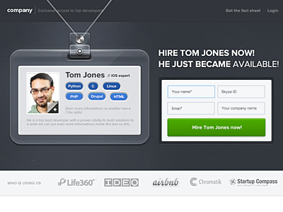
Make note that one card is equal to one action. So, it is better to use minimum user interface elements such as buttons so as to not ruin the organization of the design. Sometimes a button is not even required in card style design. However, if you think a visual cue is needed, go for one button. Keep the layout simple and open; yes, I repeat material design approach will do good to you. If a button is what you need, just stick to it.
The Cool Canvas
By now it must have been obvious to you that product and interaction designers will rely completely on cards in the future. The same will be the case for marketers and creatives in advertising. With the surge in social media and creation of its fragmented services, the cool card-based canvas will cash profits through creativity. All the platforms namely Facebook, Twitter, Pinterest , Instagram, and Line, are as it is in full power through the use of card design metaphor and will continue to do so. We are not saying that it is a magic formula for design, but it will surely make the users want to click or tap so that they can interact further. Combine these tips mentioned in the article and we guarantee your project will be a hit with card style concept.
