What is Kerning?
Overview
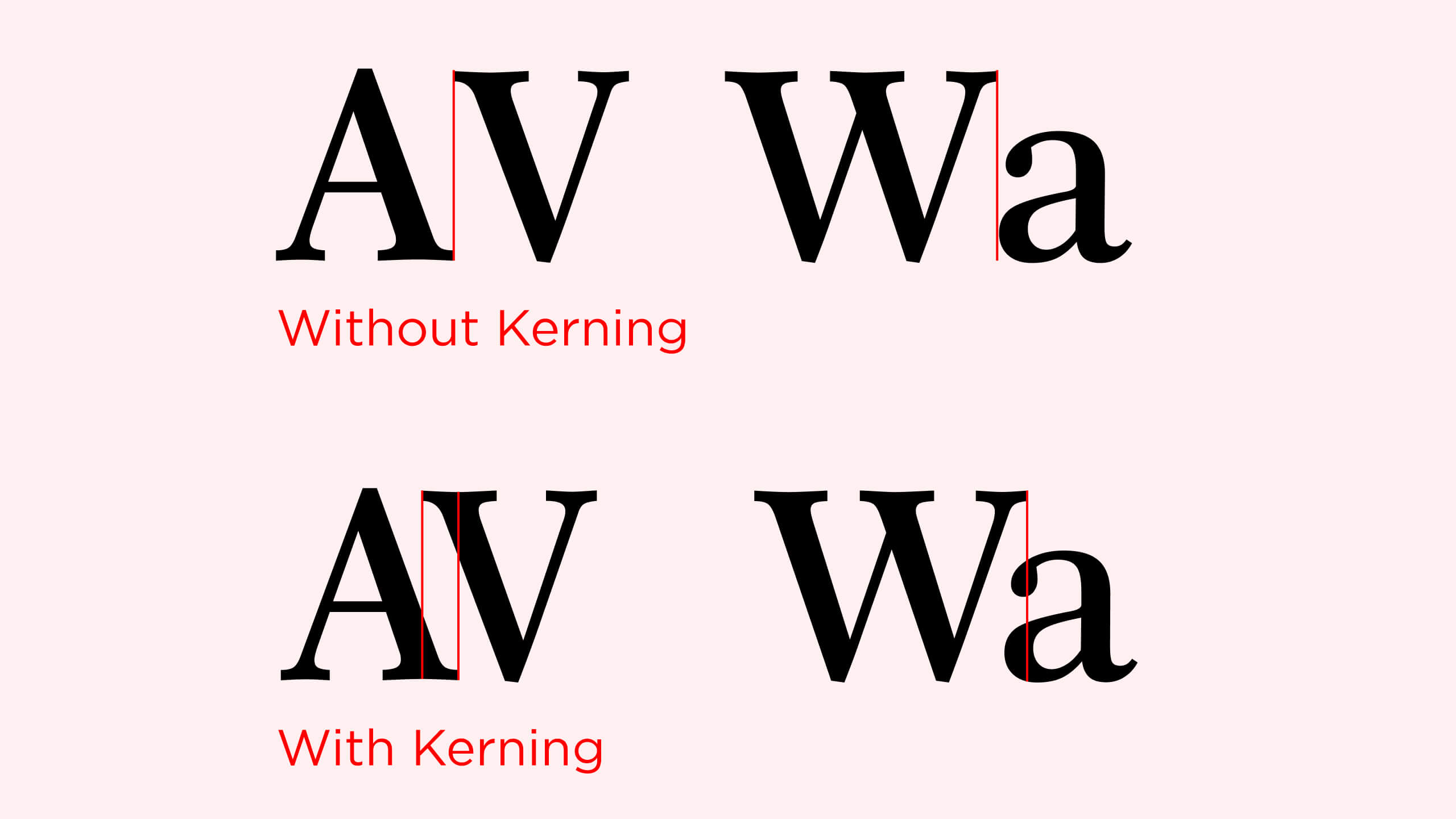
Kerning is the spacing between individual letters or characters for improved legibility. Kerning is adjusting the amount of space between characters so that the text displays with the optimal and desired effect.
Kerning is the distance between letters and characters. Unlike tracking, which adjusts the amount of space between letters of an entire word in equal increments, kerning focuses on what the type looks like - creating readable text that's visually pleasing.
Kerning is a concept within graphic design. This element addresses typography and font choices in graphic strategies. Kerning emphasizes elements of a font or adds more depth to them to convey more meaning. For example, widely spaced types may look more diagnostic, while letters closer together seem more necessary.

LET’S WORK TOGETHER
Boost your design scope with HealXRlabs
Book a call with us and get the party started!
Book A Demo


