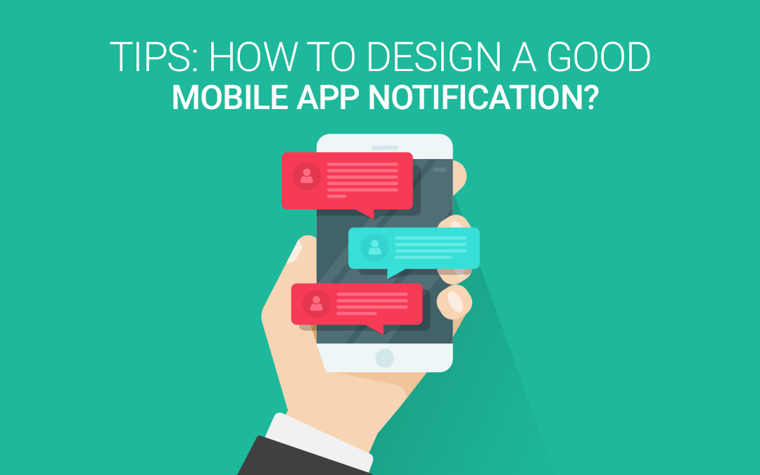
Beep! And there comes a notification…O c’mon bugger, not again! Yes, that’s what you think every time a notification prods its way in your mobile. Well, admit it or not, we, as a matter of fact, don’t even bother to check each and every notification and alert messages that we get on daily basis. We consider them useless and tend to ignore outrightly as they distract us from our day-to-day activities and break the flow. Actually designed to augment user experience and usability, these notifications somehow miss the goal and become a source of irritation for the users.
Such is the case that they ultimately end up limiting the notifications (if possible) or dismissing the service or worst uninstalling the app altogether. Why does that happen? The answer is a lack of value-for-interruption. When you install a mobile app you expect a reward or benefit in return of your initial need, even if that is at the cost of receiving notifications, unless and until they are useful and interesting. However, this is where they go astray. To think of it, it is their constancy that is the culprit because the designers don’t consider notification designing a big deal and take it for granted, harming the UX in turn.
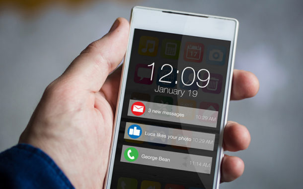
It is very important to create notifications that are appropriate and helpful to the users. Why? The reason is that these notifications can serve as robust tools for companies to connect with their customers directly and convey the right message at the right time and place to enhance interactions. Of course, notifications are annoying, but think from a product owner’s point of view; they are valuable in intimating users on major errors, app crashes or new IMs.
Okay, now the challenge here is crafting notifications that don’t fall in the anti-UX pit and are relevant and meaningful for your product as well as the user. So, what makes a notification good or bad? When is it necessary to ping? Read on to discover more on the notification art-
1. The Need
Prior to your notification design route, always make it a point to consider the need for the notifications required, if any. This might seem strange to you, but some notifications are just an added burden to the user. There are times when we create notifications for practically every error simply to keep on to the usability logic. Like the buzz on system status; this is not even required and is of least interest to the user.
If the notification provides information and doesn’t depend on any action from the system to recover, then it might not be that critical. Whereas in the case of significant errors when the service or app relies on a user’s action, which is also relative to the data, notifications are of great use for the users as well as the product maker.
2. Tailor-Made
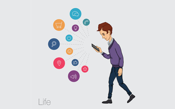
Notifications should be open to customizable product features. This certainly doesn’t imply having users turning off all notifications (though that is what every user truly wants), but empowering the users for selecting the content of the notifications. If the user is given the control for selecting alerts, they are satisfied looking at the pings. If you don’t have sufficient user data to back up the design of the notification system, customization can be of great help. Eventually, you will follow the type of notifications that are helpful, apt and timely for the users and the ones that require changes.
3. Apt And Timely

How can you be relevant with notifications? The best practice is to use all-time favorite user data analysis. The actual behavior stats of the user are the best indicators for relevance. At the time of making notifications design, pay heed to product usage report and other information that you have collected on the target audience. This is a good tip to make relevant notifications for users and thereby increase the conversion rates.
Timeliness is also an important factor here and that means you ought to notify the users of proper time especially when they are least likely to ignore it. Of course, nighttime is just not useful for prompt notifications. User stats are a great source for collecting data as they reveal about the time zones of their locations and the best time when they are likely to look at a message.
4. Clarity In Message
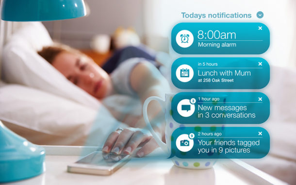
The content of the notifications should correspond to the language of the users both literally and figuratively. Make sure that the message is understandable and doesn’t confuse the users. Phrases like ‘you have won’ and ‘100% free’ are a big no-no as they look like spam messages and raise more doubt than belief in the minds of the customers.
The message must be crisp yet clear at the same time. Don’t annoy the users with the content of the alerts. Remember, notifications are a useful tool for communication so you must stick to your brand image and message intent at the same time be different and useful.
5. Deliver With Efficiency
You ask for the methods of delivery and types of alerts and there goes the list- email notification, SMS, web notification, pop-up alert, mobile app push notification etc. Now, if you want to sort these notifications and offer them for ideal help, you have to recognize two categories of notifications as per the interactions, that is, Product-to-user notifications and secondly, user-to-user notifications.
Based on the service and the need for the user, these categories might serve varied purposes. For example, an Instagram user is keen to learn about the snaps that include him or her or Facebook friends that are new to the app instead of reviewing the app.
6. No Interference
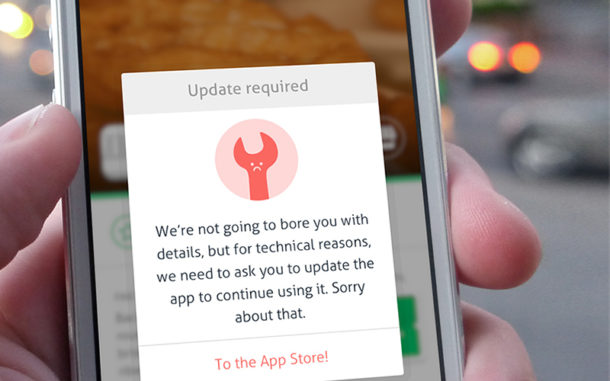
Notifications that fulfill their goals and aid users with timely alerts and reminders are good, but what about notifications those are far from help and just mere distractions as they pop their way onto the user’s screen. Yes, this is where the problem lies. So, the designers need to take care and distinguish between these notifications so that they can stick with the user-friendly agenda of design.
Notifications should least interfere with any particular action that the user is complied to undergo and still at the same time accomplish the goal of informing the users what all-important is coming up. For instance, in Mac, OS X is the OS that takes care of the calendar app notifications and finds a way to gather the attention of the user irrespective of the frequent indispensable apps and programs, thus enhancing usability.
So, whenever any important event turns up, the calendar pinpoints with small notifications that slide on the top right of the screen. This way, the movement catches the eye yet never interferes with the tasks because of the small size of the notifications.
7. Last-Chance Prompts

What can be more unfortunate than deleting an app accidentally that usually stores all the information and data that you have gathered over time? Be it social media or cloud storage apps, the scenario in which you lose all the valuable data just because of an accidental click on your phone is maddening and difficult to handle.
This is the reason notifications serve as confirmation messages so as to clearly confirm what is being deleted before the action takes place. These popup confirmation boxes should be big and cover the screen in order to gather the attention of the viewers. Make it a concise, to-the-point question so that user should know what decision has to be taken. Pay attention to the future call-to-action buttons and make them stand out in design with a different color.
8. Use Numbers
Numerical values always make the process simpler as we can clearly analyze how much time has to be allotted to complete the task. Also, numbers can help us decide if we want to work on a task at the present moment. Countable things are a plus for usability as they let us make best decisions as per the situation. We can look after our workflows better. The sight of one alert or icon that tells us we have one notification is of great use as we tend to look at it in the moment because it involves less work.
Dealing with one notification will considerably take less time than five notifications in a queue. When we have several notifications to deal with, there are chances that we tend to delay the task until the time we are free so that we can conveniently handle the load later. For example, the Google notifications system uses numbers to inform the alerts that are pending to be seen at a given time, thus marking how much time is needed if you deal with the given alerts. This empowers the user to manage time appropriately.
9. Control The Frequency

A common blunder, so to say, that harms the long-term outlook is by intimating more notifications that are needed to the user. This notification overdose can kill the communication flow established with the users and can put off the users or make them withdraw from the app altogether. Make a note to understand your target audience, their requirements, and patterns and decode the frequency of notifications that should be sent to them.
10. Worth It Out
A user doesn’t mind getting notifications unless they give that worth for causing all the hindrances. Obviously, they should be relevant and be capturing enough to attract attention. Personalized content is always favorable and delights the customer with the direct say in messages. For instance, the Facebook app usually sends user notifications to add suggested people as friends or even to find more friends on Facebook. This is very random and is not at all apt to direct the users back to the app.
It is quite irrelevant and causes a nuisance to the users. On the other hand, Netflix is really good with its push notifications as it informs the users when their favorite show can be seen by them. They send notifications of only the personal favorites that have a new season to catch on. Never misuse the power of sending notifications and send them for the sake of it. Keep a tab on the content as users prefer content that matches their personal interests.
11. Keep Testing
The sure shot formula to make a push notification super is to test it. A/B testing can be used for push notifications. However, like in the A/B test of a change in the site design, testing messaging is judged on speed and determination. While testing doesn’t only consider positive metrics rather look at the big picture and take into account other major metrics as well. See if the goal is being achieved; the notification should persuade the users to take the desired action.
The notification should be designed in a manner that enhances the user experience and this can be tracked successfully through the metrics that study the number of users who re-engaged themselves with the app after getting the push notification. Also, don’t forget to look at the app uninstalls and push opt-outs that have arisen as a result of the notification; the numbers can contribute to removing the notifications that are causing more harm than good.
Takeaway
It is seen that the designers drift in their purpose of designing notifications just for the sake of completing the chore. As a result, every app is redundant with its superfluous alerts and notifications. Designers must be clear as to what notifications are vital and should appear in front of the user since not all stands of significance to the user. If the notification directly influences the users’ UX then it ought to find its way to the user else it is better to not send it at all. Notifications, if well planned, can actually add real value to your users’ lives and transform your brand journey.
