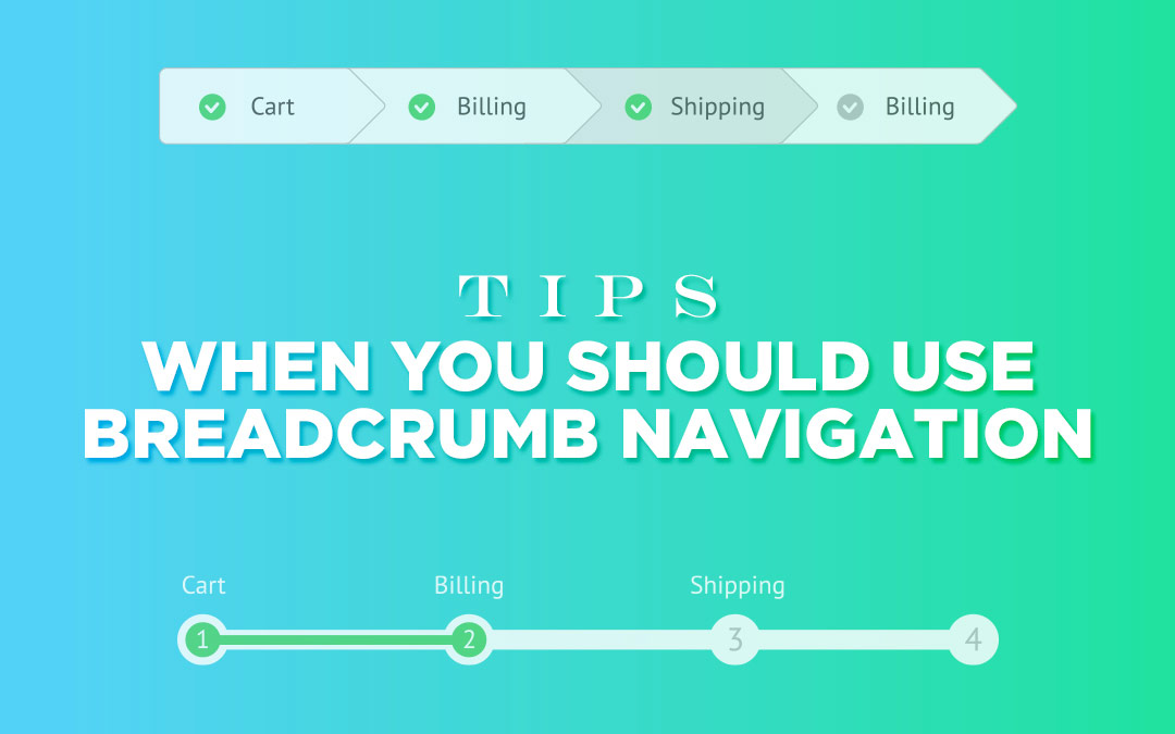
What is the first thing that comes to your mind when you feel lost in an expanse? Um, let me guess- ‘Where am I?’ As soon as you know that, you can deduce your way to the destination. In fact, that is the reason shopping malls have wayfinding maps prompting the ‘you are here’ indicators. Same is the case with digital space too. Users always want a hint of their whereabouts when they lose track in a site’s navigation. By knowing their location they can easily figure where to proceed to. Here, in this situation, a wayfinding map in the form of breadcrumb navigation is definitely of great help. The ‘you are here’ indicator will pave a way for them in the site’s hierarchy.
Breadcrumbs (or breadcrumb trail) is kind of a secondary navigation system that displays the visitor’s location on a site or web app. Interestingly, the term is derived from the famous Hansel and Gretel fairytale where the two main characters form a trail of breadcrumbs so that they can trace their way back home once they get lost in the forest.
Just like the fairytale, breadcrumb navigation is to aid the users to track their way back to the place from where they originally started. They want to know their location in the site’s hierarchical structure to be able to browse to a higher level in the hierarchy.
The mention of breadcrumbs in web design itself means a navigational setup that divulges the location of a user either on a website or application. However, it is seen that in development and design stages, this type of navigation system is often left behind. This is so as some people view it completely unnecessary for a product whereas there are some who consider site breadcrumbs and the relative navigation as an absolute must for the project. Also, there are creators who tend to ignore it altogether as they feel that there is an inverse proportion between the work and the worth involved.
Nevertheless, breadcrumbs stand high in enhancing the overall usability of any website. Being an alternative navigational method, you can easily know your position in a website’s hierarchy. Actually, this is the very point, which when reached reduces the number of steps required to get to a high level.
Breadcrumbs represent the structure of a website so well that the user can not only grasp the hierarchy of the website but even navigate through that hierarchy swiftly. With that much in gains, let us learn about the use of breadcrumbs on site and some of the best ways to display breadcrumb trails in design:-
1. Usability Points
Breadcrumbs have a great visual appeal as they pinpoint towards the location of the user corresponding to the site’s hierarchy. This trait renders breadcrumb navigation as an excellent source of contextual information for users and makes them aware of the entire site hierarchy. It promotes the findability of website portions and pages.
The website, as a whole, can be grasped better when chalked in breadcrumbs rather than when it is made in a menu. Further, the content value increases and you can easily browse through pages to fulfill your needs, thus reducing the overall site bounce rate too.
2. The Level Meter
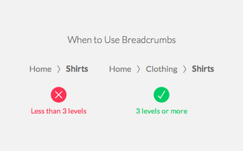
All sites create their content based on a hierarchy. Now, some are superficial whereas some are meaningful based on the type of content. If your hierarchy consists of 3 levels or more, it is ideal to follow breadcrumb navigation. Remember that a site having only 2 levels does not require breadcrumbs. The reason is that as the user moves from the homepage to the next level it is unlikely for him to lose the path.
But if there are 3 levels, there are chances that the users can get lost midway. Users can turn back and forth going from the main to the subs quite a number of times. So, they can get confused as to which is the main page and which is the subcategory. This is where breadcrumb navigation can be of rescue.
3. Homepage - The Start

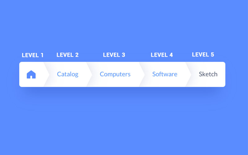
It is the homepage from where the breadcrumbs start. The homepage is always the first level as this is where the users begin their journey. It acts as a reference point to the users as to how elaborate the site is. Showing the home page first gives the user an idea of the hierarchy. Note it is not mandatory to use the word ‘home’ for the homepage link at all times. A home icon or a small site logo will go too. With this trick, you can make the base level prominent and stand it out, just like elevators rely on the star icon and use ‘G’ to pinpoint towards the ground floor of a building.
4. Signal With Arrowheads
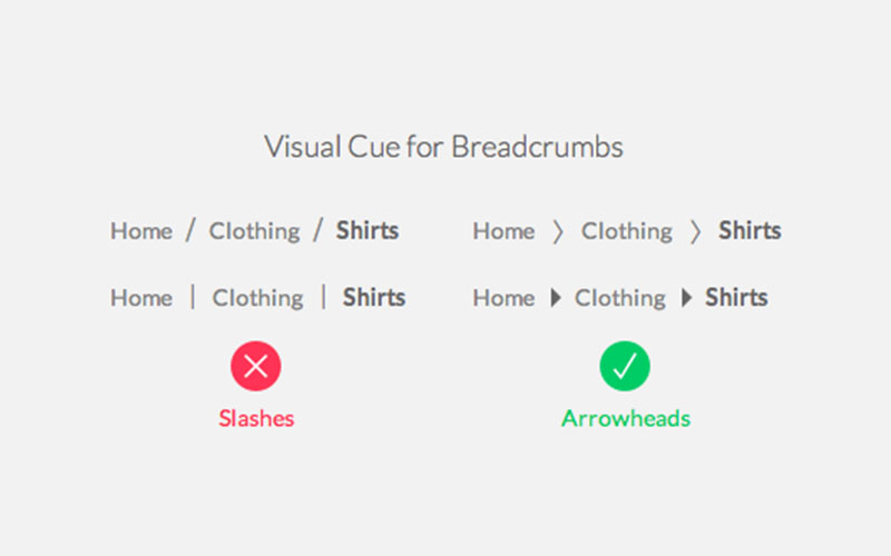
It is better to use arrowheads over slashes as visual hints for breadcrumbs because they indicate direction. It appears more like a trail of pages users are finding their way through. Keep slashes at bay as they operate only as separators.
5. Limit The Actions
When it comes to usability, breadcrumbs are winners as they decrease the number of actions a user needs to perform to reach the higher level. Rather than resorting to the browser’s back button or employing site’s main navigation to return to a higher level, users can function with breadcrumbs.
6. Less Space
The best advantage that we have with this navigation system is that its compact structure doesn’t consume much of the page space as it comprises of only text with links in a horizontal line. The plus point is that they don’t affect in terms of content overload.
7. The Current Page Level
The page that the user is currently on becomes the last breadcrumb level. Make sure to create it as a text label, not as a link. If you form it as a link, there are chances that the users will be puzzled when they click it. They will be on the same page and be confused what changed. Have a text label as a clear indicator as to where the user is.
8. Distinguish the Position
The text label of the current page the user is on should distinguish from the preceding links. This will make the users clear about their position just through the appearance. A good way to do this is to bold the text label and make it bright or unique from the other links.
9. No Problem
Individuals might ignore this little design element, but they will never be misguided with breadcrumb trails or have trouble in their functions.
10. The Right Use
If you want to find whether your site will profit from breadcrumb navigation then a simple way is to create a site map or diagram identical to the site’s navigation structure and then interpret if breadcrumbs would enhance the user’s understanding to navigate in between the pages. When a website runs on a fixed hierarchical structure that is of the same format or a website is divided into different sections that can be further bifurcated into other subsections, this is the ideal case to bring breadcrumbs into play.
Also, when a page is loaded with a hierarchy of pages and when there is no other navigation system to give visual details of the same kind of level, this site is apt for breadcrumb navigation. Another proper use is when a user is connected to a website from any kind of external sources like a search engine or a blog, to make it simple to move across the site.
Additionally, it is advisable to use breadcrumbs when there is loads of content arranged in a fixed linear structure or a hierarchical structure with set categories. A good example is e-commerce site where there are a huge variety of products differentiated into logical categories. If you find that a website suffers from a high bounce rate or increased cart abandonment rate, this is generally due to the confusing main navigation and lack of breadcrumbs.
11. The Types
Breadcrumbs can be of three types- location, path, and attribute.
Location-Based
This type of breadcrumbs gives a picture of a site’s structure. With it, visitors can gauge and navigate your site’s hierarchy that is at multiple levels. Users are given links to the pages that are labeled as ‘level up’ from the page they are on. Location-based breadcrumb navigation is very helpful for users who move to a deeper level of a site from an external source.
Path-Based
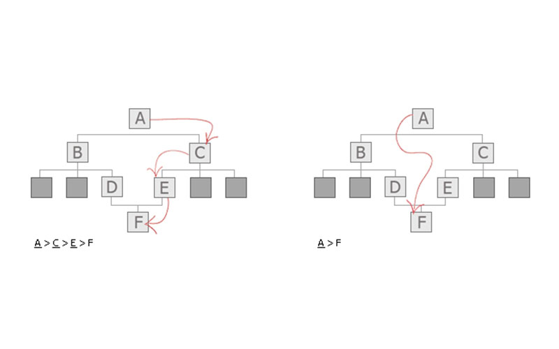
Path-based breadcrumbs often referred as history trail depicts the complete path traveled by the user to make it to the set page. The users can also view the links to the pages that have been used to arrive at the page they are presently on. Sometimes this navigation can be really useful, but most of the time it confuses the users and they tend to browse quite wildly, shifting from one page to the other.
Such vague search is not of much help to the user and can be quickly replaced by a ‘back’ button in the browser. Path-based navigation is the least popular type online owing to it’s similarly to the regular ‘forward’ and ‘back’ functions.
Attribute-Based
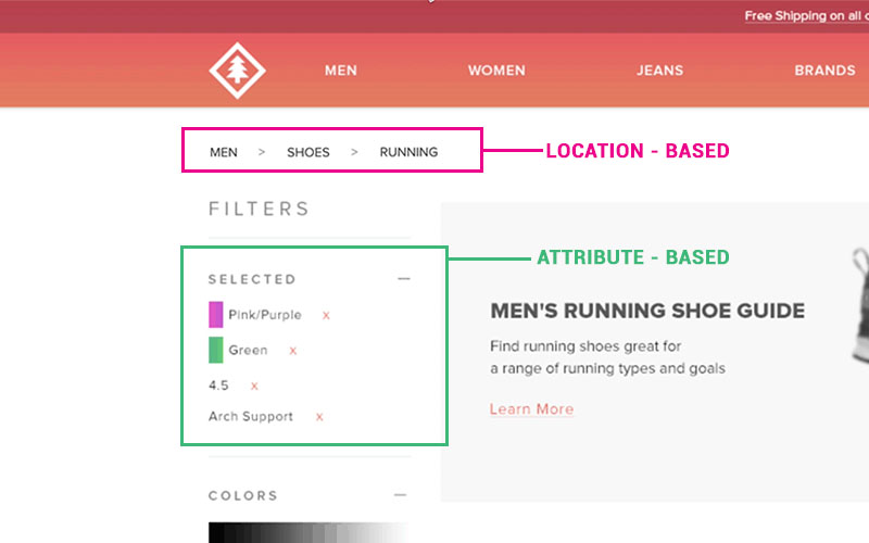
This category lists the types to the particular page or mentions the most used product, as its main use is for the e-commerce websites. It does not follow a single path always. It majorly deals with describing the attributes of one particular site. Attribute-based breadcrumb navigation works well for the visitors who wish to understand the relationship of products and adopt a different approach.
12. Execute in Style
Below are some tips to execute the breadcrumb navigation with perfection:-
Never Replace
Always consider breadcrumb navigation as an added feature and don’t make the mistake of replacing it with the essential primary navigation menus. Remember it is a feature to give comfort; a secondary navigation system; just an alternative to moving around the site with ease.
Link Smart
The last item in the breadcrumb trail is not compulsory to show and even if you want to display it, be careful to not make it clickable. As users are present on the page, it is illogical to add a link to the current page of that to the breadcrumb navigation.
Separators Work

The most accepted symbol for parting links in breadcrumb trail is the greater than sign (>). Generally, the > sign is used to represent hierarchy as in the pattern of Parent category>Child category. Other symbols that work are arrows pointing to the right ( ->), right angle quotation marks (>>) and slashes (/). The choice is governed on the look of the site and the category of breadcrumbs used.
Proper Size
Take special care of the target size and padding at the time of designing. Make sure that there is enough gap between the varied breadcrumb levels else people will find it difficult to utilize them. However, you don’t want the breadcrumbs to rule the page, therefore make them less bold than the primary navigation menu.
Focal Point
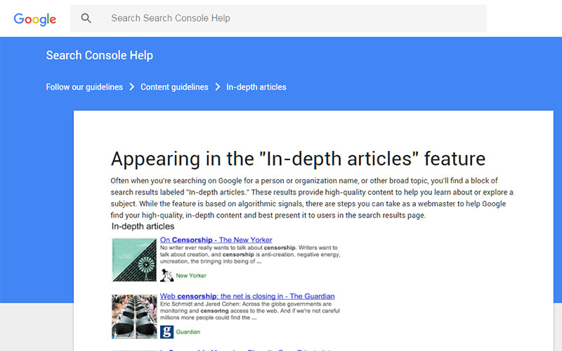
Hinder from using fancy fonts and stark colors as they will defeat the main purpose of employing breadcrumb navigation. A general rule while working on sizing and styling is that the breadcrumb trail should not catch the viewer’s attention at the first glance as soon as they land on the page. Too bold and flashy breadcrumbs might distract the users from the primary navigation and content.
Not for Mobile Site
If you are on a mobile and desire breadcrumbs to find your way across then most probably your designing is amiss. There are chances that your site is too complicated or intricately nested for this very usage and environment that mobile equips with. To handle this problem, think of a way to make it less interwoven so that breadcrumbs are no longer an issue.
End Note
Breadcrumbs grant all the ease and comfort that you want for your site, provided the content and overall structure makes sense. It is one of the small things that embraces usability and ensures user comfort. Remember that breadcrumbs are not a luxury rather a necessity in case your site has 3 or more category of content. Breadcrumb navigation only has merits and nil demerits to it. Users always want to know their position in relation to the rest of the site. This lack of knowledge can get them lost and waste their time and efforts. Just leave a trail of breadcrumbs behind and make it easy for them to reach their destination.
