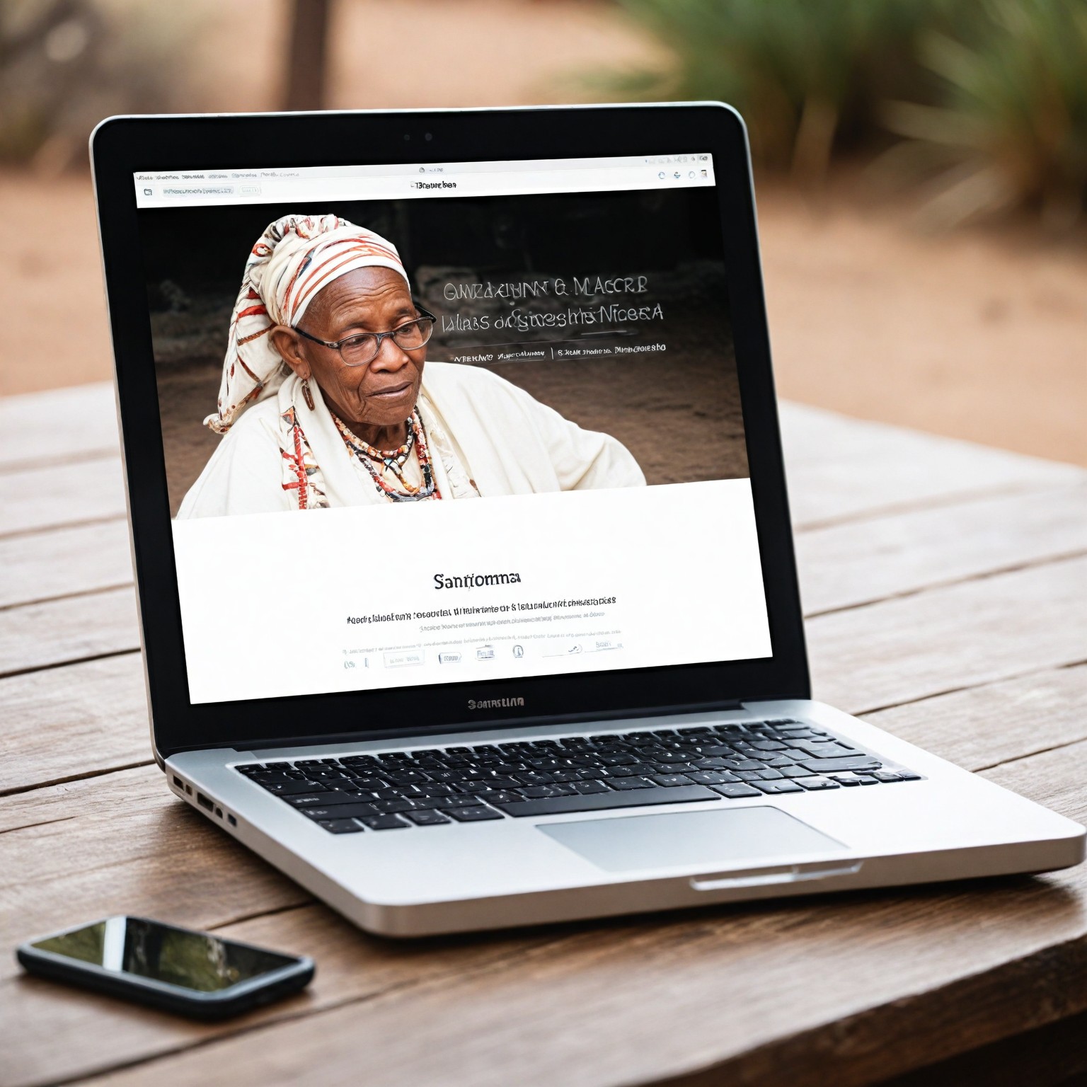
In recent times, a variety of devices by which we can use the Internet, significantly increased. The problems that arose on this occasion, for web developers, also apply to the presentation of content to users countless, countless gadgets on which it is known to have different resolutions and different ways of navigation. Given the technological development, web design or a few dozen versions would be economically unreasonable, especially since we do not know whether for half a year does not appear to like the new tablet under which our site will become unusable.
Why we need Responsive Web Design?
Between January 2009 and July 2012, mobile usage jumped from .06% to nearly 12% and continues to rise exponentially every month. With currently 1 in 10 people visiting you from a mobile device, how can you afford not to make your website visible to these users? This month mobile browsing in South Africa passed desktop browsing as the number one way to access the web. A new report released by the IDC predicts that mobile browsing will surpass desktop browsing globally by 2015. With hundreds of new devices entering the market every year, what is the best way to make your website available to this ever-growing client base?
What is the Problem in Responsive Web Design?
A phenomenon that came to meet the problem turned out to be Responsive Web Design. This fashionable today increasingly phrase appears in industry publications. But what does it mean? It is difficult to translate into Your Native Language accurately. Generally speaking, it is about creating the page in such a way that it was convenient to view both the big screen and on your smartphone or tablet.
What is Responsive Web Design?
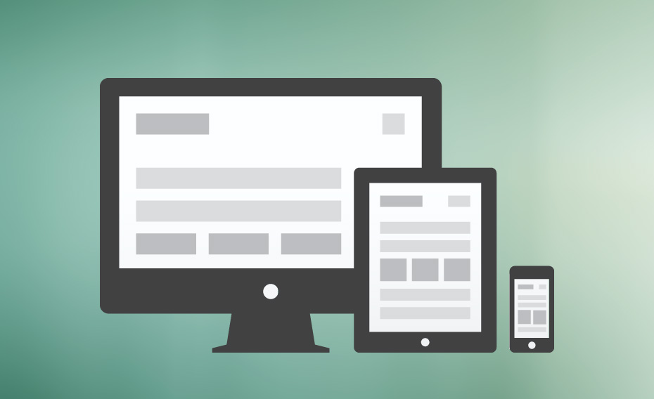
Responsive Webdesign, dubbed RWD, is a new concept of building websites that consists mainly of the fact that web page and, more specifically, all the content and presentation elements will vary with the change of the width of the site. RWD takes into account every screen resolution and the small screens of changing the page layout to vertical. More specifically, a website created according to this idea is sensitive to changes, flexible and scalable.
What are the Benefits of Responsive Web Design?
Pages based on RWD give great comfort. With a well-designed website, navigation is readable; page elements are intuitive and transparent content architecture. Depending on the width of the screen page will look a little different on the big screen will make full use of its capabilities, on average slightly reduce the column, and on the smaller side to convert one-column view. Turn navigation and the easy to hit with your finger, significant links and images will scale to the most optimal width to change the size of fonts. More specifically, show that the illustrations below.
Many experts believe that responsive design in a short time became one of the basic standards of modern, creating websites. RWD is not a perfect work, and finite, but still under discussion, there are new ways, different approaches to the subject, hybrids with other solutions, but worth a look at this carefully. Especially that site owners can see a growing percentage of their traffic from mobile devices. Increasingly, our customers are aware of the need to adjust the page for that purpose; therefore, looking perspective on this phenomenon, soon you may find that the use of the WFD will no longer be a necessity.
Below I attached a Slide, Where beautifully explained Responsive design Slide by Slide :)
Why hire HealXRlabs Studio Agency for Responsive Design?
Responsive Web Design is an approach to web development that makes the website design compatible across devices like smartphones, iPads, and other tablets. It ensures that the website maintains its look across different devices like mobile phones, laptops, or desktops.
Lately, the demand for responsive web design has increased manifold, and we are fully prepared to meet all the needs and expectations of our clients in all areas.
What we offer:
- Current website analysis
- Responsive design implementation
- Compatibility with all browser sizes
- No functionality loss
- Mobile compatibility
- Quick load times
- CMS independence
Get a free web design consultation today!
Our Clients
Our customers love us because we are delivering the Simple, Smart & Best Tech Solutions.
We completely endorse a responsive web design as it allows a great user experience across all kinds of devices with different screen sizes or/and limitations.
Please note that RWD imposed on the designer and graphics, as well as on other team member's additional responsibilities. It requires a lot of attention in the design and planning of changes in the front-end for different width screens, taking into account the many variables that affect the final look of our website. Many times it happens that you should also bring such projects to the customer and explain that the page element can change its size or position. It also means extra work and change existing ways of designing the functionality and appearance of the site. However, once the effort made will make our website will benefit both now and in the future.
We at HealXRlabs Studio are experts in mobile-first responsive web development. Contact us today to work on your next website.
Helpful Resources of Responsive Web Design
Responsive Stimulator - www.responsinator.com
Responsive Web Design Books - [Link]
Responsive Web Design Tutorial - Smashingmagazine.com
