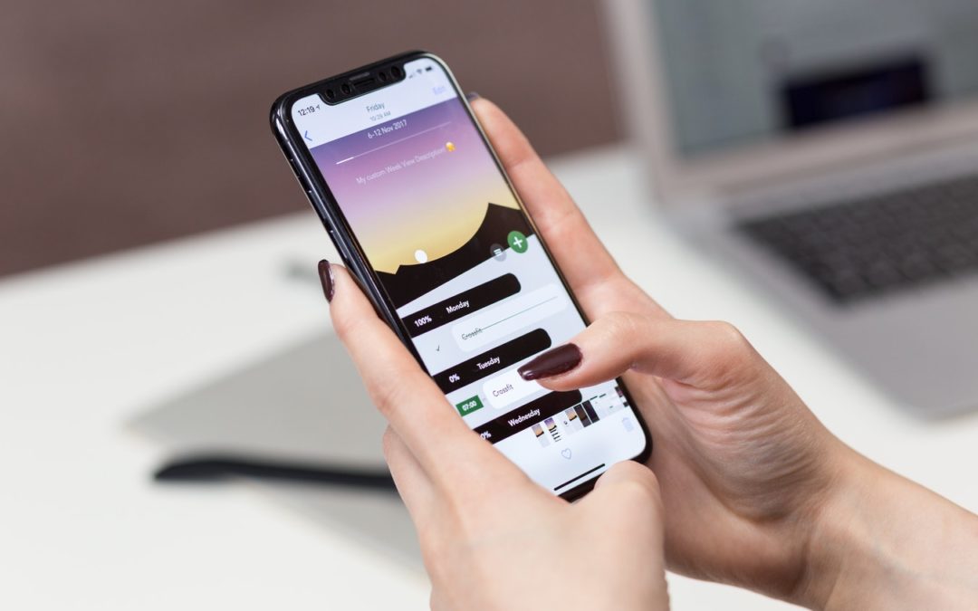
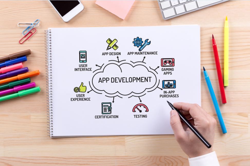
App syndrome: A state when a user just can’t get over an app and want to use it over and over again. Now, is that your case too? Well, that’s not surprising looking at the number of brilliant apps hitting the market. The extraordinary features are bound to swipe you away. Apps have, undoubtedly, created a spark in the mobile world. Coming across a value-driven app is the best a user can ask for these days. But what makes an app great? How can you make the user stick with the app? To understand this, let’s take it from the beginning. Yes, from scratch- the design. A well-framed design sets the platform for effective functionality and usage.
Actually, writing an app is a piece of pie as compared to its design. It is designing where the real work starts. And that truly makes sense given the fact that it is essentially the design that sets the trigger, bewitches the users and makes them stay longer with the application. You win half of the race if you succeed in capturing the users’ attention. When it comes to developing an app, UX and UI are two areas that put the pieces into action. You must do thorough research on your target market before taking your app development project in full force. The user interface design should be super-efficient else you will undermine your app’s credibility.
It is imperative to follow an agile mobile development approach so as to give rise to high engaging user experiences. Here, we have some design tips for you that will help you to form an eye-catchy and feature-rich mobile app:-
1. Pixel Power
Every pixel is a fireball. A good designer gives utmost importance to details and makes it a point that all the pixels come into valuable use. Be it the icon or the homepage, pixels can change the fate of the design. Just because they are small in size it doesn’t mean that they should be ignored. In fact, being small, they require even more attention. To be sure of the effect, mock-ups of desktop icons must be created so that it creates a great impact.
2. Best Of Typography
Fonts have a great influence on the user experience. Choose wisely and try to distinguish the titles, subtitles, and content with different styles and colors. And yes, do not forget to adjust the size accordingly. Even though clients select the font, but it is ultimately the call of the designer to make it look class apart. Give your clients the best of options and amaze them by providing different samples that include different ways of leading and tracking.
Even if the text does not feel appropriate, do not simply run behind the font rather try to manipulate the font. As it is there is less space in the app, so making little changes can go a long way in transforming the look-and-feel of the app.
3. Far From Website
The mobile app UI/UX has its respective methodology which incorporates various mobile elements and gestures. There is a set standard for everything, right from buttons to functions. Now, if you think that making apps is altogether a new phenomenon then you are mistaken as it can easily be made simply by reproducing the functions of iPhone and Android. Users are pretty used to the apps like email, calendar, browsers, etc. So, if you plan to bring in existing features, it will be easy and convenient for the users.
4. Up For Platforms
You must know that iPhone and Android are completely different platforms, not just in looks but also in function. Being acquainted with both the design principles of Android and iOS will improve your marketability and skills by leaps and bounds.
5. Know Your Way
Easy navigation is a must for an app to be awesome. Apple and Google are actually the perfect examples to learn from. Although navigation makes an app look attractive still there should not be any compromise on the functionality and spontaneity whatsoever. Let’s say you are new in the realm of designing. In this case, do not try to experiment much. Follow the pattern of the existing navigation principles. Navigation is something that should not be a miss while trying to be out of the ordinary.
6. Color Catch
One of the major factors in designing an aesthetically pleasing app is color selection. The color scheme should be balanced as well as go contrast so that it makes the app attractive, eye-catchy and interactive to use. Remember not to use many colors especially while designing an icon or theme. Consider usage preferences to finalize your color scheme and contrast options. Also, follow the templates and stencils to improvise your design and make it look grand.
7. Move To Keyboard
In the majority of mobile apps, there are certain screens that require keyboard input. Now, this is something that the designers tend to ignore as they do not consider the screen display after the on-screen keyboard is activated. This feature should be considered at the time of testing and also check the relative on-screen context once the on-screen keyboard is activated.
8. Tab It Right
Tabs make the access easy for the user and hence should be designed in the right manner. Every platform has its own set of tabs. For example, in iOS, primary tab navigation doesn’t anywhere resemble like a tab. They are actually icons placed at the bottom of the window, which the user utilizes to jump to the main topics of the application. The users are well aware of this feature and do not expect to locate it at the top of the window, unlike the Android users.
On the Android platform, tabs are usually kept at the top of the application, which can be further scrolled left and right. The point that I am trying to make is that if your app is governed on the ‘tab’ feature as its main navigation tool to the central topics, then you need to adopt different approaches in iOS and Android.
9. Hand For Buttons
Smartphones have been designed in a way that the bottom half of the screen is easily accessed by the thumb. Right-handed users are more comfortable in reaching towards the bottom-right side of the phone and vice-versa for the lefties. This is an important factor that should be kept in mind for one-handed apps.
10. The Info Look Out
Whenever you ask your user for input, foresee the information the user will require in order to take the call-to-action. If your UI fails to provide the same information in the very place you are asking for it, then there are chances that the user will cancel the request and go back to the information present and then decide the further course of action.
11. Set Image Resolution
With the advent of high-tech smartphones, you can access high resolutions that can make the images look breathtaking. However, if you still have low-resolution images that are compatible with the websites, your app will look scattered and blurry as compared to the native operating system enabled fonts and gradients. Note that your images should be 264 PPI and above if you want a clear and sharp view.
Even though you can find high-resolution tablets as compared to iPad with Retina, still 264 PPI pictures are stark clear by all means on these devices. Also, you can utilize vector-based images that can adjust to any resolution power.
12. Iterating Lessons
Great apps come with great efforts. As a designer, you should iterate the design patterns so that you can reach the target of a perfect interactive app that also stands out in usability. As iterations follow, you will come across new revelations and lessons that can be put into use for future projects.
13. Secure Always
It is seen that 508 compliance and security issues are generally handled at a later stage in mobile app development cycle which ultimately results in prolonged project completion. As a designer, it is necessary that you co-ordinate with the back-end professionals and middleware specialists so as to make certain that the right type of data is processed in an effective manner. Dynamic UI designing leads to a worthwhile user experience that totally satisfies the user. Systematic planning will also enhance an app’s overall productivity.
14. Simple Gets Sweet
The word ‘simple’ is often misinterpreted by the clients as they go for the minimalistic version in design to comply with it. Unfortunately, this is not what simple means. Simple implies ease in usage by the first-time user so that he can open the app without getting hassled in detailed guides. Indirectly, this will enable him to perform various tasks just by following a few steps. For example, if you choose bright and catchy colors for your app’s interface, this will give a beautiful appearance to the app which will persuade the user to download it and also, stick to it for future use.
15. As Real As It Gets
As a UI designer, make it a point to engage real users while testing different UI design concepts and ideas. If you adopt this approach at early stages of development, you will be pretty sorted in terms of including and leaving the specific features. Also, there is no need to re-work on your designs, so you can save on your budget and time.
16. Looks Do The Trick
It is most preferred that a mobile application’s UI is more graphical as against text-heavy design. Be it high interaction or repeated use, a pleasant-looking UI will do wonders for your app. Rich visual display will guide the user as to how to engage more with the application.
17. Be With OS Guidelines
UI designing should be governed on the requisite user guidelines corresponding to the different operating systems. Try to add unique features pertaining to the navigation systems, interactions, and touch gestures. By implementing innovation, you can actually bring out an improved version with the essential features and reject the unnecessary ones. An app is evaluated thoroughly before it takes entry in the prime app stores like Apple Store and Google Play.
As you plan to make your app available in the app store, do check the kind of apps that gain entry in these stores. You must adhere to the guidelines provided by the operating system that is required for designing the UI.
18. Back Button In Control
Android supports the back button function that navigates the user back again and again. However, in case of iOS where the back button is software operated, you must create a back button and place it on the top-left corner of the interface where the user expects it. Abiding by the set back button behavior as per the different operating system is important so that you can meet the user’s expectations successfully.
19. Clean With Placeholders
In the case of a few data input fields, having placeholders in the field is a good idea as it makes the app look crisp and well-defined. On the other hand, if there are many data entry fields then using placeholders instead of field labels can complicate the things for the user. Now, unless the entered information is clear, the user will not know what it refers to.
20. Clear Focus
Jumping onto different things is of no use. Great mobile apps keep their focus intact just on one thing. Try to depict your app in one clear sentence without any additions using ‘and’. The user should be able to use and operate its functions quickly for the very first time itself. In case of any redundancy or confusion in navigation, the customer will quickly change its options and uninstall the app.
Bottom Line
It is the target audience that decides the look-and-feel of the app. By following the requisite guidelines of the operating systems, you can successfully design a UI that is clean and user-centric. If you want your app to be fun as well as functional, then you must create a user interface that is intuitive and interactive. Well, designed apps can truly win the hearts of the customers. In this advanced app development world, you can only reach your potential users if you are adept in making versatile yet simple apps. In other words, if your app is easy to learn and quick to use, success is all yours!


