The life of a designer is a life of fight: fight against the ugliness :- Massimo Vignelli
True, by all means. The thought of going aesthetically low is beyond my imagination. When we talk about the information architecture of a website, it caters to the dynamic duo of context and content, presented in the most appealing way. In fact, talk about enhancing user experience, and aesthetics gives an equal fight to actual usability. Difficult to believe, is it? How can visual design be equally or more significant than usability? Actually, this is not a bolt from the blue.
We humans are highly influenced by the things and people that are visually appealing and beautiful. Indeed, adults and children are more likely to rely on the words of an individual they find good-looking. And same concept applies to the nature of apps and sites; users are immediately convinced with an application that is aesthetically pleasing and strikes them in the first go. So, is it all about eye-catching interfaces? Can ‘attract and win’ always work for humans? Well, today is your day. Let me silence all your doubts and give you a good UX booster. Read on -
All About Attraction
As we explore the importance of aesthetics in UX, first we need to figure the meaning of attraction. What makes something objectively attractive? A question that is simple yet complex. Many philosophers have been trying to dig the answer from many ages. One attempt that Pythagorus made on defining beauty was to symbolize it as a manifestation of harmonious mathematical relations, much like the golden section. Many other mathematician philosophers have also taken their turns in quantifying beauty.
However, there is a difference in their opinion. Voltaire regarded beauty as something that cannot be defined, so, I guess, there goes the statement-beauty is in the eye of the beholder. Empiricists do follow the same meaning, considering beauty similar to pleasure, that is, felt and perceived by the person who sees the beauty and regards it as beautiful.
According to the belief of some scientists, visually attractive things are the healthiest stuff for human beings. That is the reason we become ‘unattractive’ when we are ill. Even nutritious food like berries, which are considered good for our well being, are one of our favorites as we find them visually good. Nevertheless, there are flaws here too, just like beautiful frogs can be poisonous too.
Some, on the other hand, are of the view that it is the social and cultural viewpoint that gives rise to beauty. Think of the fact that in US, majority of the children grow up watching Disney films, which makes them believe that they live in a world where witches and evildoers are hideous and dreadful to look at whereas heroes and heroines are very attractive and stunning.
Okay, this is just the beginning. The beliefs have been further reinforced by the media where certain fashion items, hair and even body images are suppose to be in vogue, which, unfortunately, will be deemed as outdated ten years down the lane. As cultural attitudes evolve with time, there will always be a different way of defining beauty.
Summing it all in the UX terminology, there can be particular interactions and site elements that may seem visually pleasing to us as they take the usability ratio high. They are an instant puller because of the ease they bring along. Albeit, these web trends and visual elements, which are gathering all the limelight will surely be distasteful in the design domain in the coming months or years. For instance, we all agree, once comic sans was the ultimate font of choice and no site was complete without flash splash pages. But, as of now, they have become a thing of the past.
Visual Flight In UX
Okay, now we know that there is no such thing as ‘perfect beauty’ or ‘absolute aesthetic’. Let us further understand the influence of visual design in UX. Yes, here it accounts more than looks. According to usability.gov, visual design tactfully synthesizes images, colors, fonts and other elements that results in higher level of interactions and better engagement of the user with interface. Do keep in mind that there is a vast difference between visual design and interaction design.
Interaction design centers on the functionality that is required to fulfill a task. Visual design, on the other hand, involves the consumer by gathering attention on the correct functionality, leveling tasks on the page as per its size, color and white-space. It even helps to create a relationship with the brand through visual signage and hints.
What if we combine graphic design and user interface design? Can that result in visual design? Yes, to some extent. Considering the fact that these fields are constantly changing, we are not wrong in regarding graphic design as the design of static or still images and visuals. UX design includes both interaction design and user interface design, thereby giving importance to communication. Visual design is placed in the centre, taking in still images and visuals, with the focus of enhancing communication and usability.
Visual design has a huge impact on the notions that the users form on looking at the website. Chances are that the users might look forward to great stuff as a result of the attractive screens they encounter initially. They automatically start expecting high functionality, better usability and more personal touch from the product and performing a usability testing on your product can be good idea.
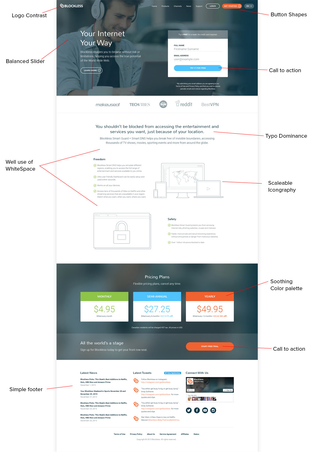
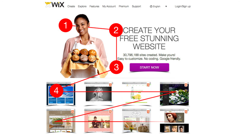
Unfolding the depths of visual design, now comes the point of correlation with UX. Luke Wroblewski, Product Director at Google, spent numerous years researching on this subject. In 2008, he presented a topic ‘Communicating with Visual Hierarchy’ that stated the link between visual design with UX. He elaborated on the importance of visual hierarchy explaining that placing different items on different areas of the screen for attention makes us-
- Communicate messages
- Highlight actions
- Categorize content
Further, he revealed various tips and suggestions for designers as to where and how they place the information for display. He stressed that an aesthetic visual hierarchy has high usability.
Cut to 2015, even 7 years later, role of visual design in user experience is taken for granted. People argue that the design of UI obviously affects the user experience. There is no research required to prove it. This not rocket science. We are humans. Looks conquer us, of course. We, definitely, judge a book by its cover. But there are examples where exception proves the rule.
For instance, Microsoft has been doing exceptionally well even with its lousy products, take into view- Outlook, where even ‘almost the same’ interface has considerably high market share. So, what happened here? Did the people like the looks of Microsoft, as in; is the interface beautiful in their eyes? Or did the visual design create the appeal by not making it a mere table stake?
People also hold the belief that visual design does its bit in affecting the opinion of the user though it may not help the user in attaining their goals. There are few areas in user experience where visual design plays a major influence. Certainly, good/bad design touches upon the UX, but how? That is what is to be figured.
A visually pleasant web product creates the same impression as a well dressed person does in an interview. However ugly might the website be, users are glad if they have a great experience using it. But even if there is one hitch, they have the tendency to change their options quickly. On the other hand, if the website is attractive and beautifully designed, users rely on it more and revisit it to get the best in store.
The Approach For UX Designers
As UX designers balance is what is required. There are two ways to go about. Never put visual design alone on the stake so as to keep a bad experience at bay. Don’t think that going visually overboard can save you from the affects of a website that is faulty in its features or functionality or that is crappy in its construction. Next, never keep visual design totally aside.
It is that factor that will make you stand out from your competitor and make one application distinct from another. So, are you designers all geared? Here are some tips to keep you on track-
1. Be Reliable
A user can only rely on a product if it is consistent and not too unusual. Too much playing with the visuals and elements can ruin the website and turn it upside down. Users generally follow their instincts while choosing a site, and if they are not clear with the functionality that is what will deem it unattractive for them.
2. Consider Both- Concepts and Prototypes
People usually term their online experience as ‘viewing’ rather than ‘interacting’, although it is the latter that is what it should be known. Visuals are considered effective in evoking response and branding if done strongly can change our outlook towards interactions.
3. Let Trends Not Bother
LBD (yes, our very own little black dress) has always been that evergreen and classic pick in fashion for the last 100 years. It is simple yet graceful. Same goes the case with a clear, sharp, model design that will have a forever appeal to it and will flourish like anything. For example, some features of flat design will always be present in a layout, but the overall look will be more like the ‘latest-in’ design that makes the app appear current.
What Matters
Usability generally hogs all the limelight and what fades behind is visual design. Aesthetics play a major role in improving the functional elements. Visual design can actually amplify the usability by creating well-designed experiences through well-designed products. After all, beauty can alter how we think and behave. For people, it is the entirety that matters before they look onto the individual parts.
More than the button or the form, they follow their first aesthetic impression. And beautiful pages undoubtedly create good impressions. Remember, usability alone is not the complete formula. You got to tap in your creative ability as a designer. Yes, keep visualizing like a NINJA!

