Every user has a goal in mind. And one of the most popular interaction they perform to achieve it is via a form. Yes, forms are indeed the final step of the user journey towards completion of goals. Actually, forms are a pathway to an end. They must be wired properly in design so that the users can complete them speedily, without any hassle in input fields. Whenever a visitor tries to get in touch with you, he will resort to using a form or some sort of input field like a text box. So, in order to make the user experience amazing, designers should pay extra attention to input fields and build them creatively to cast a lasting impression on users. In this article, we will talk about input fields as a component of forms and how we can make them innovative :-
1. The Constituents
Generally, a form comprises of the following five parts:
- Structure
It consists of assigning fields, deciding the look on the page and creating rational link between several fields. - Input Fields
Input fields can have text fields, check boxes, password fields, radio buttons, sliders and other fields devised for user input. - Field Labels
They inform the visitors what the relative input fields mean. - Action Buttons
When user clicks on the button, the action takes place like submission of the data. - Feedback
User can interpret the outcome of the input through feedback. Typically, apps or sites depend on messages as a way of delivering feedback. Messages inform the user about the result, either positive through successful filing of the form or negative like if the fields entered are incorrect or any other such case.
Forms also include the following parts:
- Assistance
It is a type of help that guides how to fill the form. - Validation
Automatic check that confirms whether the data user has entered is correct or not.
2. Input Fields
Input fields are what you permit your users to type in your form. Based on what information is required, there are several types of fields such as text fields, dropdowns, check boxes, password fields, datepickers, radio buttons and many more.
3. Amount Of Fields
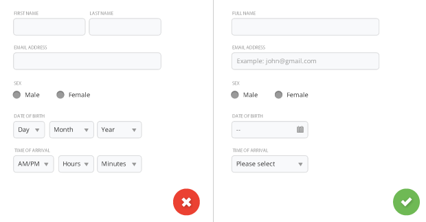
Note: try to reduce the number of fields up to a minimum number possible. This will make your form more equipped, less burdened, especially when you put the users to a task of providing lot of information. But don’t go overboard here; no one is in favor of a 3 field form that diversifies into a 30 field question queue.
4. Compulsory Vs. Optional

Stay away from optional fields in forms. But if you are compelled to use them then you must clearly specify as to which input fields can’t be left unfilled by the user. The rule is to use an asterisk (*) or ‘optional’ word, which is workable for long forms with several mandatory fields.
5. Having Default Values
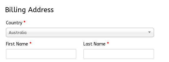
Don’t rely completely on static default unless you think that a majority of your user population will go for that value, especially if it is a mandatory field. The reason? Chances are you will make errors as people tend to go through forms quickly online and they don’t have the time and effort to crystallize through all the choices. It is likely that they may straightaway leave something that exists with a value. That said, smart defaults do make the users’ form filling quicker and more correct.
For instance, you can pre-select the user’s country as per their geo location information. But remember to use them with care as users have the tendency to leave the pre-selected fields with their existing data.
6. Keyboard-friendly Option For Mobile App

Users must be comfortable to trigger and change every field through the keyboard. Power users, who are hardcore keyboard lovers, should be suited to smoothly tab through the fields and make the necessary changes, that too without removing their fingers from the keyboard.
7. Autofocus For Mobile App
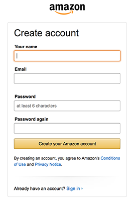
Auto-focusing a field provides the user hint and a starting point to immediately begin filling the form. You must give a lucid visual notification that informs regarding the shift in focus through features like change in color, flash in an arrow, fade in a box or others. Example, Amazon registration form includes both the auto-focus and visual notification features for the user.
8. Keyboard For Text Inputs In Mobile
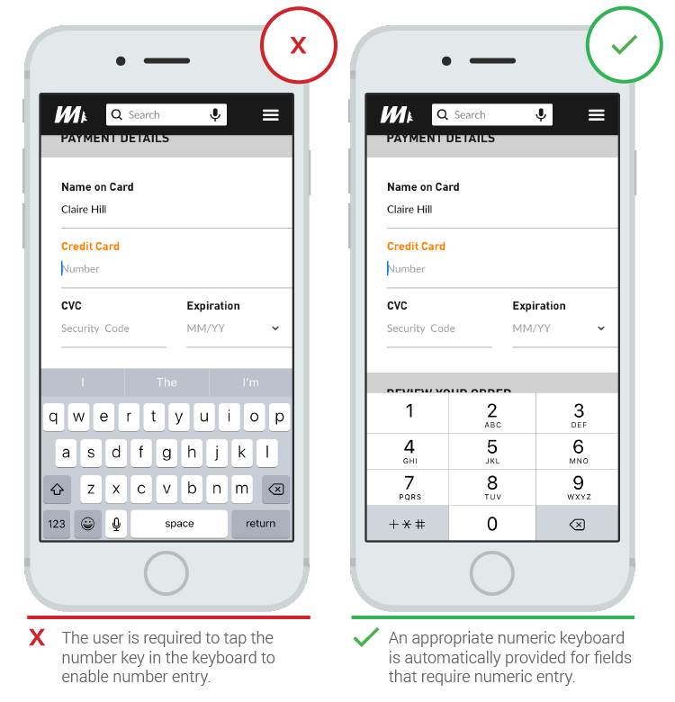
App users love apps that make an appropriate keyboard available for text filling. Be sure that this is executed consistently throughout the app instead of particular tasks and not leaving any of them.
9. Modern Form Design

Rather than using 6 fields for interaction with the user, a clear yet minimal form interface can display one text input at a time without disrupting the flow and causing any chaos. Slight visual cues like tiny progress bar and a figure that marks the number of input fields to be completed are of great help. However, one limitation is that it isn’t possible to go back to the last entry.
10. The Natural language

Imagine how convenient it will be to use a sentence where some words function as dropdown selector and text inputs so that data can be collected easily from your users.
11. Fullscreen Form

A fullscreen form is worth the experiment as it gives the visitors a continuity and distraction-free environment in form filling.
12. Email Sign Up Forms

Have dynamic email subscription form animations that make form filling experience delightful with all the creative strokes in design.
13. Login/Sign Up Form

Visitors can be encouraged to ask for quick access by integrating social media accounts during signup.
14. Credit Card Sign Up Form

In a typical credit card form design there is a visual display of the card to process the users’ input from the 16 digit code, expiry date and CVV code.
15. Single Field Credit Card Form

This is a minimal type form that will permit your user to submit the credit card number and other significant card related info that too from the single field.
16. Payment Form

17. Payment Card Design

Summary
Users tend to doubt when it comes to filling forms. Thus, try making the process as simple and coherent as possible. Small changes like group related fields and prompt of suitable information for each field can contribute towards form usability. Usability testing will help you get fruitful results in form design. You can be innovative in your input fields, but remember not to cross the line of usability. Hope the above article has given you great insights in designing forms for super user experience.


