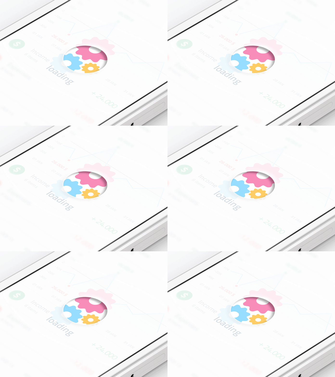
One thing that users hate immensely is waiting. If you test their patience by making them wait for too long, then get ready to lose them, as users are quick to abandon sites and spent their time on better places. Although there are technical techniques to fire up the speed of your site but some apps leave users with no choice except to wait. However, it is possible to make the user’s sense of time quicker by making them realize that your app loads faster as compared to others. When an app starts loading, visitors can view a progress bar on the screen as a visual hint of when the app will wind up loading.
Now, you must understand that the way your progress bar loads and animates creates an impression in the minds of user. It is this progress bar that frames their perception. The aim is to reduce user tension as much as possible by providing feedback to the user about what is going on and that too within reasonable amount of time. The users should not be left guessing about the happenings of the app. And this is where the progress indicator rightly bridges the gap between the user and the system. In this post, we shall explore various types of progress indicators and their right use :-
1. The Key To Feedback
Oh yes, we all love instant app responses. But there are times when your app won’t be able to meet the set working for speed. Slow loading time and latency issues tend to delay the performance of the app. In such cases, the users must be assured that the app is actually working as per their request and that the progress is happening towards result. A good interaction design is the one that provides feedback about- current status (what all is happening?), outcomes (what just happened?) and future status (what will happen next?).
A progress indicator is regarded efficient if it provides some type of instant feedback to the users. It is good to notify the users that the app requires more time to undergo user action and even tell the approx. amount of time it will take to do so. The users’ wait time commences the moment they tap the screen thereby initiating the action. Ideally, the system should immediately give some visual feedback to inform that it has received the request. The positives of this are :-
- It removes all the doubts in the minds of users and makes them certain that the app is working.
- Give them a valid reason to wait and lower their perception of time by giving them something to look during the tedious task of waiting. This diverts the users and they pay less attention to the wait they are made to do. It is advisable to use a progress indicator for any task that takes more than one second. For anything less than one second, using an animation can backfire and irritate the user.
2. The Types
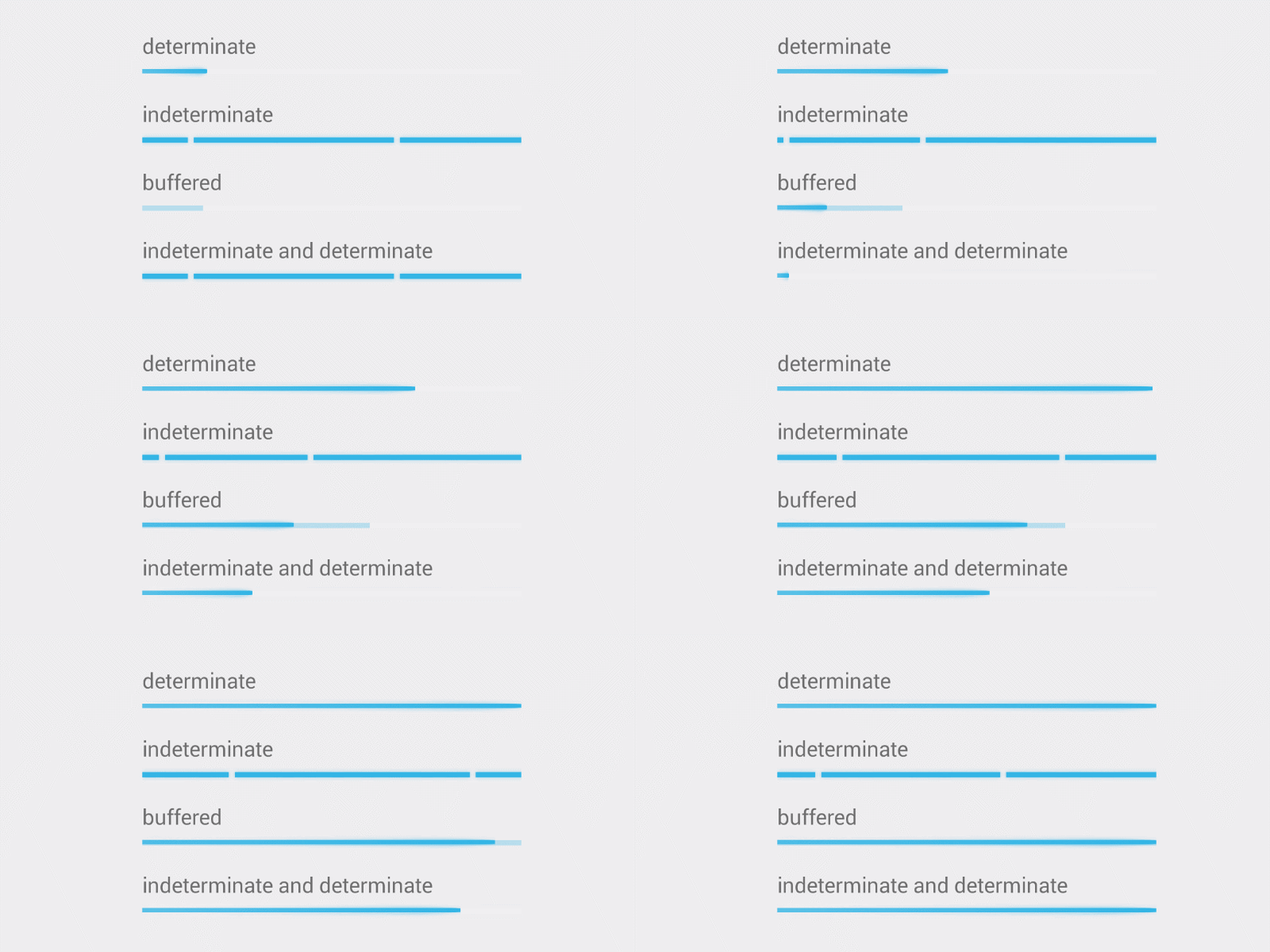
The progress indicators are of two types - 1) determinate 2) indeterminate
- In case of determinate indicators, they tell how long an operation will take to complete when the
percentage is visible.

- When the indicators request the user to wait while something is being finished and not tell how long
it will take for completion, such indicators are indeterminate.

- Further, there are even combinations of these two types of indicators that work together.
3. Looped Animation

Another way to ensure the users that the system is working is through animated graphic kept on loop that surely gives them feedback but not sufficient information as to how long they have to wait for the action to complete. The rule of thumb is that use looped animation only for fast actions, that is, between 2 to 10 seconds. Boring the user while making them stare at spinning wheel for a longer duration can lead to high bounce rates. Also, by adding more clarity for the user through text that tells why the user is kept waiting, example- ‘loading comments’ can give more patience to the user.
Remember default loading icons gives a false meaning to the actions. They as it is fulfill various functions like operating system tasks, telling the status of everything from device boot to troubles in network connection or data loading. This is the reason people hate seeing a loading spinner with no indication of progress of time as they lose track of time for the particular action. Remember, spinning gears is risky for data that is loaded from a server as connectivity quality is not in the hands of developer. In this case, data takes up to 15 seconds to load in bad circumstances as against 2 seconds of normal loading time.
4. Aligning Looped Animation

Going a step ahead, you can also align looped animation with existing controls, particularly buttons. In Android platform, a circular loader can be integrated with a floating action button. This is done to ensure that the submission is complete not just the progress. It is displayed with the help of completion of the circle.
5. System/Custom Looped Animation
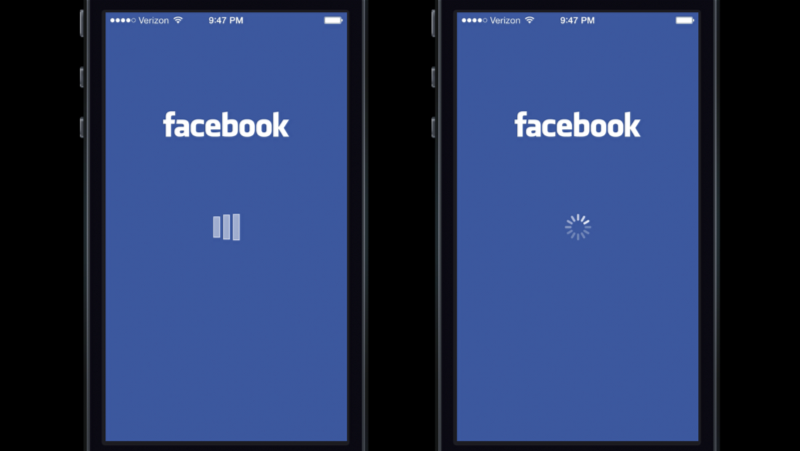
Facebook app grants an exciting experience with looped animation. In Facebook loading indicator, when the users were shown a custom loading animation in Facebook iOS app, they held the app responsible for the delay. But when they were presented iOS system spinner, they considered the system responsible for delay.
6. Linear Animation
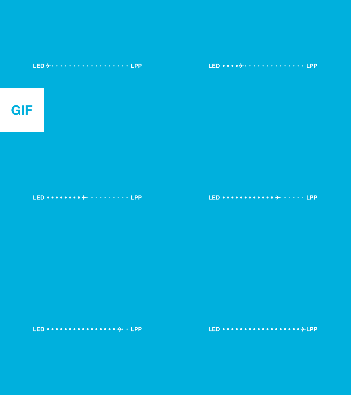
A determinate linear progress indicator should comply with percentages and always fill from 0% to 100% and not reduce in value. For multiple operations in line, utilize the indicator to show the progress as a whole and not of separate operation.
7. Percent-Done Animation
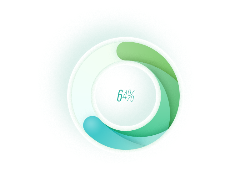
Prolonged waits seem to stretch longer than finite waits. Percent-done progress indicators are the most useful type of wait-animation feedback. They highlight the current status, how much has been achieved and how much is left. A percent-done indicator clearly explains the user the speed at which the action is being processed. The rule of thumb is to use percent-done animation for tasks that take 10 seconds or more to complete. It is always good to give a general time estimate to the users. For this you don’t have to be accurate; a simple statement like ‘this will take a minute’ is sufficient to keep the users waiting contently.
A percent-done indicator can be used for the actions that take less than 10 seconds where there are the loading of a series of documents or registries as here the system works with a set number of records. Include text explanation in this case like ‘updating address 3 of 50’. For actions that consume time, give the users the option to stop the action in case they are getting impatient while waiting. If you forget to do so, your design will hijack the control of the system and the users will have no power to work according to their needs.
This type of animation builds an expectation for the user as to how fast the action is being performed. In return, changes in speed can be witnessed which influences user satisfaction; however, if the progress gets stuck on the last percentage here, the user will become irritated and there will be no use of showing progress as a whole.
8. Progressive Animation
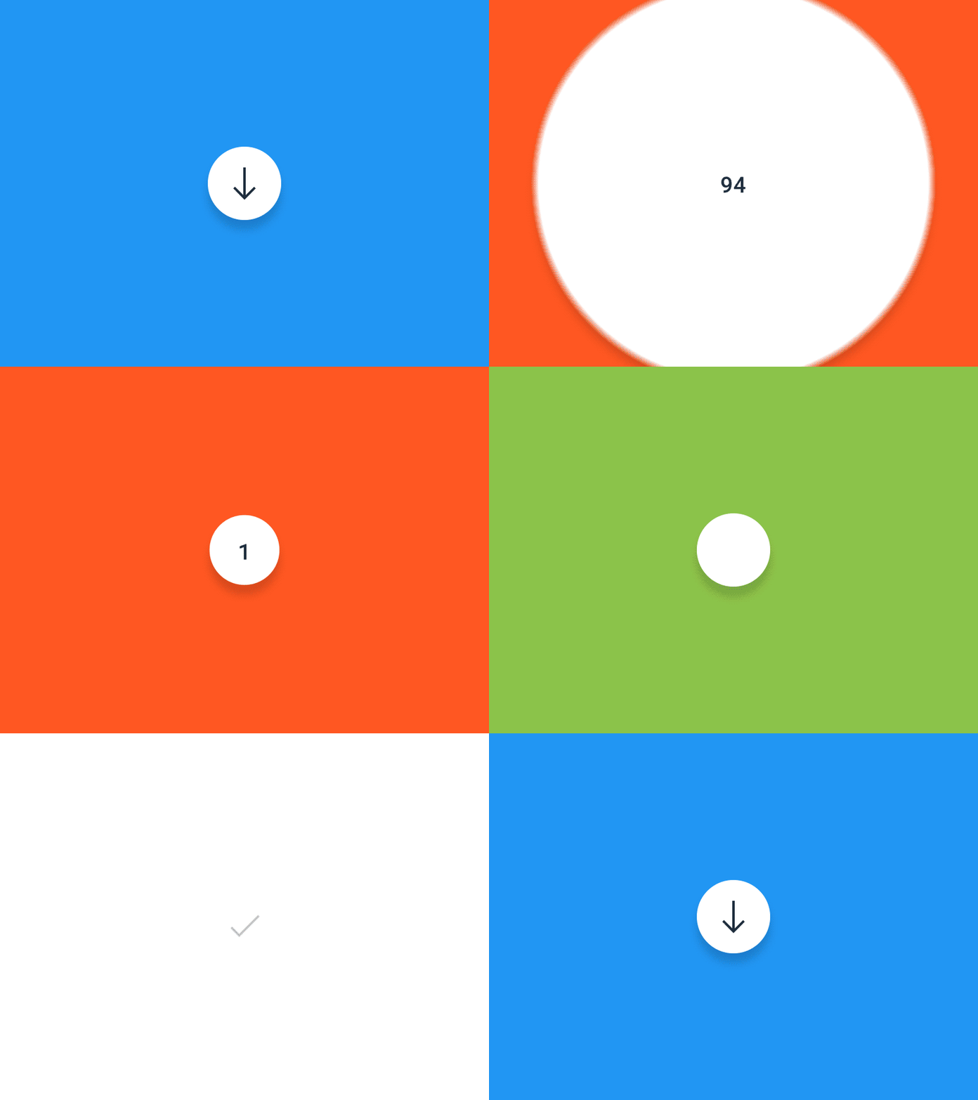
Progress bars represent how long an action is taking to complete, but usually, they are not always correct. You can hide small delays in your progress bar by beginning the progressive animation slower and then making it move faster as it reaches the end. Note that the progress bar must not stop as it will misguide the users that the app has frozen.
9. Steps On Display
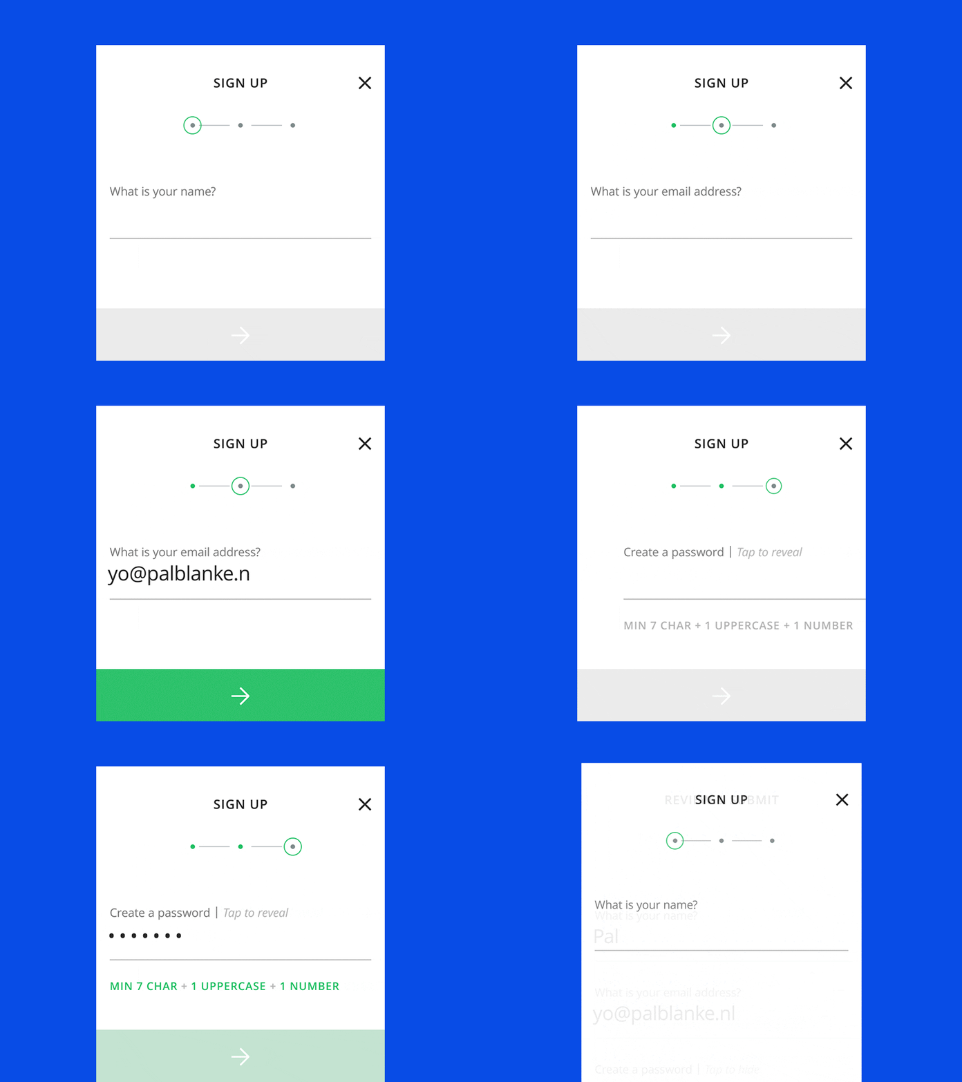
Rather than displaying a percentage number, prefer showing the various steps involved. Users might not be able to judge how long each step goes, but getting an idea of the number of steps aids them in forming an estimate in their mind. The steps can follow a classic method for description or can be high on creativity, whatever suits the app.
10. Skeleton Screens

Waiting can ruin user experience badly. But it is always possible to make the wait more convincing and pleasant if you aren’t able to quicken the action. And talking about wait-time, it is just the right time for skeleton screens which are also known as temporary information containers. In other words, skeleton screen makes you focus on progress more instead of wait times.
It is the blank form of a page where information is gradually filled in. Such action creates an impression that things are happening speedily as information is slowly and steadily shown on the screen. The medium tricks the user by displaying a simple wireframe such as a placeholder at the time when the actual content loads. This screen brings the entire focus on content being loaded not the progress towards loading.
11. Avoid Static Progress Indicators
Static progress indicators are the ones that don’t have any moving image and contain text like ‘loading...’ or ‘please wait…’ to inform that the request has been accepted. As even some feedback is better than not having any, static indicators don’t provide sufficient information on what is going on with action and thus, it must be rightly replaced with some useful type of indicator. If as such the system hangs or fails to perform, there is no way that the users can know that they are required to restart the action.
12. Leave Click-Again Warnings
The biggest faux pas in design is when the sites warn the users not to click twice by threatening them like ‘clicking again may create an extra order’. This is not at all user friendly as you are not supposed to threaten the user in any case. Also, the cause is lost here as the users are seldom interested in reading such long word counts.
13. Handle Boredom
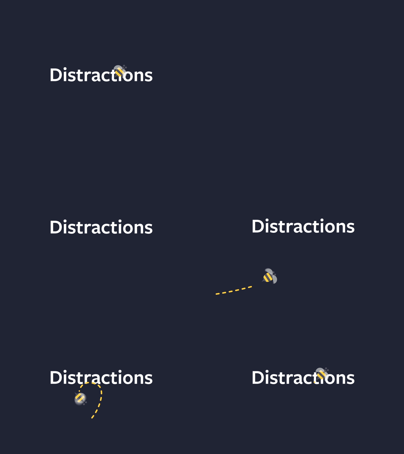
Take care that the users are not bored while waiting for an action to happen in your app. Offer them some distraction that keeps their mind off the wait-time. Try to make it fun, entertaining, something that they haven’t expected and entices them to wait patiently by immediately catching the users’ attention till the app completes the loading. You can go for fine animations to distract your visitors and make them take long loading times casually.
Takeaway
Progress bars are the best way to smooth out the waiting process for the users. Providing them feedback will give them infinite patience (to some extent) and will grant a positive user experience. Feedback can tackle uncertainty well and make the users more willing to wait. Good progress indicators will prompt the users to finish the task successfully and even create a more positive impression of your website or application.
