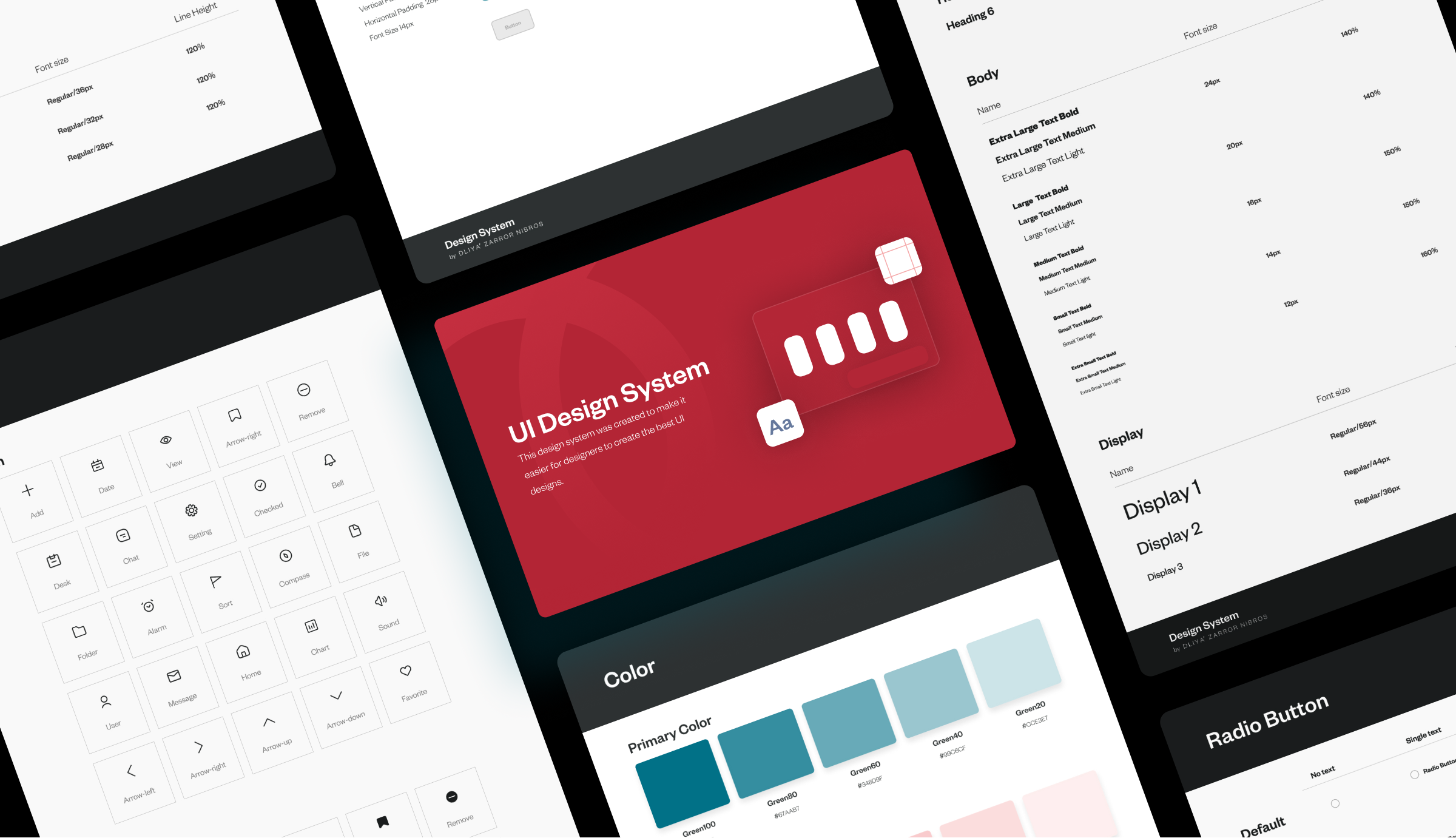
A design system encompasses a collection of standards, reusable components, and patterns that are employed to establish visual consistency across various projects and pages. Figma, on the other hand, is both a vector graphics editor and a prototyping tool.
I covered the following topics in this Design system tutorial:
- Introduction to Design System.
- What is the purpose of developing a design system?
- Difference between a brand style guide and a design system.
- What to include in a design system?
Imagine if you could begin your design projects more quickly and cut down on the amount of time needed. A Design System can be especially helpful in this situation.
Now, you may be wondering what a Design System is.
Introduction to Design System
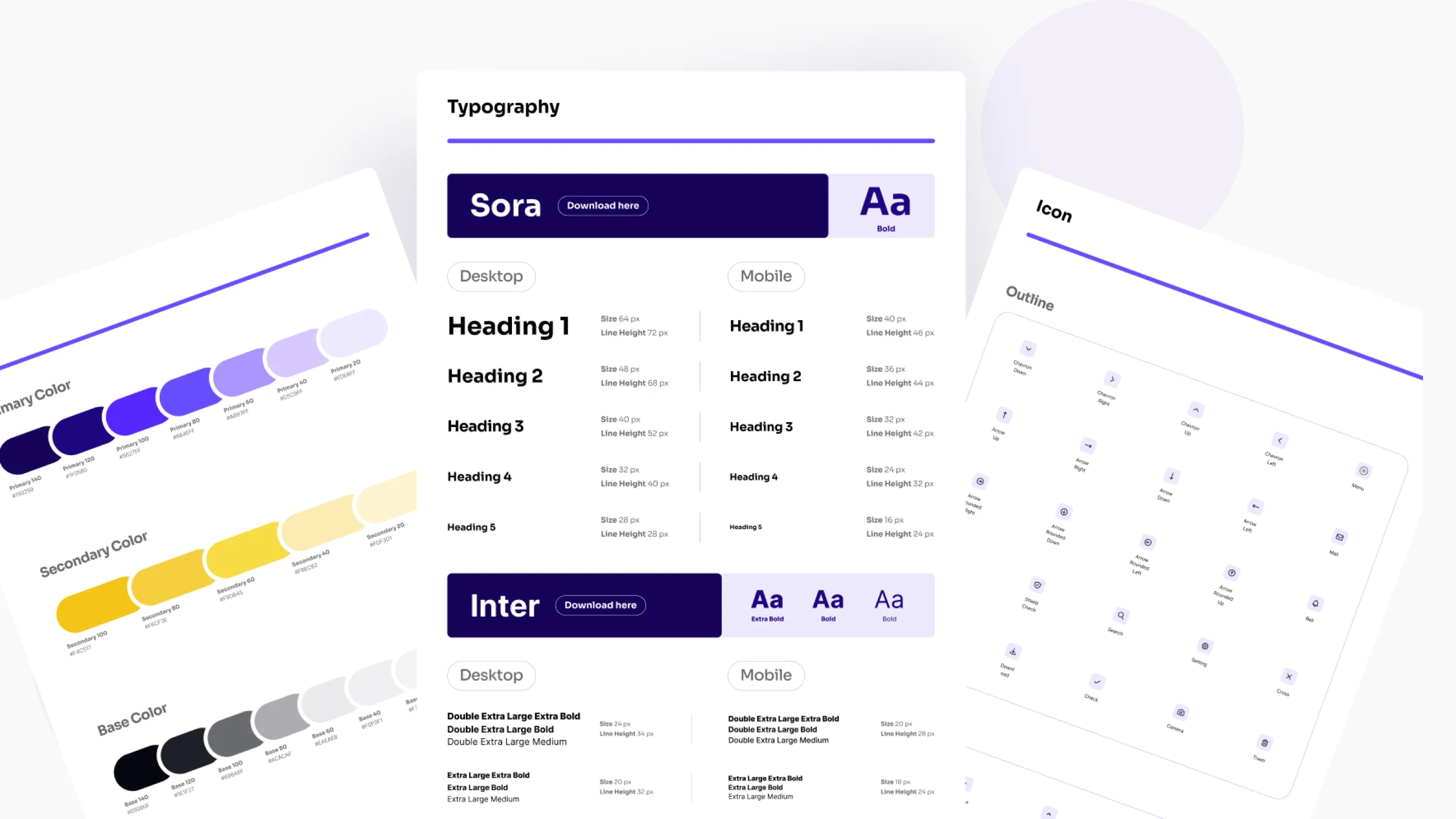
A design system is made up of guidelines, reusable components, and patterns that ensure visually pleasing consistency between multiple projects and pages.
It functions as a core resource that designers should use for creating user interfaces that are consistent and integrated across many projects and teams.
What is the purpose of creating a design system?
Building a design system with Figma has several advantages and meets certain requirements for designers and design teams.
Here are some justifications for why creating a design system in Figma is essential:
- Consistency: A design system creates a set of visual and interaction patterns, elements, and rules that provide consistency between various components of an application or product.
- Efficiency: Instead of making something fresh for every new UI element, designers and developers may use a library of pre-made and pre-tested components.
- Scalability: In order to keep the UI manageable and coherent as the project's complexity increases, it provides an organized resource where new elements, styles, and patterns may be contributed.
- Reusability: A design system enables designers and developers to take advantage of existing assets across different projects or within the same project by creating reusable components.
- Branding and identity: A design system often includes brand standards and guidelines, ensuring that the UI remains in line with the organization's overall branding and identity.
- Accessibility: Teams can handle accessibility concerns from the very beginning of the UI development process by including accessibility principles in the design system.
Overall, creating a design system before making a user interface (UI) helps lay the groundwork for a process that is well-structured, constant, and efficient as well.
Top 4 Design systems
1. Material 3.0
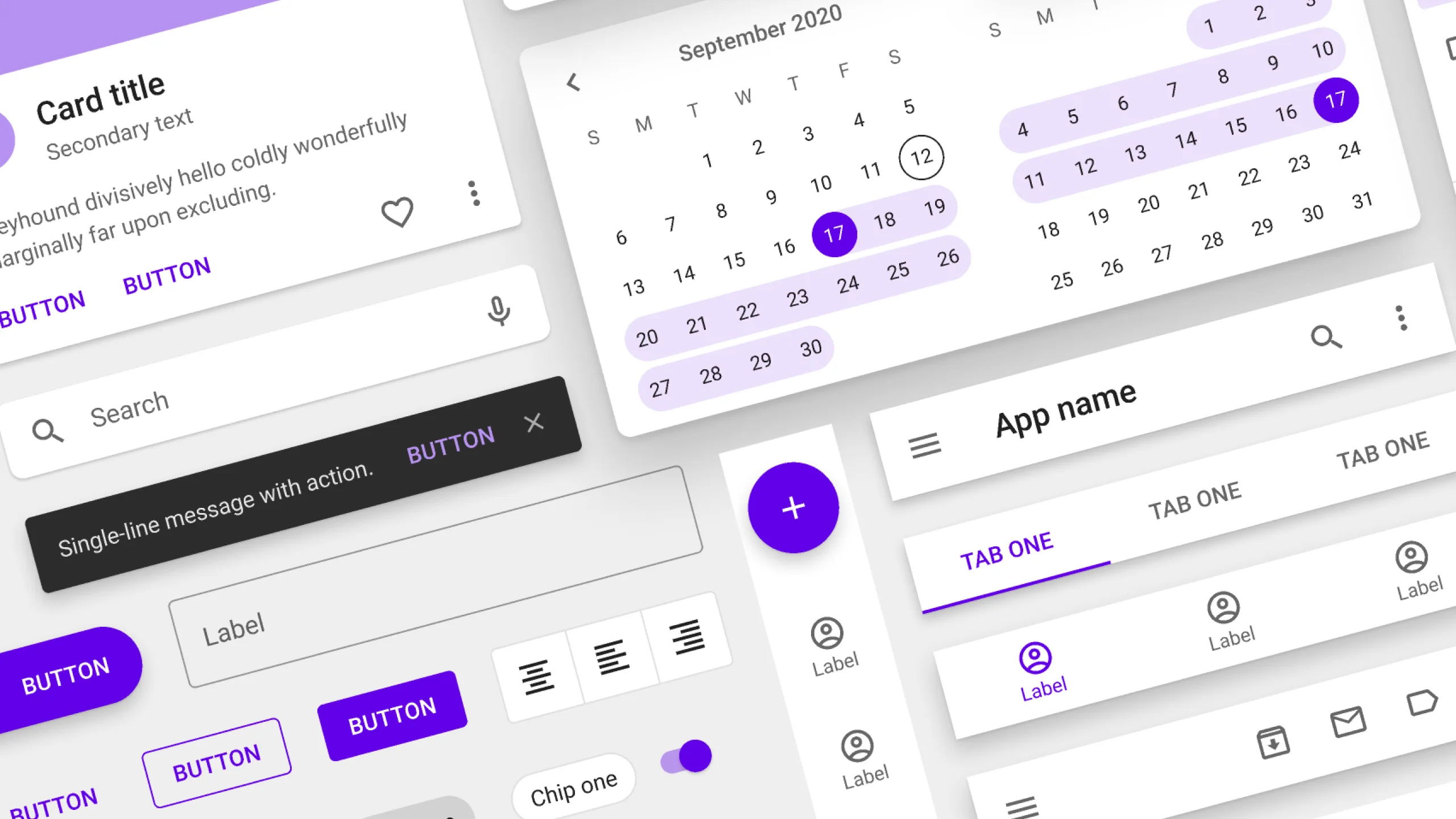
Material Design is an adaptable system of guidelines, components, and tools that support the best practices of user interface design. Backed by open-source code, Material Design streamlines collaboration between designers and developers and helps teams quickly build beautiful products.
2. Fluent 2.0
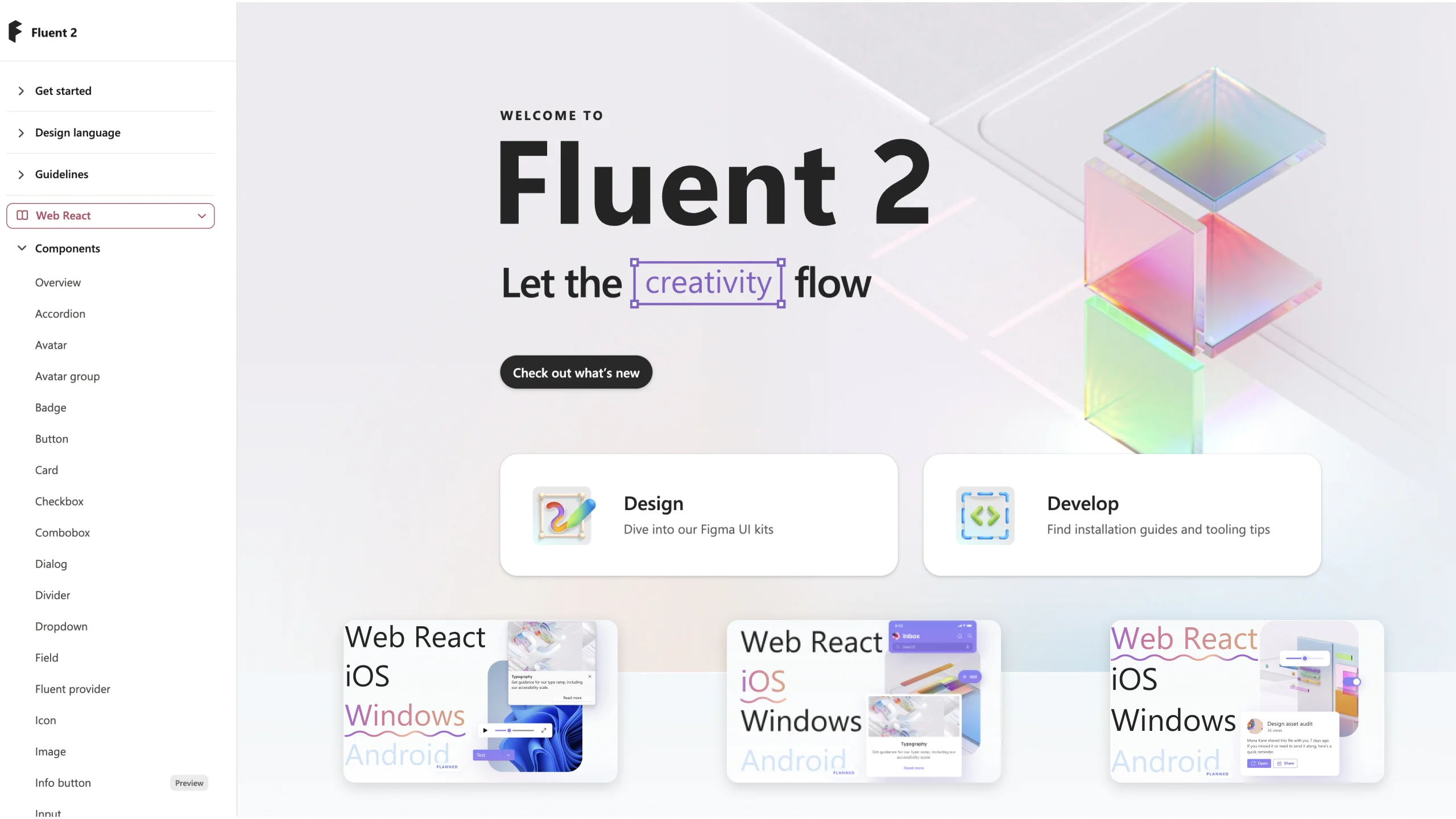
Explore the next evolution of Microsoft’s design system Fluent, enabling more seamless collaboration and creativity than ever. Move fluidly from design to development, between apps, and across platforms.
3. Carbon
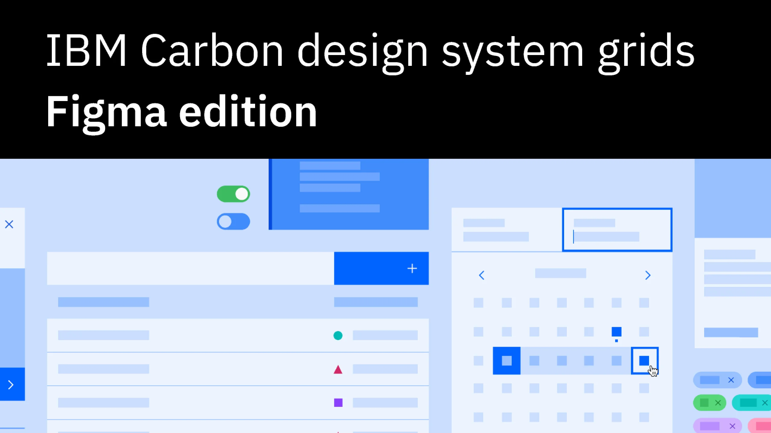
Carbon is IBM’s open-source design system for products and digital experiences. With the IBM Design Language as its foundation, the system consists of working code, design tools and resources, human interface guidelines, and a vibrant community of contributors.
4. Packt
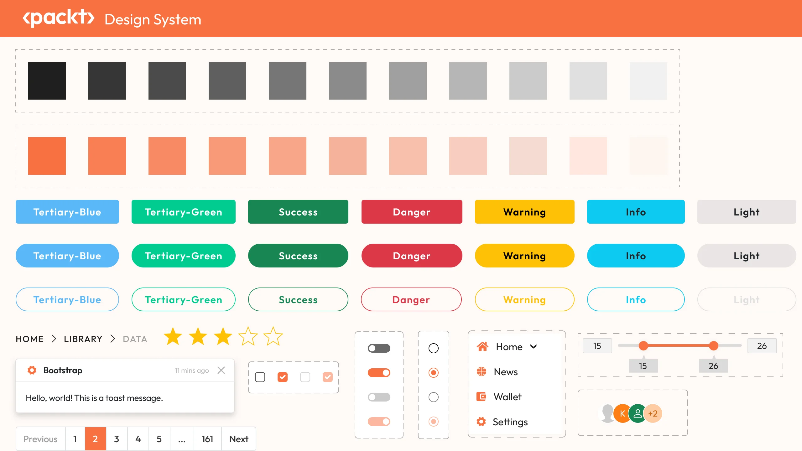
Packt Packt Publishing, also known as Packt, is a UK-based publishing company specializing in technology-related books and online learning resources. It’s known for its extensive catalog of books and e-books covering a wide range of topics such as programming, web development, data science, artificial intelligence, cybersecurity, and more.
I’ve created it design system with over 40+ different components and their variants around 4000+.
Difference between a brand style guide and a design system
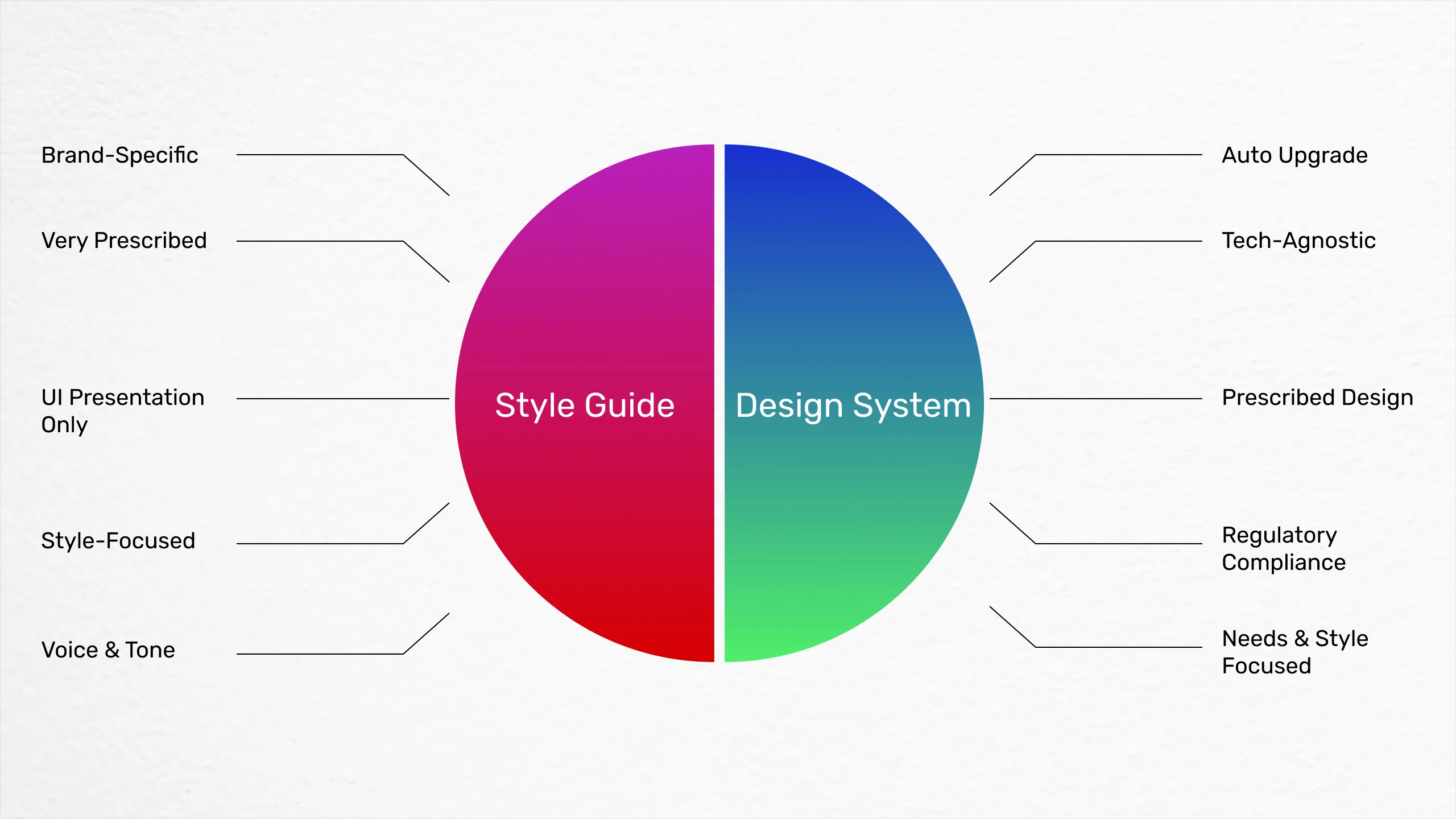
Although a design system and a brand style guide have similarities, they serve different roles during the design process. Here is an overview of how they differ:
What is Brand Style Guide?
A brand style guide can be thought of as a simplified version of an extensive design system. It saves important information and frequently used assets, like logos and their variations, fonts, colors, images, typography, and other elements.
It also defines rules for their correct application, ensuring obvious and constant alignment across your whole team.
Some important assists of the Brand style guide are:
- Logo
- Colors
- Typography
- Iconography
- Images
- Usage Guidelines
- Voice and tone
A style guide is an artifact of the design process. A design system is a living, funded product with a roadmap & backlog, serving an ecosystem.
-- Nathan Curtis
What is a Design System?
A design system goes beyond the scope of a brand style guide by documenting not only all the assets you have utilized in the past but also any other elements that can be standardized for future reuse.
Some key features of the Design system are:
- Button style
- Text style
- Layout
- UX Pattern
Book a call with us and get the party started!
LET’S WORK TOGETHER
Need help developing a similar project?
What to Include in the Design System
Here’s the list of elements you should include in your design system:
Color palette
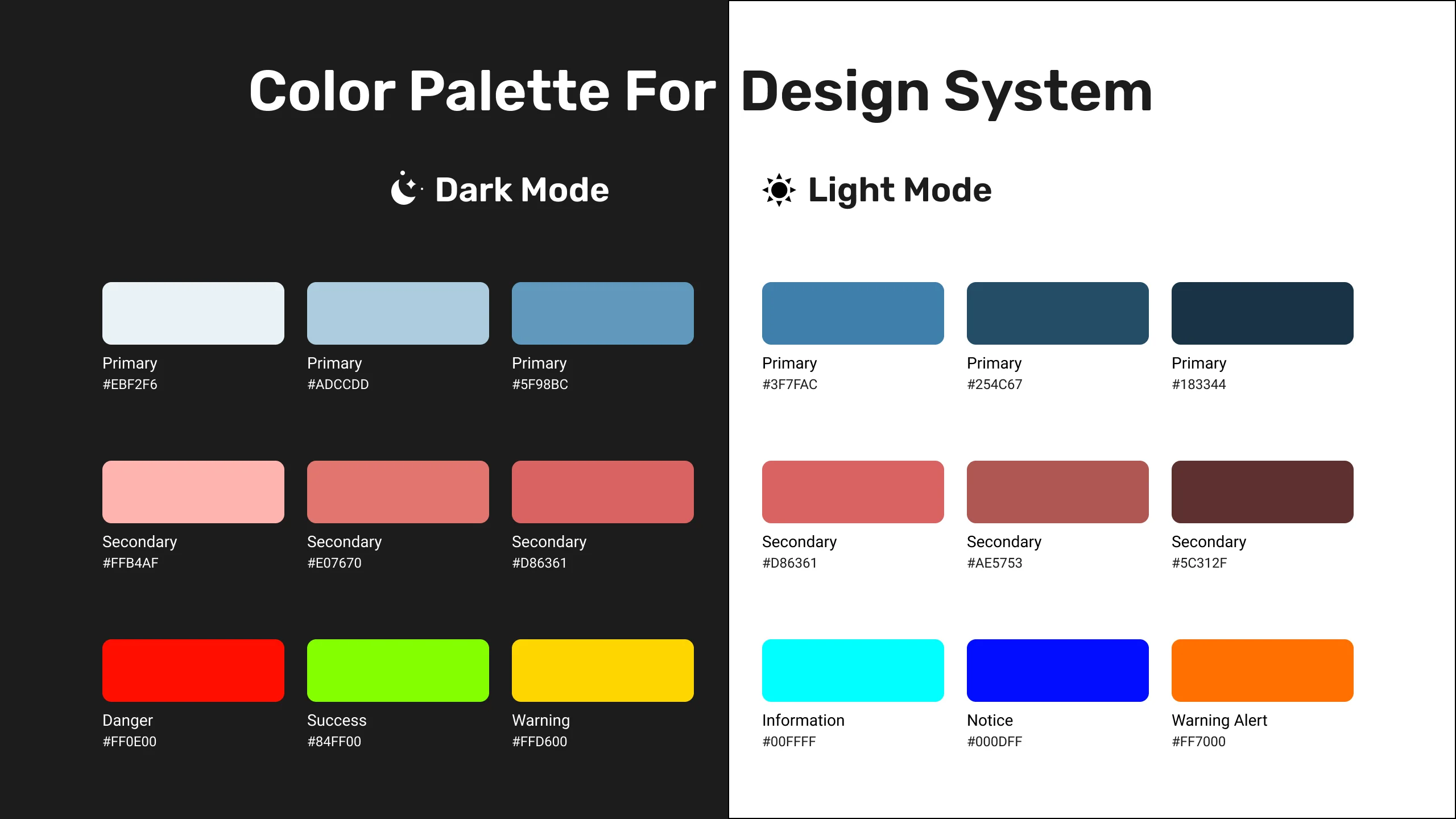
Begin with your Colour Palette as the very first step when creating your Design System in Figma. When possible, make an effort to maintain a limited palette of Base Colours, which often consists of Primary, Secondary, and Tertiary shades.
I suggest using a useful tool that can be found at the following website: Adobe Color to speed up the entire process of making tints and shades. The process of creating Tints & Shades will be much accelerated by this tool.
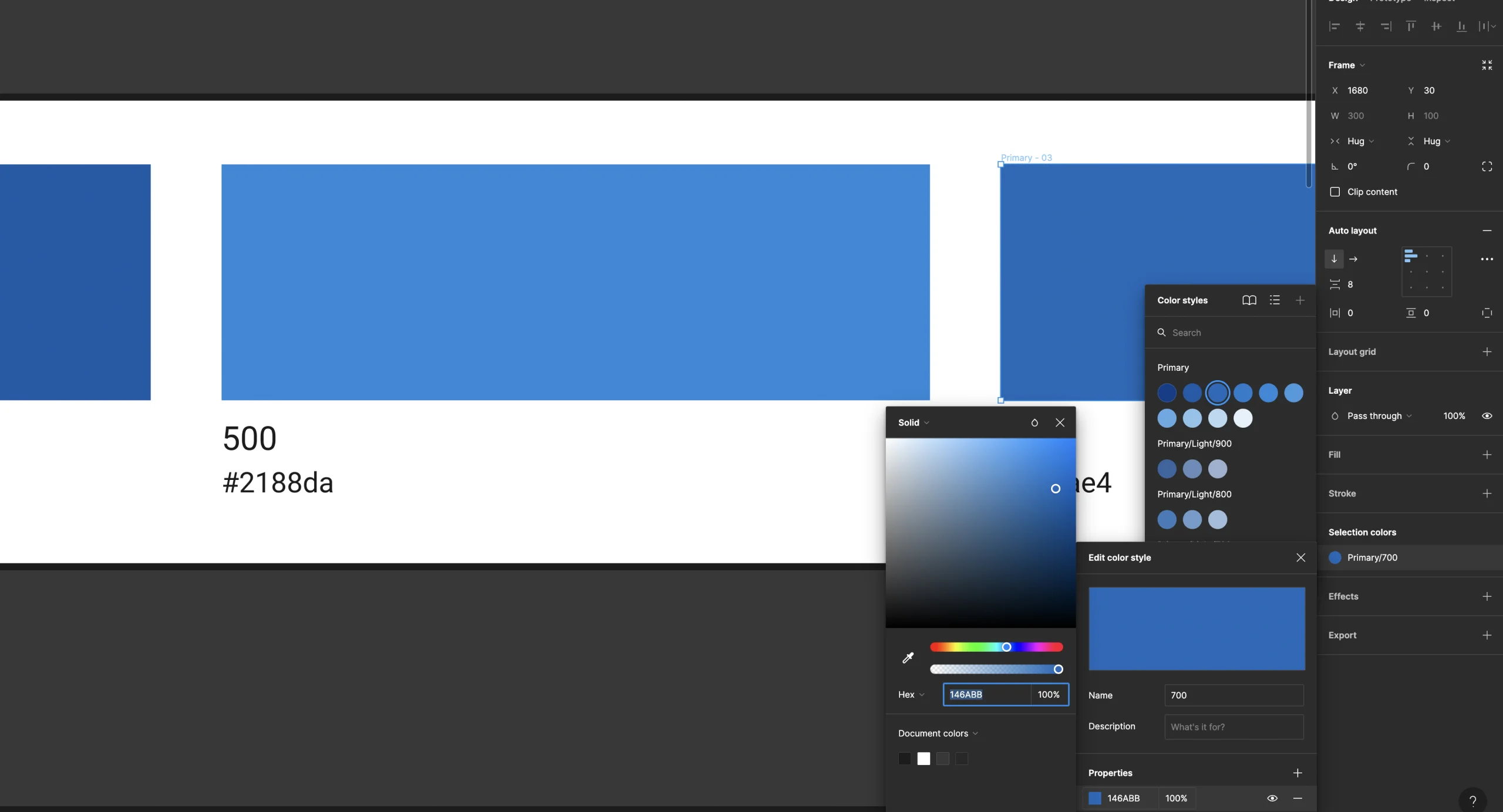
Additionally, it's important to use standard Base Colours like Red (Error), Green (Success), and Yellow (Warning) for a variety of components like notifications, badges, and input field borders. By providing visual cues for error messages, successful actions, and warning indicators, these colors will improve user experience.
Typography
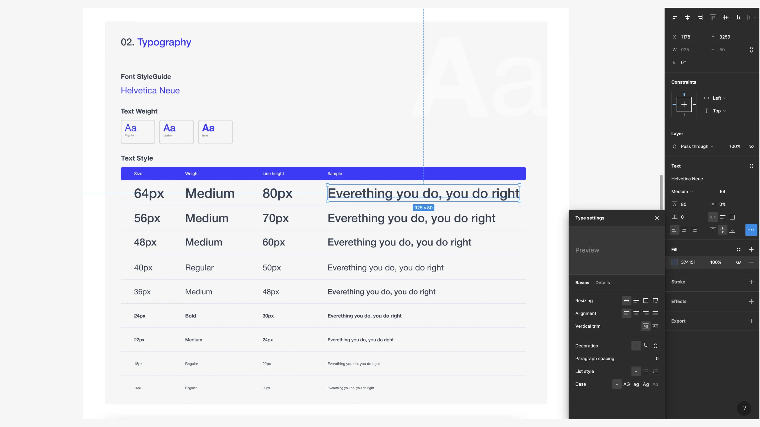
Make sure you have a wide range of typographic alternatives for both desktop and mobile usage.
However, if at all possible, I suggest sticking to the two font family rules while creating your own system.
I made the decision to look for new fonts taking into consideration the following requirements:
- Brand Description
- Readability
- Flexibility (various weights)
- Free for commercial usage
Step 1: Pick a Scale
To size the typefaces and specify spacing, pick a 4-based scale.
Step 2: Setup Typography Style
Decide which typography trends will be used in your design system. This often comprises body text, headings, and other text components. The font family, font size, line height, letter spacing, and any additional styles like bold, italic, or underline should all be specified.
The popular line height calculator tool I use is GRT (Golden Ratio Calculator).
Step 3: Create Text Style
Go to the "Text" area of the design panel in Figma by clicking it. In order to add a new text style, click the "+" icon. Give the style a name, such as "Heading 1," and list the needed parameters, including the font family and size. For each typeface style in your system, repeat this method.
Step 4: Apply Typography Style
You can apply the text styles to the appropriate text elements in your design once you've defined them. Choose the desired text style from the "Text" area of the design panel, then choose the text layer you wish to format. This ensures consistency throughout your design by quickly applying the desired typeface style to the selected text.
Iconography
![]()
Choose a small but interesting icon set for your first build.
Step 1: Icon Set Determination
Choose the categories of icons you want to use in your design system. Choose the groups or themes that fit your design approach and the specific needs of your project.
Step 2: Design Icons
To create your icons, use the vector editing tools in Figma. You have the option to import already present vector files or design icons from scratch. Make sure your icons match the overall aesthetic and style of your design system, are legible, and have a unified visual style.
Step 3: Create Component
Use Figma to turn your individual icons into components. From the context menu, select "Create Component" after selecting an icon and right-clicking. You can easily organize and reuse your icons as a result.
Step 4: Define Variants
You can build variants inside the component if your icons have a number of states or variations, such as filled, outlined, or colored. To swap between various icon versions without changing the primary component, use the "Swap Instance" capability.
Buttons
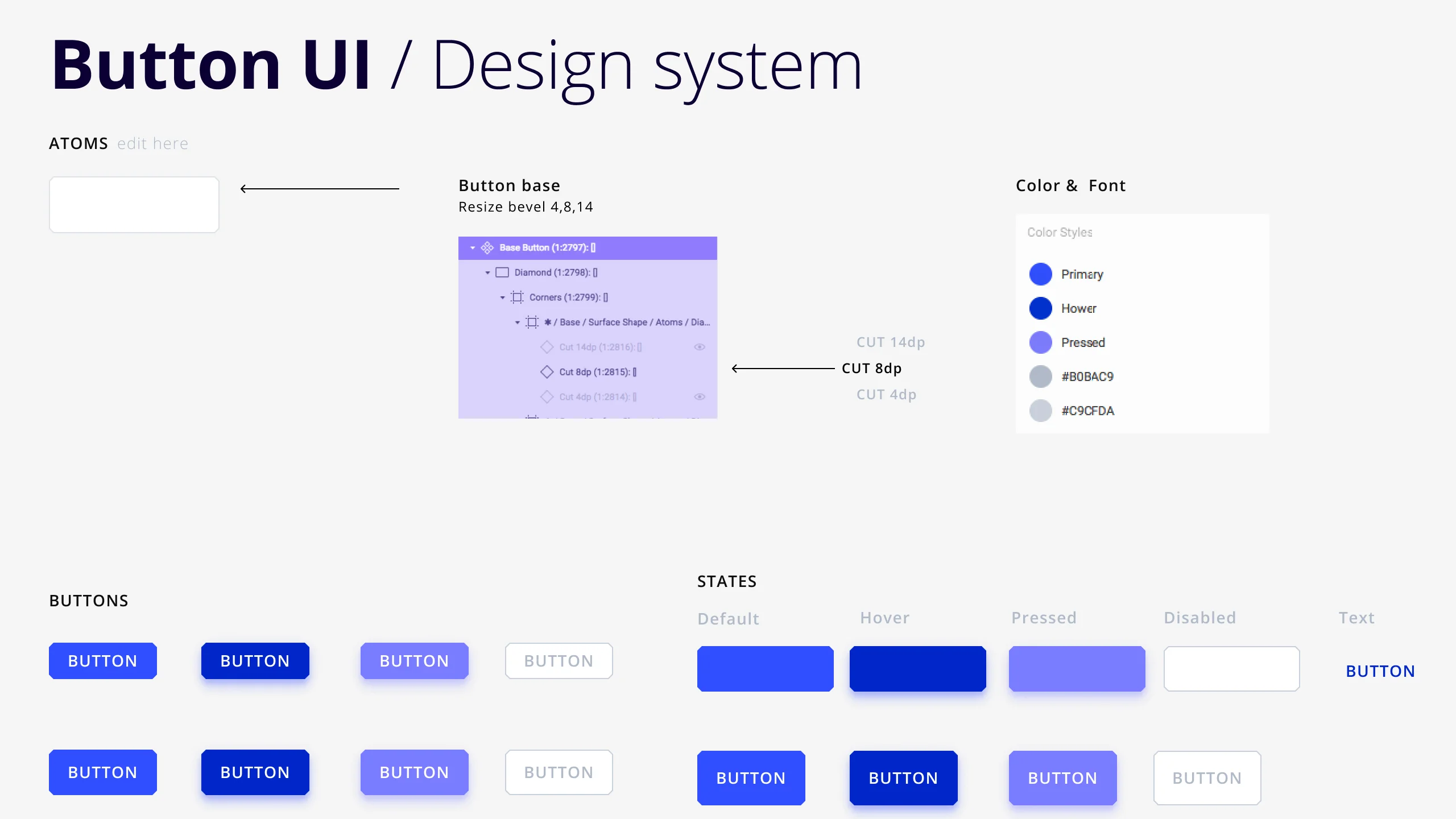
Buttons are the most important component to consider when designing a user interface since they guide users to what they need. The button will draw attention more quickly if it is bold and has a high-contrast background.
Step 1: Button Types
Determine the various button types that you need for your design system. This could include the primary, secondary, ghost, outline, or any other variations relevant to your project in the form of buttons.
Step 2: Create a Button Layout
Use the "Rectangle" tool from the left sidebar to draw a rectangle or the shortcut key "R" to quickly do so. After choosing both the text and the rectangle, add your CTA text on top of it and use the auto layout property.
Step 3: Make Adjustments
Using the options provided in the properties panel, you can alter the text's font, size, and color. Add padding, corner radius, and alignments quickly.
Step 4: Create Components and Variants
Right-click > Create Component or press Command-Option-K to turn your button into a component. A four-diamond icon appears and the selection box's color will change.
You can duplicate the button component and change its parameters to create different iterations of your button states such as primary, secondary, or disabled states.
You can add different properties for different states and name them appropriately.
For e.g,
- Button / Primary / Extra Large / Default
- Button / Primary / Extra Large / Left Icon
- Button / Primary / Extra Large / Right Icon
Selection
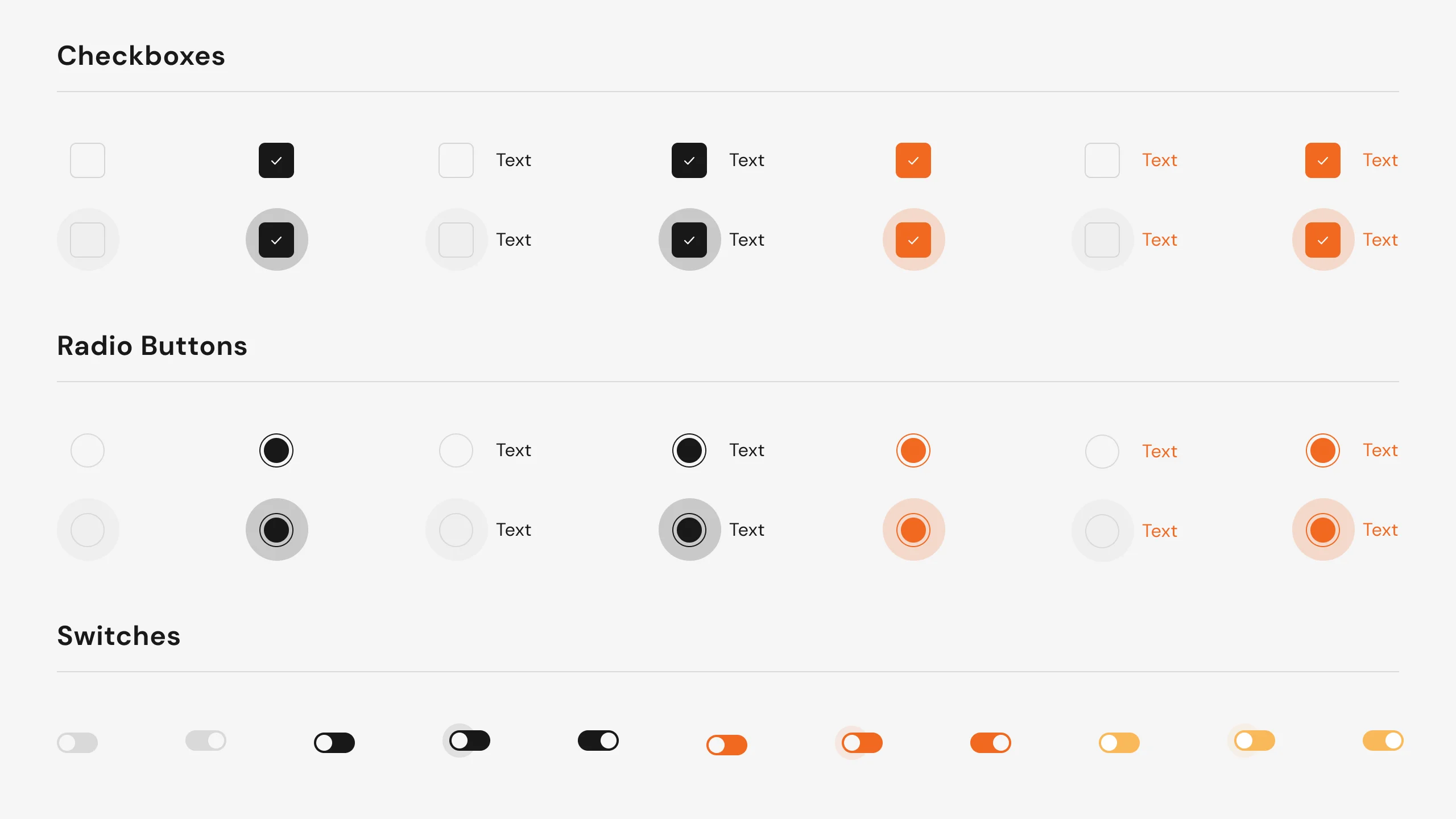
For selection in UI Design, the radio button, checkbox, and toggle switches are the most popular and commonly utilized components of interface design. Here I’ll discuss radio button selection.
Step 1: Define Selection Types
Determine the various selection types that you need for your design system. This could include the selected, unselected, disabled, or any other variations relevant to your project.
Step 2: Create Layout:
Draw a circle shape on the canvas. This circle will serve as the background of the button. You can adjust the size and proportions according to your design requirements.
You can customize its appearance by adjusting the fill color, stroke color, and stroke width in the properties panel on the right.
Step 3: Radio Button Indicator
Create a smaller circle inside the larger one for the radio button indicator. In order to create a smaller circle, click the "Ellipse" tool again and drag while holding the Shift key.
Change the fill color, stroke color, and stroke width of the smaller circle to suit your needs. Normally, when the radio button is chosen, the fill color should change.
Step 4: Adding Text
By selecting both shapes and right-clicking the "Group" option or pressing Cmd/Ctrl + G, you may group the two circles together.
Next to the radio button, you may add text labels to complete the design by providing context or other options.
Step 5: Create Component
To make different versions of the radio button (such as selected, disabled, and hover), simply repeat the instructions above, and name accordingly.
Once you are satisfied with the design, you can save it as a component in your design system by choosing the radio button group followed by either right-clicking and selecting "Create Component" or pressing Cmd/Ctrl + Option + K.
Input Forms
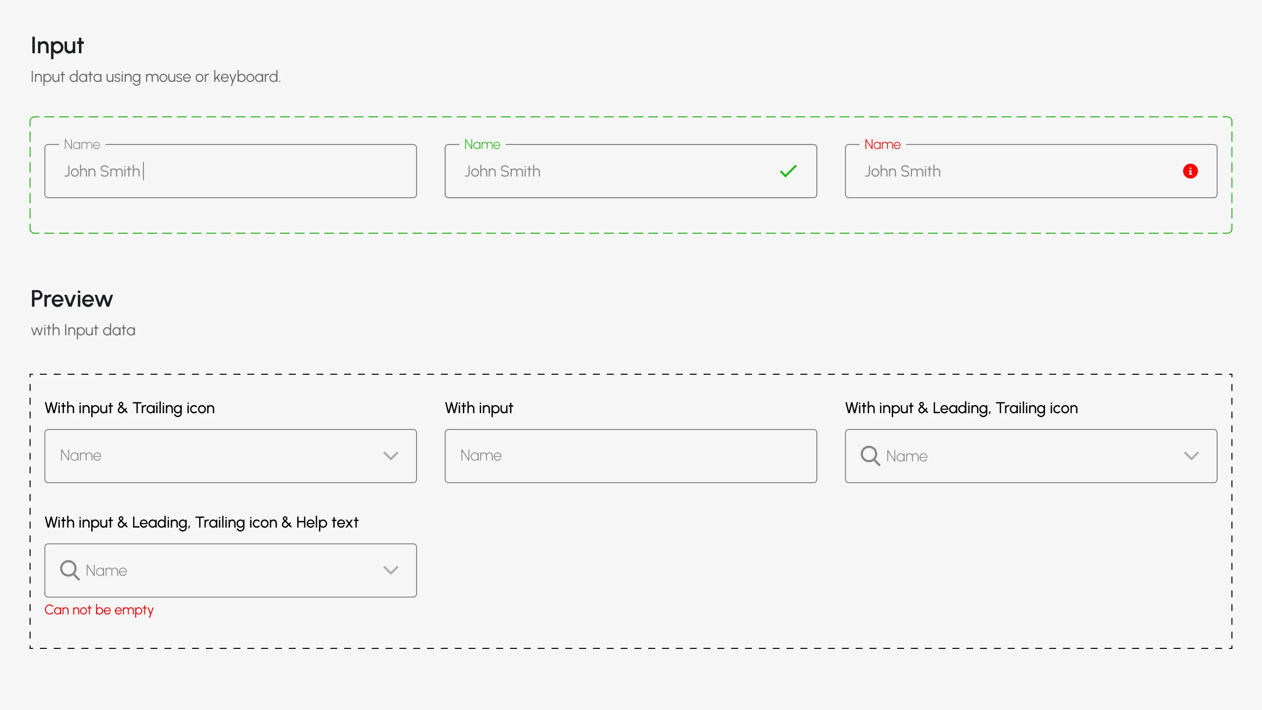
With the increasing prevalence of mobile and tablet devices, as well as the advancements in input methods, forms have become an integral part of user interfaces. Their design and usage are continuously evolving to cater to these changing dynamics.
As more people embrace these technologies, the need for well-designed and user-friendly forms becomes even more crucial.
You can create a form that asks the user for:
- Registration
- Login / Signup
- Contact Form
- Survey / Feedback
Step 1: Define Input Types
Checkboxes, date pickers, radio buttons, text inputs, toggles, and select/dropdown menus are examples of input types or form controls. Forms have to include a way to be submitted, such as a submit button, link, or keystroke (enter).
Step 2: Create Layout:
Draw a rectangle shape on the canvas. This rectangle will serve as the background of the button. You can adjust the size and proportions according to your design requirements.
You can customize its appearance by adjusting the fill color, stroke color, and stroke width in the properties panel on the right.
Step 3: Add Placeholder and label
Right above the rectangle, you may add text labels to complete the design by providing context or other options.
You can also add some placeholder text in rectangles such as Enter name, Mobile number, etc.
Step 4: Create Components
Once you have customized the input form, select it and click on the "Create Component" button in the Figma toolbar or right-click and choose "Create Component" from the context menu. This will convert the element into a reusable component.
Step 5: Make Variants
You can make variants of the component by clicking on the + sign in the component section and changing its parameters to create different iterations of your input form states such as while click, hover, filled, disabled, selected, etc.
More components…
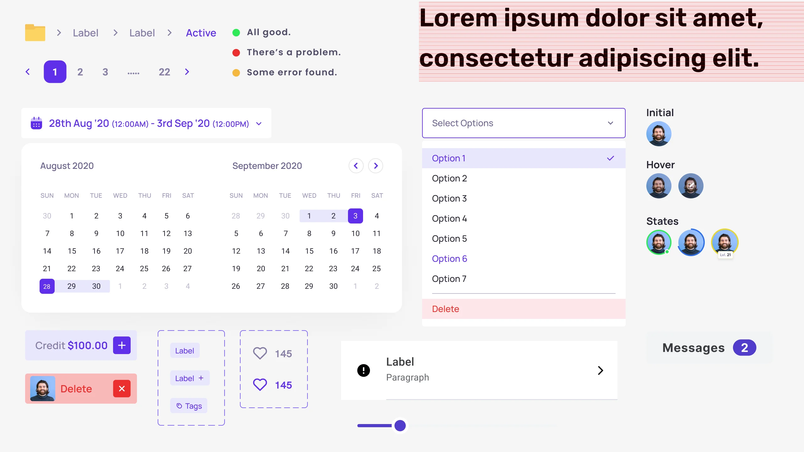
I don't want to take up too much of your precious time, though. Thus, the following are just a few chosen parts that I added to my own system:
- Cards
- Modals
- Avatars
- Badges
- Rating
- Dropdown
- Pagination
- Tooltip
- Calendar
To deal with different scenarios, it is important to make sure your design system includes the frequently used UI elements. You'll be ready for your first build after you have these components in place.
Conclusion
As I already mentioned, creating your own design system takes a major time commitment (in my case, around three months), but the sense of achievement you get after it's finished is priceless.
Owning your own design system takes the stress out of starting a design project from scratch. Being able to use your existing system and never having to worry about starting over is an amazing feeling.
And if you just ain’t got the time to build out your own System, We can help you make it quickly, contact me on team@healxrlabs.co.za
