Innovation rules the web world. The ever-changing trends, new and exciting concepts and dynamic techniques and tools set the pace. We can only deliver mind blowing experiences in the future if we first craft brilliant interactions in the present. We can’t just stick to ‘what’s now’; it is all about ‘what’s next’. 2016 has been a spectacular year with more bent on mobile friendliness and device agnosticism, easier site accessibility, more intuitive apps with simple navigation and services making interactions pleasant and powerful at the same time. Indeed, the field has come of age and taken the world by storm.

Creative minds are refining the usual to reach to a cutting edge of technology, design and user delight. By challenging the existing norms and developing new styles, we are steering towards a bigger and brighter future. Towards the experiences which come from digging little big details and bringing user delight at every corner, to a mark where basic day-to-day interactions involve, interest and indulge users in unique ways. So, how to get onto this desired level of web design?
First and most important is to keep a finger on the pulse of the industry. With that, we also need to keep a tab on the new trends; the ones which will pop up and bring a real paradigm shift in design. Yes, we cannot predict what will shine when it comes to web design, but surely we can make a list of things that are likely to surface. Keep reading to discover what 2017 will unfold in this amazing world of web design-
1. Micro-Mini Interactions
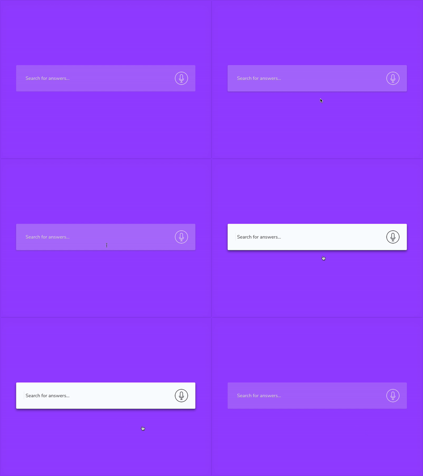
The web world has been driven with microinteractions for quite some time now; the term that we use for single task-based interactions such as liking a comment, setting an alarm etc. Every time we spent time on Facebook, we end up performing several microinteractions subconsciously, big ones as well as small types that are not that prominent to come to notice. As apps are becoming more granular and specific, we are gradually advancing towards a deeper atomization of microinteractions wherein separate interactions are split into even smaller parts within a greater interaction.
These can be called micro-mini interactions as they are several, minuscule interactions present within a microinteraction. The time is not far when we will be able to perform thousands of micro-mini interactions every time we use our phones. For instance, managing an ongoing process like music volume is microinteraction whereas swiping the volume towards the right is a micro-mini interaction.

Micro-mini interactions have become a must part of our day-to-day life and are vast in scope. They influence the user and consumer experience as every scroll, touch, click etc. is full of creative animations and feedback. The importance you give to the minutest interactions results in more powerful experiences for all.
2. Tamagotchi Gestures
As our products become more and more anonymous, autonomous, automated and homogenous, there is a pushback from users. UX community has been more open to Tamagotchi Gesture in their work thereby creating a personality that is more of simple, incomplete and fragile. Major brands like Amazon or Twitter go back to the previous time where things weren’t so embellished still gave comfort and happiness just because they got what they desired.
Yes, they might not be that attractive visually or hierarchically confined, still, they are admired despite all the flaws. By the end of this year, UX practitioners will be incorporating Tamagotchi gesture in all their projects so as to add the human effect to the upcoming products.
3. Feedback At Its Best
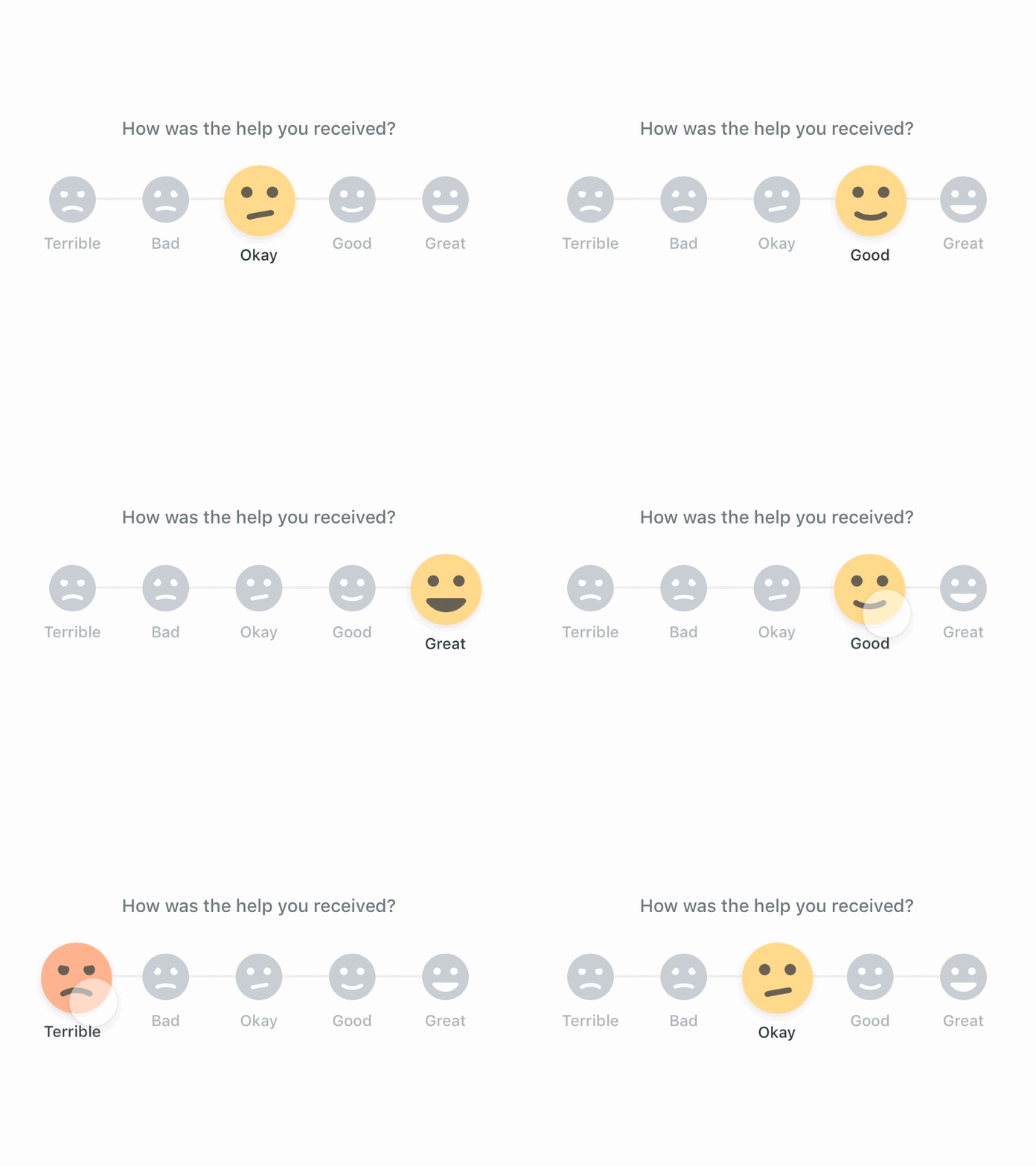
Haptic feedback is the one that uses touch in a user interface such as a visual keyboard which gives tactile feedback by way of its individual keys. Haptic technology has advanced tremendously with the increase in the number of high-end mobile devices and is expected to climb even higher in the coming years all because of the declining costs of Electro-Active Polymer Actuators (EAPs).
These developments have empowered the interaction technologists to devise new and interesting methods of innovating user behavior with the help of haptic cues such as employing a series of subtle pulses and vibrations to take the user directly to a ‘purchase now’ button at the time when they are stalling on some product’s info page or to discourage the user from a leaving a page by creating exciting elements on the page.
Recognizing the potential of this change in user behavior that is more of a subtle hypnosis, interaction designers are calling this version of tactile interface element as hapnotic feedback. While the objective behind hapnotic feedback is still doing its initial rounds, you’ll surely see the designers exploring it to its fullest in the coming months.
4. Going Non-Linear
Being simple does not imply being usable. In 2016, we witnessed the simplification of apps and services in which the navigation menus became straightforward, interactions became divided into step-by-step procedures and users were given no option but to interact with a fixed flow following a linear route. Let’s take an example of Uber that begins the process of setting a pickup, then receiving an ETA, further paying the driver and rating the driver.

People might relish such easy systems, but a delightful UX is actually the one that fulfills the users’ needs, not desires. Currently, there is a lot of withdrawal of users from these linear experiences as they don’t want to be pressed from one screen to the next.
The future is about giving the users the best of utility and functionality and as providers of UX we must take care of that. By 2017, we will go the de-linear way and users will be given the option to navigate through different paths, exercise varied decisions during the processes and more selections to complete each touchpoint.
5. From Action To Response
There is a common term used amongst interaction designers called interstitial anxiety which corresponds to the tensed time a user feels between the action and a response. At times when latency is high and load times take forever, this moment causes anxiety to the users as they are left clueless and powerless- what to do next? If left unattended, this nervousness can lead to a poor experience that will drift your user away from the product.
Adept designers are now trying to utilize these anxiety levels or emotional states to their benefit. By drafting transition elements that hint at the next screen to follow, users are given the privilege to preview and thus expect rather than worry what is going to happen next.
6. For Every Age
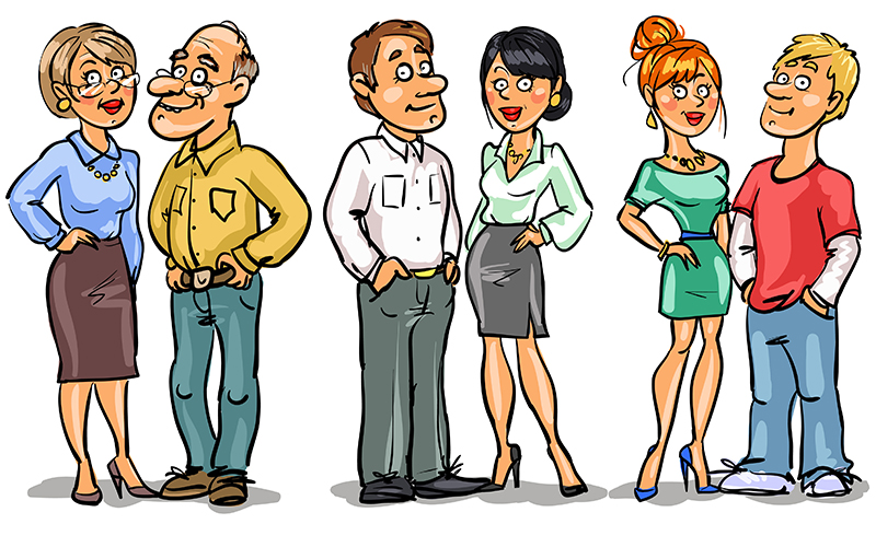
The responsive design stands on the merit of adaptability, that is, the ability to restructure your content as per the device of the user. Actually, this is just the first step; there is a lot to be done to meet the expectations of the user. We already know that the sites get converted to the format of a wide range of devices and thus, now will come the time when the content and structure will modify to a wide range of ages. Online advertising has been customizing its content to satisfy the likings of the user since long and soon the sites will also follow the same pattern.
An 8-year-old and an 80-year-old don’t read the same books or watch the same programs, so why should they get to experience the same content online? The website should be responsive to ages and display what suits the best to different age groups.
By the end of this year, there will be plenty of metadata to direct age-specific adaptations on the websites like navigation menus will change in size based on the estimated ability of the users and those who find it challenging will be given the option of simplified interfaces to make it convenient for them to engage with the feature sets they are already comfortable with.
Also, the font-size will increase to suit the eyesight of the elderly and the color schemes will adjust on the basis that young will get to view more saturated hues whereas the old will get to experience more muted palettes.
7. Semi-Flat Design
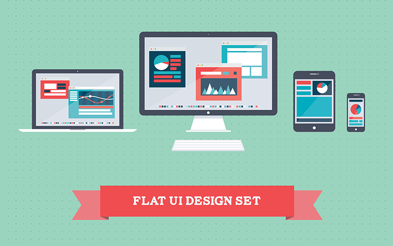
After Windows introduced its Metro style, the design world became all abuzz with flat design. But soon a lot of limitations came forth and so, it started getting converted to semi-flat design to sort the usability issues. By merging depth and dimensions with the help of clean shadows, cards, and well-planned transitions, the semi-flat design has emerged to be a more feasible alternative owing to its supreme usability. Semi-flat design easily fixes all the issues posed by flat design and we definitely see more of it in the year 2017.
8. Tailor-Made Illustrations
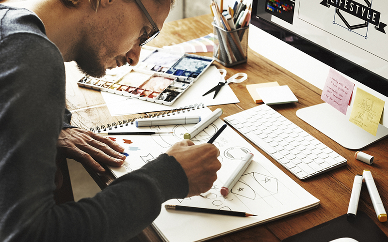
As a designer, you might be thinking why I should design another icon when there is an ideal vector pack already available on the web. Well, this thinking is just but if you want your site to perform extraordinarily then your efforts have to be extraordinary too. Stock icons and illustrations save a lot on the time and money; however, nothing can match the effect of custom-made illustrations and the delight it gives in the first place. They add a lot to the visual appeal factor and contribute immensely in a dynamic website experience. It is forecasted that loads of tailor-made features and illustrations will not follow the art of bandwagoning in 2017.
9. No More Templates
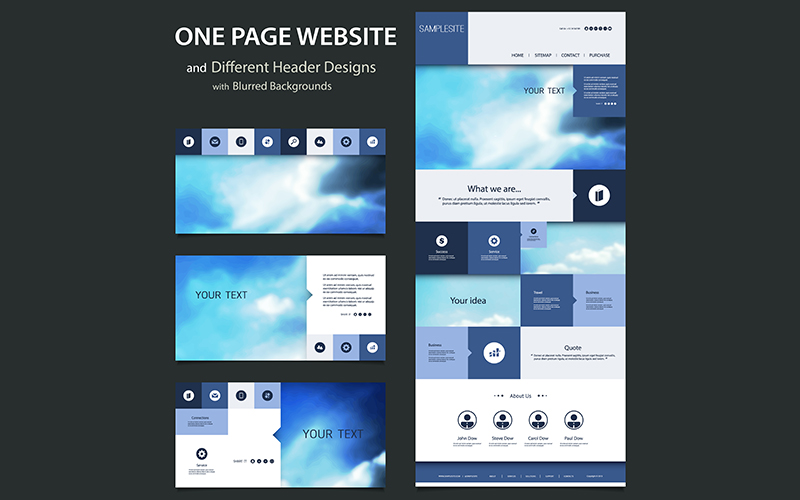
It’s been long we have been under the notion that websites will stand out if their colors and fonts stick to a brand even if those features are a part of the same box design that so many of others have put to use. Now is the era of defying the usual and experimenting, so many designers will be using overlapping, sliding and animated designs so as to polish the overall look and heighten the level of user experience.
10. Color Blast
If 2016 was all about being subtle, then 2017 will mark more colors on a platter. Already we can see a lot of designers making use of different typography and clear HD images. This along with hand-drawn elements can create a personalized effect. Yes, with so much stiff competition to conquer, we ought to be unique than others. If you can make your own typography striking it is good as long as it is clear and speaks for your brand’s goals.
The best trick is to create a balance between being straightforward at the same time bold. Use colors that capture eyes and typography that is a pleasure to read and adds a fine touch to the layout.
11. Cinemagraphs
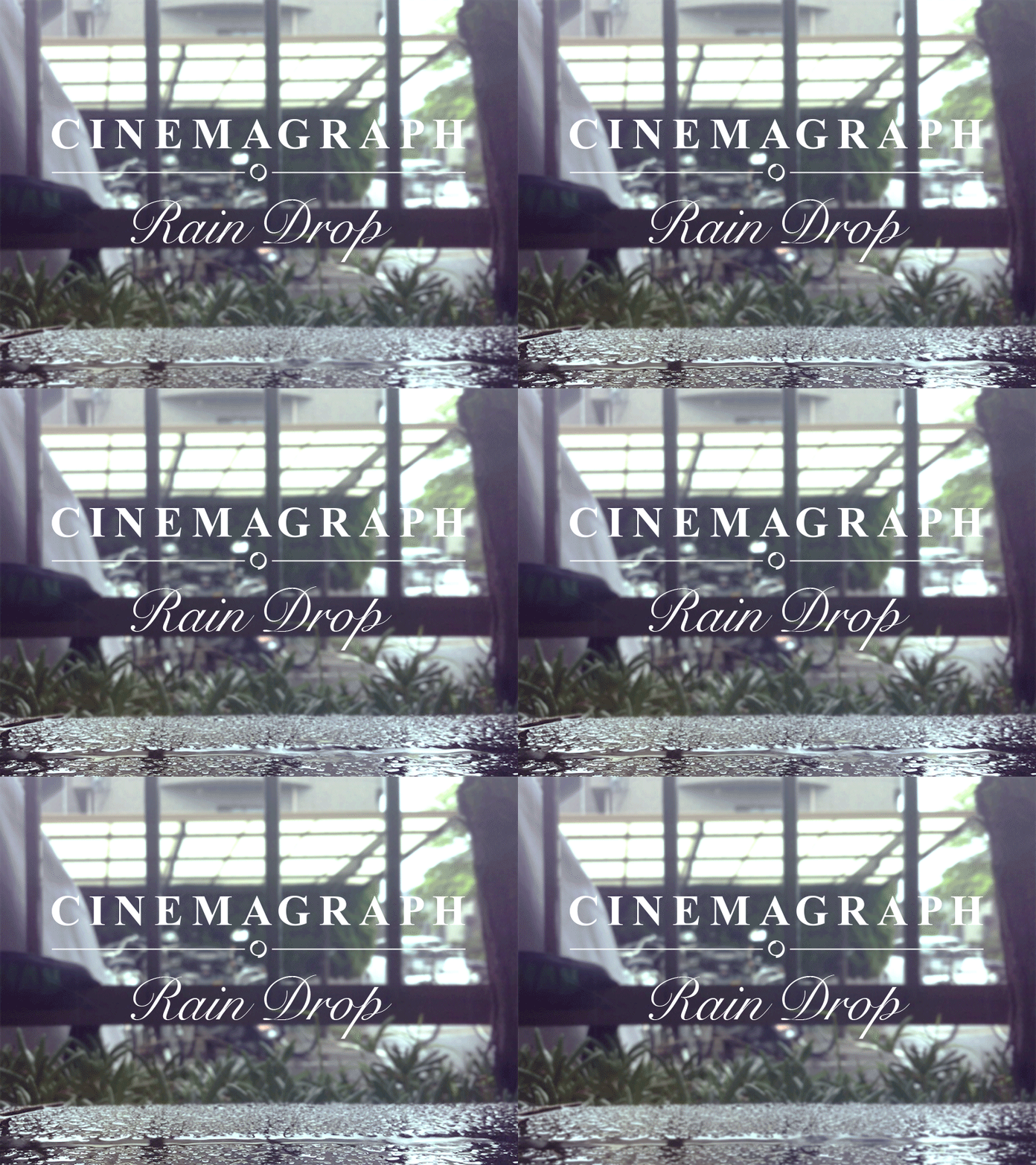
Cinemagraphs are a powerful medium to attract the onlookers. They add on to the mood of the website and provide a tinge of sophistication and elegance. Well, that’s not it. Cinemagraphs are much better than videos as they don’t prove heavy on bandwidth and are quite appealing than photos because they aren’t restricted to a simple shot. This technology is not new to the design world but with the kind of craze it’s garnering presently, we will see more of it this year.
12. The Digital Trust
As a UX designer, your chief duty is to imbibe the feeling of trust in a product. In fact, the most important aspect of any successful business relationship is trust. The same applies to a user’s relationship to a product. But still, the people aren’t aware of the significance of trust in digital business. With the ongoing threats, especially that of the security and data, it is difficult to maintain trust on the web and thus, the majority fail in establishing that reliability of the brand.
As data threats hamper more and more product-user relationships, it is critical to devising more and more channels to establish trust with the customers. 2017 will be extra particular in taking the digital trust building process to the next level and skillful designers will be entrusted the task to engender trust on the web.
13. The Grid Power
The grid designs have become very creative off late. You can see the websites where images are stacked on top of each other. Now, stacking isn’t a problem as when the user rolls over an image the z-index of the image adjusts the photo to the top of the pile. The look may appear haphazard on the first glance but as we scroll down the page everything automatically aligns itself. A dash of organic freedom to an ordered grid layout is always welcomed.
14. Center For Content

Keeping the content in the center is a brilliant trick that has been increasingly used on the home pages. This centered content keeps the main message as the center of attraction on the screen along with appealing visuals or refined textures placed next to it for enhanced visual effect. This is a wonderful technique for the pages which have less content. But even the pages loaded with content can get a sort of facelift with the use of split content layout design. Split content separates the screen into big sections.
The best part about split content is that each section can capture without being under the influence of a single design tone. As a result of this, the designers can enjoy them more creative freedom and at the same time deliver clear content without interfering with its hierarchies.
15. The Parallax Effect
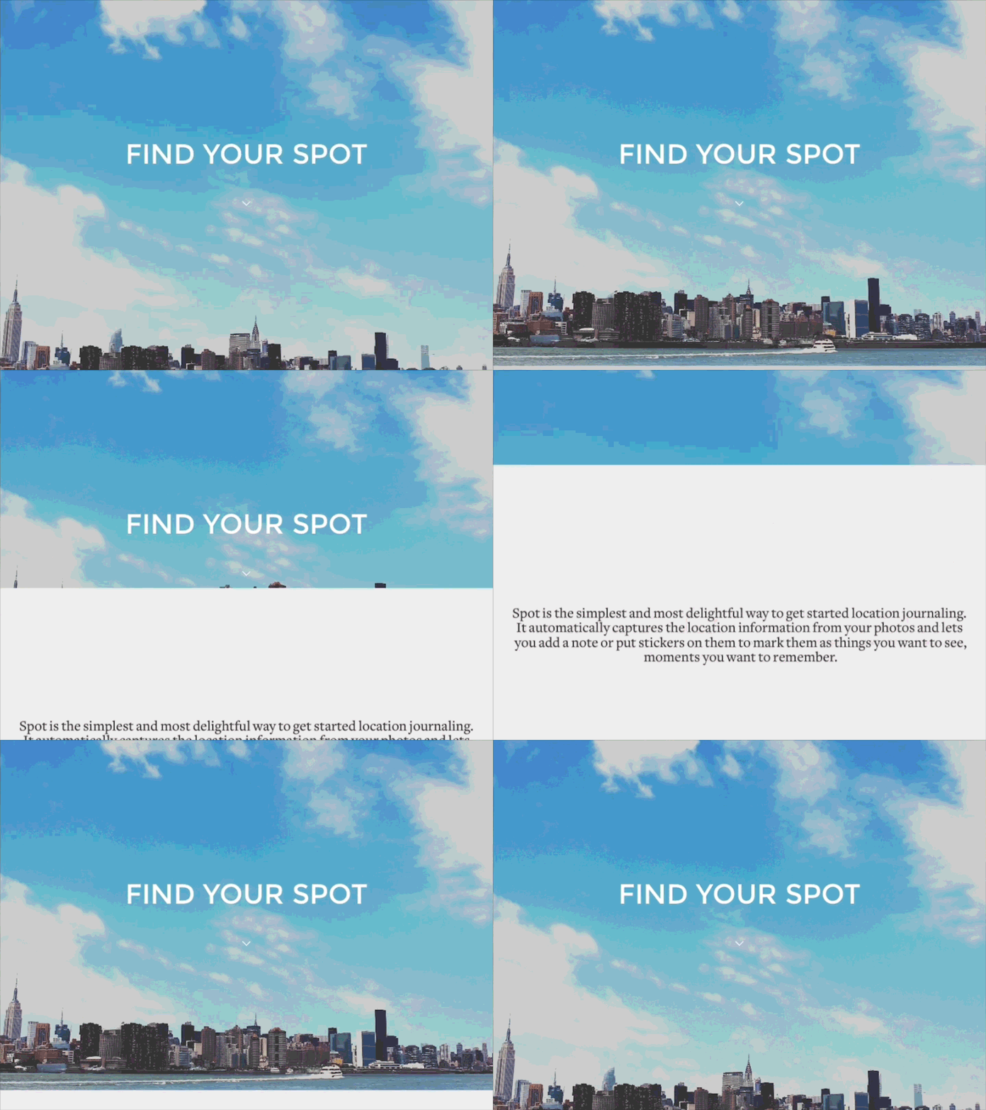
Okay, if you are new to the term, parallax effect is used to maneuver the speed and movement of background imagery. The background has a different pace as against the rest of the page so it grants the site an illusion of depth. As technology is getting progressive with the operations of such effects, so we can certainly see many websites relying on them for casting a spell on the viewers.
In The End
Change is inevitable. The world around us is changing and technology keeping up the march has got us all trapped in this inexorable cycle of growth. It is best if we embrace these changes with all our might and make the most of it. By now we know, design can never be static and things change at a moment’s notice; so we as design-thinkers, makers and doers should be ready with our arms to strive for innovations and leap ahead in our fight for our brand and website. After all, don’t forget, it is all about survival of the fittest!
