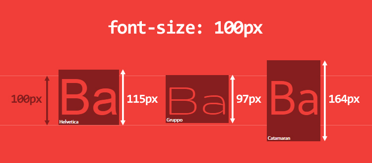
Typography is the art of making your text alive. Your choice of typeface makes a great difference in marking your design- good, bad or great. This is true especially when it comes to UI design considering the bulk the text has or even sometimes the entirety has given to an interface.
A designer should not limit the scope of text by viewing it just like content rather he must consider it a user interface as a whole. Actually, if we come to think of it, web design is 95% typography. So, you need to go beyond fonts. The salient features that lead to optimized typography are readability, accessibility, and graphic balance, but the prime factor that dominates here is usability.
Beginning graphic design: typography
Now, while typeface takes onto arranging type there is much more to user interactions, thus the designer has to work in accordance with other elements like posting, hierarchy, structure, and balance. All this is done to lessen and eliminate any friction between viewer and interface.
Just remember your typography should aid communication. Be it design websites, mobile apps or even wearable UIs, all your works must put forth your intent and purpose clearly. Since text weighs a lot in smooth communication flow, let typography become the strength of your design.
How Typography Impacts UI design?
If you want to excel in your UI, it is important that you excel in your typography. In this post, we will cover some tips that will help you master the typographic style in your user interfaces-
# Size Matters
It is seen that user interfaces use text elements that vary in sizes as in field labels, section headers, button copy etc. There are typefaces that look spectacular and are easily visible when passed at larger sizes, but certain typefaces with very fine letterforms or overly adorned designs crack at smaller settings. In fact, there are fonts that are normal and not very elaborate serifs that cause troubles at minute sizes.
So, if a typeface is to be applied for small labels in a UI and is also to be employed for larger headlines as well as for bulk content, do pay special attention to its scalability. Opt for a typeface that is compatible with multiple sizes and promotes readability and usability in every size like in categories Lato, Univers, Avenir etc.
# Stark Letterforms
The worst thing that can hamper the quality of text is to have letterforms that aren’t differentiable from the others present in that lot. This can pose a problem while reading that text.
More than letters, it is the figures that suffer the most as they are often neglected while deciding the attributes of the fonts for a particular project. Make sure to not confuse with identical letterforms. Uppercase I’s and lowercase L’s can be jumbled up.
When placed together, a lowercase R and N can quickly be assumed as lowercase M. So let the users be sorted by selecting a face that clearly distinguishes between these forms. Clear Sans vs. Lato is a good example to explain the clarity of uppercase I and lowercase L.
Talking of legibility that pays special attention to typeface, letters, and details, let us look at some of the factors that influence this primary design function-
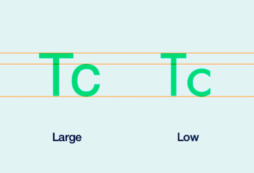
1. X-Height
Around 95% of the letters that we come across are lowercases. Keeping big proportions between uppercase and lowercase enables a clearer typeface. Remember the best character stroke thickness is the one that accounts for 18% of the x-height.
2. Counters
The white space within the letters such as “o”, “u” and “d” is called counters and the typographic experts are of the firm belief that more is the extent of counters, the better it is to recognize the letters.
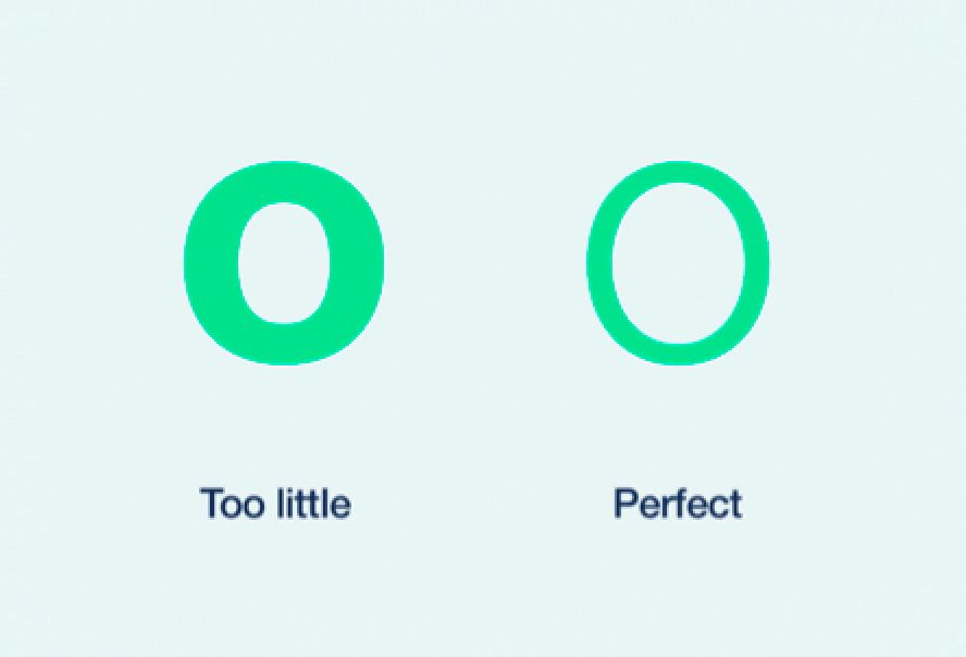
3. Weight
Note that lighter typefaces are clearer than heavier weights of type. It’s somewhat related to counters and permits non modified character shapes.
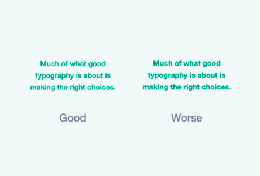
4. Wide Proportion
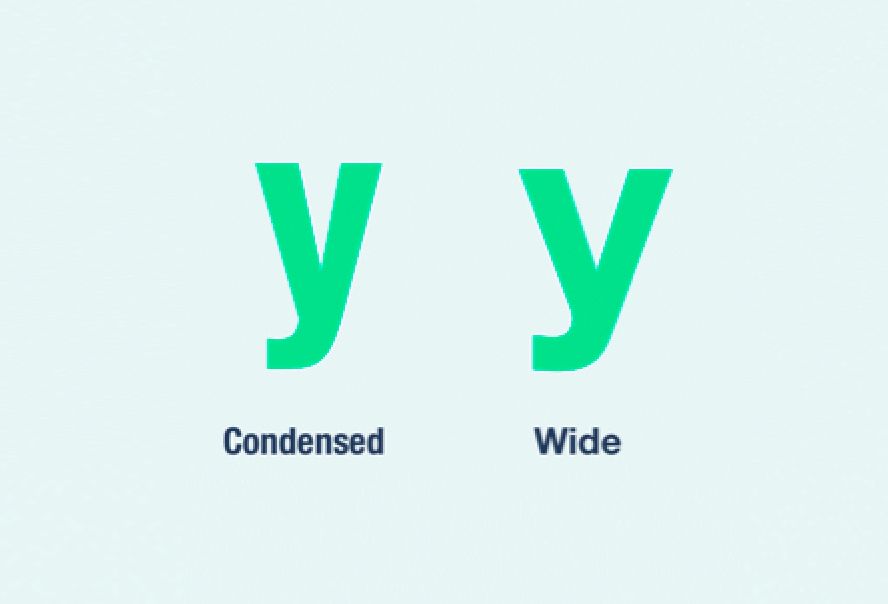
Proportion refers to the width of a character as against its height. Mostly it is wide letter over the compressed format for the purpose of better letter recognition and of course, improved legibility.
5. Letter Spacing
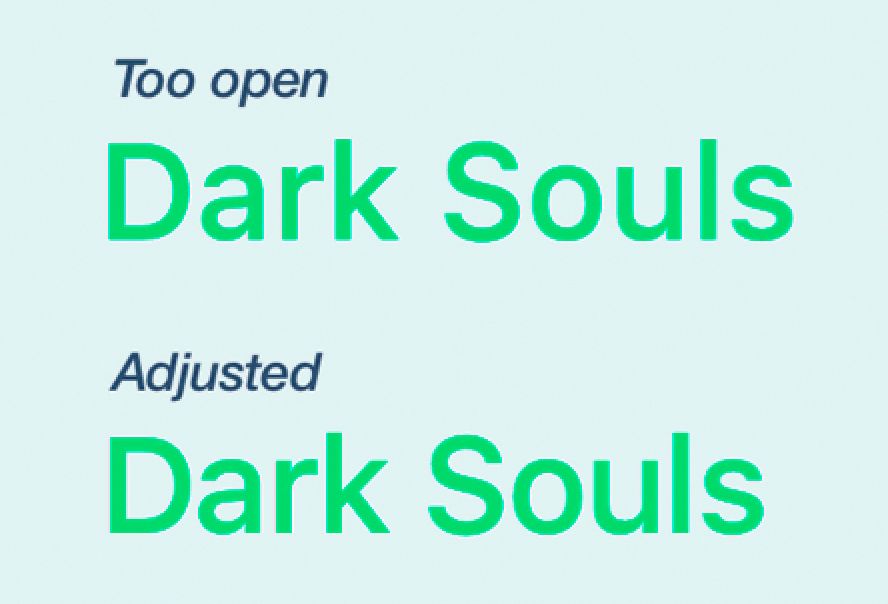
As such there is no fixed formula to figure out letter spacing, it is just that the bigger text size you have the less letter spacing is required. As the typeface comes out too open, you must set the spacing manually. In case of UI design, the manual setting is applicable to headers.
# Text is UI
Skilled designers are the ones that consider the text as UI whereas ordinary designers regard it as content. When your text supports a functional element, it becomes equivalent to UI. All the workings of your UI design are compatible with your type.
# Readability
Readability means the quality of the overall reading experience. The ease with which we can understand the text display, recognize heading, subheading, paragraphs, and blocks. It is kind of macro typography that renders the text attractive in order to encourage more readers. It is managing color, contrast, size, composition and many others that amount to an enriching reading experience. Some points to be taken care are-
1. The Serif Fight
Traditionally, serifs have been believed to be more legible. The print was loyal to them for quite some time and they enhanced the reading experience by incorporating large blocks of text. Serif aids eye flow to move across a text. However, this is not the case with web and mobile. There are several fonts that are sans-serifs but are definitely readable and even the visual design these days support simpler letterforms. Web and mobile have more inclination towards sans-serifs. Also, the paper isn’t involved as well as there are not any lengthy texts to read on the web. The same story is with the apps.
2. Line Height
For leading, rely on this golden ratio. Multiply your letter-size by 1.618 and the result will be just the line height you want. If you are adept at calculating line heights, you can manually make changes in the result. And don’t forget, there are exceptions to this rule and you can tamper with it if required.
3. Text Block Width
Imagine yourself reading on thin ice. Too wide text blocks will tire your eyes while figuring the next line to read. On the other hand, if the lines are narrow, the eye will try to go line to line thus hindering the reading flow. We are subconsciously energized by the idea of jumping to the next line. To keep the readers pumped and engrossed, try keeping 50 to 75 characters in your text line.
4. White Space
White space is needed to lessen the amount of text that visitors see in one go. This, as a result, makes your design more readable and does not make the page congested with content. White space commands our eyes on the layout and imparts a touch of finesse and order.
5. Hierarchy
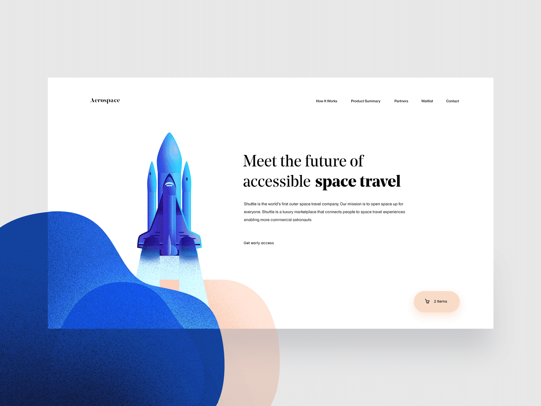
Hierarchy determines the reading pattern. It guides how to separate header from subheading and even the body text. This can be accomplished by using the effect of contrast, paddings, text sizes, margins etc. You must get a hang of this technique to accomplish excellent readability.
6. Repetition and Rhythm
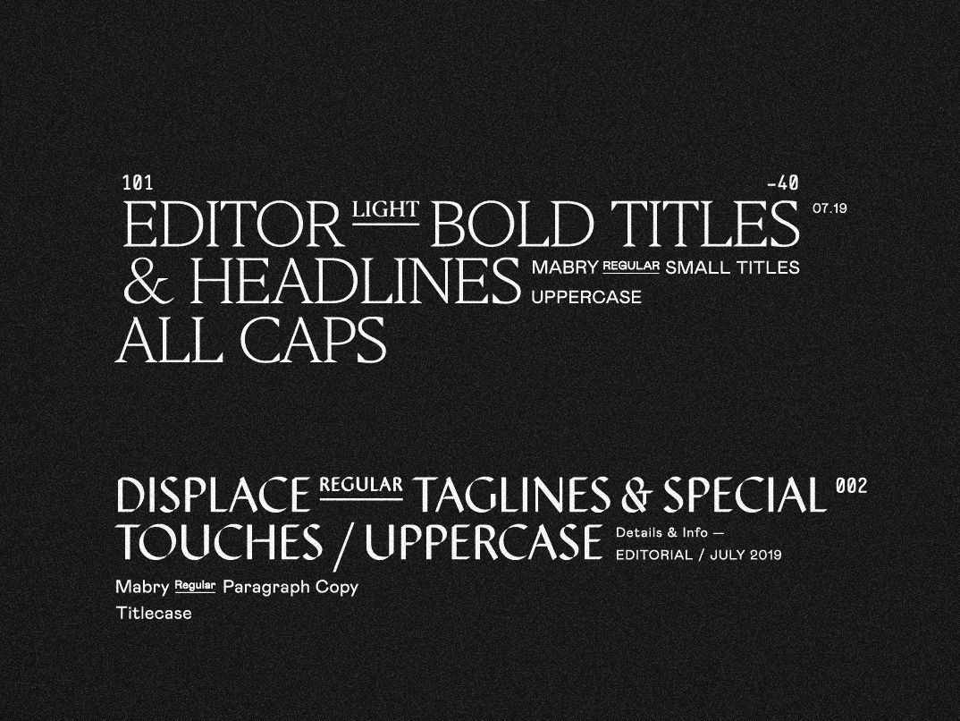
This is a cumbersome part of UI design. Any element that is put on repeat is done to provide unity in design. The art of repetition may be executed through margins, colors, padding, text size and background and boxes. Repetition grants rhythm.
# Scenarios in View
As you finalize the text to be used in your UI, take into view various scenarios and how can the text be molded to match them. For example, how will your UI behave in case an alert message is to be given? The text must stand out and be completely different from the other elements. A great UI is one that faces the challenge of an event successfully.
# The Real One
When you are checking the scalability of a UI text with consideration to different scenarios, it is important that you do so with the real text. Lorem Ipsum placeholder no doubt is useful in some cases, but in case of UI design, the letters of the words and sentences are very significant to the design and should be real. Just decide onto the words that will be taken before you apply the type in your design.
# Get the Check
At the time of creating a UI, you fairly know about the text and also what the UI does. This implies that those parts of the design that are little confusing at the first glance have good chances of being missed out on the first testing. By involving people who are not aware of the testing process of UI, you make sure that the text is understood by everyone.
# Actual Platform
This seems very obvious but is generally left behind. If you are creating a mobile application, it is advisable to test it on mobile platforms. If your UI is developed in the responsive format, run your tests on varied sizes and devices to know whether the decisions taken with regard to the text are appropriate or not.
The End
Whatever be the purpose, the type will always rule your UI. If set right, your text will ace; if set wrong, your text will fail. All the practices of UI design are applicable to your chosen typeface. Successful UI design can’t come with poor typography. So, a text that scores high in scalability and flexibility is the one that wins the race of fluid experience with your design. Make use of these guidelines and stick to these principles if you want to get an edge in the market and establish yourself as a competent interface designer.
