Trends give us a glimpse of what’s new on the horizon. These are the changes that keep creativity blooming in all the creative fields and yes, web design is no exception. Breeding on the grounds of experimentation and innovation trends pilot change and stimulate growth for the industry. To survive the challenge posed by the dynamic environment of the web, we need to keep up with all the latest trends that drive the market. When it comes to website design, we generally shake things up to focus on different styles and layouts and offer users something more than what they want with each passing year.
It’s been years we have been adding features to our websites such as headers, banner ads, sidebars, calls to action, social media buttons, signup boxes, comments etc. This, in turn, clutters up the website, consumes more real estate and diverts the attention from the content of the page. In 2017, websites will resort back to basics and make content the king. Even if that means taking off all the distractions we have toiled over for years or just adjusting them to take up less real estate, that is for time to decide.

2017 will also be a constant exploration where the viewers will get more than what they expect by browsing various websites. This year will surely bring some kickass website designs, but to give it a thought, we can already figure out some trends that will rule websites in 2017. Below are some of the ideas that will dominate the world of digital design-
1. Content Is King
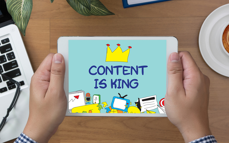
People’s outlook towards design has changed a lot in the past few years; from a delayed optimization stage that takes charge to allure users to real competitive advantage. There has been tremendous evolution. And the best part of this evolution is to witness the importance of content coming back. Designers have realized the value people associate with content, be it tweetstorms or user-made meme. The very purpose of design is to give away the content in an interactive, intuitive and informative manner.
This is the reason one can see a flatter, less cluttered and well-organized design more rather than the skeuomorphic design. However, some designers argue that minimalistic designs do not make the design alive. This tiff will continue in 2017 and hopefully, we get a productive output that is centered on the heart of design i.e. the content.
2. Mobile-First Approach
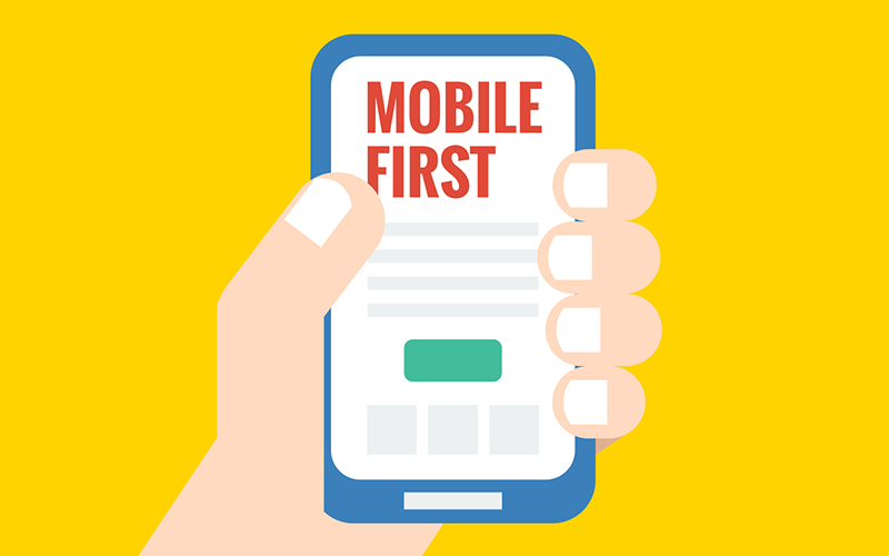
Mobile-first design caters to designing for mobile first and then takes up bigger ones. This approach isn’t new to 2017 and has been showing presence for quite some time now. As mobile phones have been recognized as the primary device for searching the web, more companies are trying to gain from the popularity of a site that conveniently provides content on a smaller screen.
Not getting driven by the design and visuals, there are certain restrictions in the mobile-first model that makes it all the more crucial for the brands to evaluate their main content and message that they want to convey. As it is smartphones limit the extent of content a user can see at one go.
This compels the brands to forgo the information that isn’t absolutely necessary and further use the left over add-ons for larger screened devices. It is anticipated that mobile-first concept will take over completely in this year and thus a more vigilant approach has to be adopted in delivering content via smaller screens.
3. Rapid Prototyping Tools
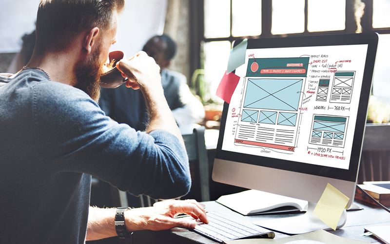
Yes, it is not a design trend but rapid prototyping tools have taken the design world by storm during the last year and are expected to do the same in this year too. The tools like Marvel, Webflow, UXpin etc. empower the designers to swiftly make low and high fidelity prototypes of sites and services that promote aesthetic look and usability, that too in the absence of coding.
There is also an option to design in the browser and then revert to tool to launch the site. Their user-friendly and high functionality traits give an edge to the experience and provide a glimpse of the look and use of the finished product in the browser thereby saving precious time, resources and failures that were likely to occur.
Clients can easily understand the working of the prototypes rather than getting stuck with those static wireframes and mockups that elaborate on minute animation and transition. It is estimated that more and more brands will get the rapid prototyping bug to attain streamlined workflows and great efficiency.
4. Designers and Developers - The Super Team
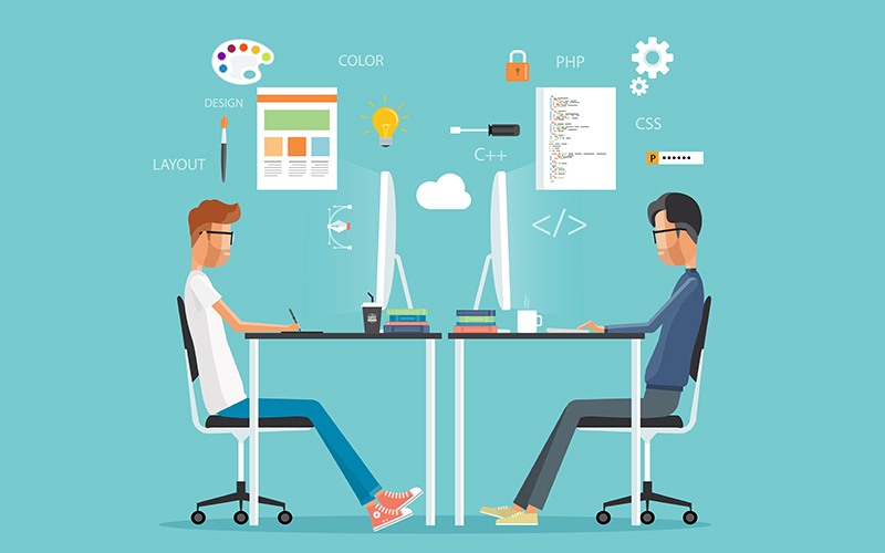
As design has been playing a pivotal role in shaping businesses, more attention has been paid to form a cordial working environment between designers’ and other fellow designers as well as their developer colleagues. The need has been generated from the creation of extensive web and mobile apps that are flooding the market these days. Giant names like Google, Facebook, LinkedIn can’t survive only on the basis of their design team rather through effective collaboration and communication across all the departments.
Various platforms have already seen a success in this regard through their shared templates and dashboards and it is estimated that 2017 will pave the way for bigger and better. A lot of emphasis is already been laid on handoff stage where designers used to handoff large packages of static images and specs, but now they are sharing interactive visualizations enabled by tools such as Marvel, UXPin, InVision etc.
5. Dynamic UI Patterns
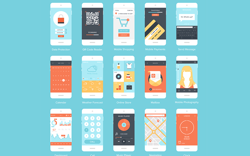
With increasing shift towards mobile-first and responsive approach and rising popularity of WordPress and pre-designed themes, there has been quite a significant change in how the websites work and look today. UI and UX patterns have come a long way in the web world where many websites are same in their look and feel and even emerge better in their user experience.
That said, don’t think all the websites have started to look similar but ponder over the fact that these consistent UI and UX patterns are turning the world into an all time user-friendly place. With stiff competition amongst all brands, any slip in the process of user’s journey can cost you a lot, so it is advised to stick to these tried-and-tested frameworks to boost the effectiveness of the site.
6. Let It Stand Out

By now, we agree hands down that it is the content that rules the web. Thus, various websites are keen on including a copy set in type that stands out and is big and bold in expression. Okay, to make it clear, ‘big’ and ‘bold’ doesn’t only mean making the font heavy rather it refers to allotting a considerable portion of the real estate to a simple, clear yet complete statement that voices efficiently for the product or service.
And, bringing a breath of fresh air, these statements are pretty straight and free from the false claims and exaggeration that we have encountered a lot recently. In this fast-moving world where information overload poses a great burden, these brief yet impactful statements give that desired effect which the companies look forward to.
As resolutions become sharper and type is more readable on-screen, brands will take typography to another level to add on to the appeal by users. 2017 will see a rise in enlarged and full-screen type which sets apart the grid, stunning, hand-crafted typography as well as lots of effectual text and image layering.
7. Tailor-Made Illustrations
Illustrations are an engaging source for forming visuals that are light and friendly and denote a fun quotient to the site. Adept illustrators have the expertise to make illustrations that impart personality and are tailor-made to stick to the tone of the brand; a concept that all the competing brands are incorporating to sustain in this crowded marketplace. With customized illustrations on the offer, brands are able to distinguish their identity, by the use of large header images, bespoke iconography, and striking visuals.
8. Fine Layouts
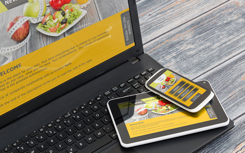
If we want to determine the future of web design, we need to track the progress of the graphic design. Since long web design has been curbed by CSS’s limitations, but advanced tools like flexbox and CSS grid enable much more dynamic layouts on the web. Our goal now is to grasp how these new web layout methods work in favor of responsive design.
9. Bent On SVGs
SVGs have a lot of merits working best for web designers and developers as compared to traditional image types such as JPG, PNG, and GIF. The name itself justifies the benefits here i.e. scalable and vector. SVGs consist of vectors rather than pixels and it isn’t raster. This implies SVGs are not dependent on resolutions and thus can look great on any screen and any device. There is no tension to make it fit into the specifics of the retina. Further, SVGs are cool as they don’t need any HTTP requests.
10. Genuine Photography
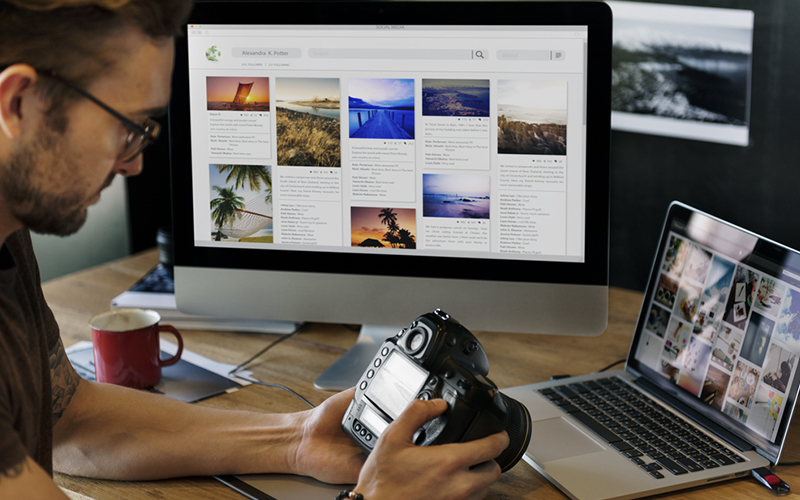
This is a major kick-photography. Photography is a vital part of web design and design in general, but as we know people want genuine stuff from the brands they trust and they very well recognize canned and copied photos if they spot one. From now on, brands and designers will be more particular of the imagery they will be using and will also be taking the shots clicked by professional photographers which capture what is ideal for the frame.
Although it will take some time before the tacky and poor stock photography completely vanishes, still it is expected that this year will take a major turn in this regard. It is anticipated that the brands will find unique ways to capture the audience with the use of photography, illustration, video, and typography to build a strong web presence.
11. The Color Call
2016 saw a rise in movements like minimalism and brutalism and with such a change, designers found methods to reflect more personality in their projects that created magic within those stripped-down aesthetics. Ultimately, bright and bold colors became the need of the hour.
Note: it is not just about bright and flashy color only. Gradients have shown their presence too thus blending and blurring those stark shades into hues suggestive of noonday sky. There is a blend of naturalism in this reoccurrence of bright and bold gradients and more of it is looked forward to in 2017.
12. Animation Rocks
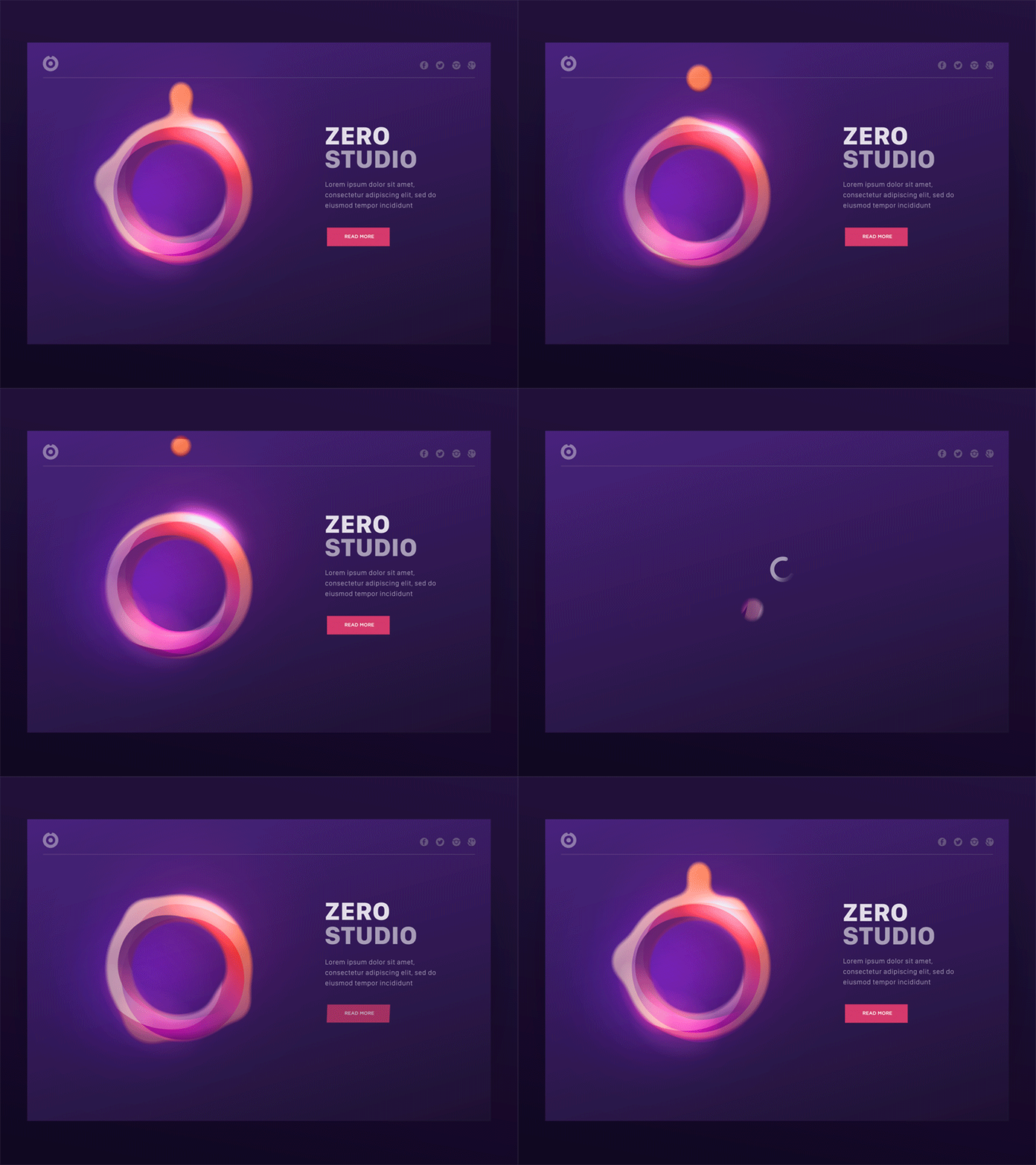
Animation, undoubtedly, has played a significant role in raising the performance of our digital interfaces. In 2017, designers will employ more and more visual aids to create interactive and fun animations that are all the more captivating and refined in look. Keep in mind the brand voice and tone documentation while forming animations to make sure that the tone is kept alive in the content.
This will render animations more effective in working and make them suitable for on-brand functions for users. The brands are increasingly working on the art of story-telling and devoting extra efforts to attract user’s attention and animation too, owing to HTML5, CSS and jQuery is contributing major in this mission. The animation is even a powerful mechanic for brands to facilitate useful interactions between themselves and their users.
13. Video Power
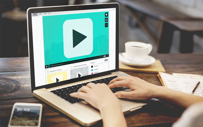
Video gets a total grip on the audience. Just like animation, a moving image is great to attract the users’ attention, involving them completely so much so that the brand easily conveys the narrative and message. Video is quite an old but robust medium aptly used for marketing, story-telling, etc. and scores much more over stereotypical photography.
The video is dynamic and engaging as a medium and captures more through its sound and movement thus holding the attention for longer durations. Video has made its mark on the internet and has proven to be effectual for the purpose of content delivery.
14. Better With Scrolling
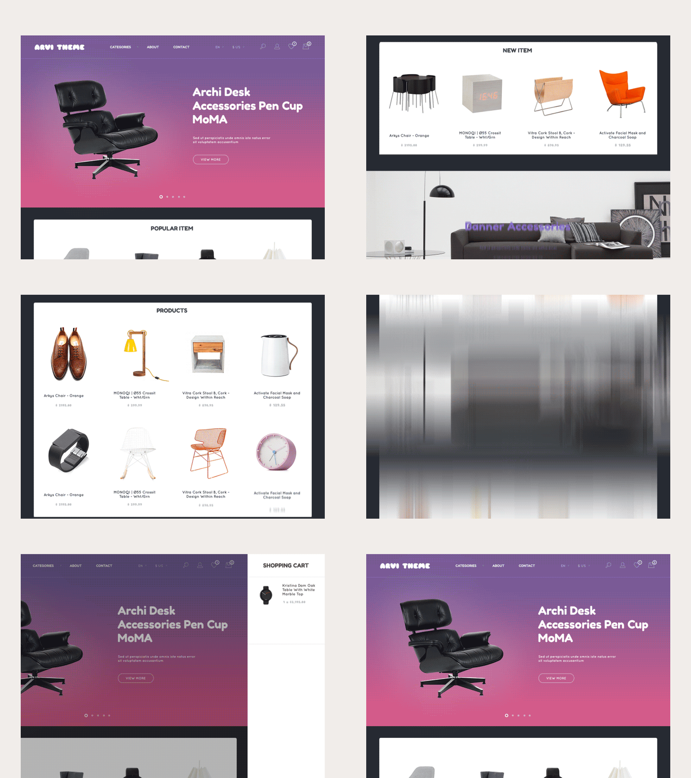
Scrolling that has been used since ages for getting from top to bottom of a page has now widened in scope in terms of delivering content online. Earlier the designers were rigid on keeping the majority of the content above the fold, but now this idea has disappeared as ‘the fold’ has no fixed place and the viewers can see the content across different sizes and resolutions.
Scrolling is a super mechanic that is a great tool for all forms of content delivery. It is also compatible with video-based content, where large full-screen videos come to halt as the screen scrolls and the static content which transforms based on the user's input.
15. Different Layouts
2016 witnessed the low where web design was either viewed as dying or losing its soul. As overdramatic as it may sound, but you can’t blame any designer for using unique ways to give away content to the readers. One of the spectacular methods for leaving the traditional layouts that do come with responsive design is the broken grid.
This will be refreshing as compared to the boxy layouts that we see much in our designs and are somewhat redundant. A good example of these unique layouts is the inclusion of overlapping typographical and graphical elements which make the design more appealing.
The Last Word
2017 will definitely be a good year for the web world. These trends will dominate the website designs and enhance the overall look and feel. Be it hand-drawn features or imaginative headings or content layouts, these trends will take web design on a roll this year. Although it is difficult to list the 100s of trends that can govern any creative industry at a point in time, the above points are some of the main points that can surely make a difference.
These points have been highlighted for a good reason; to integrate and form patterns that cast nice impressions and help to emerge online in this cut-throat competition. Some of the trends may not be applicable to you and your content, but it is always better to be familiar with the latest happenings of the industry so as to set the pace for progress.
