5. Create UX
In my previous articles I explained the UX first step – UX Research, UX second step – UX Plan, Third step UX Explore and fourth step UX Communication. In this article I discussed how to Create UX using : UI Elements – Re-use elements and patterns, create your guidelines and follow it. Start with small bytes, then create mega pages. a swipe slider? Study first about user behavior fits like – pinch, drag, zoom, rotate, shake, six-inch smartphones, left handed people, mouseover, kinect, motion detection. Can I see it on my mobile? As per Google 60% people browse website on Mobiles, Still thinking about a Responsive website?
So let’s read it in detail.
All these steps are part of the UX process and I categorized these steps into 9 steps, i hope you will enjoy this fifth step. Join our newsletter and we will keep you updated with next steps.
5.1 UI Elements: The Guide That Spells Style
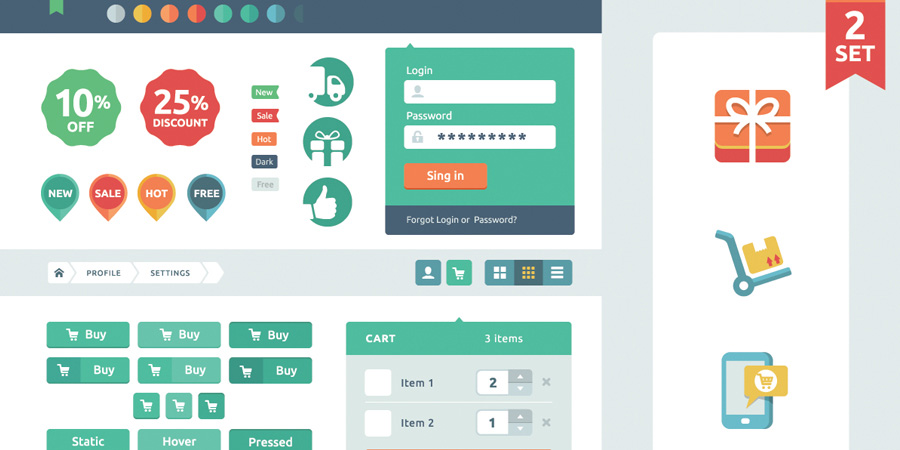
A style guide paves the path for the different stations of elements to reach the ultimate destination of design. It creates a control on markup and CSS so that the designer has the reins of design in hand. In detail, it is like a file of rules that covers the different elements as well as the coded modules of the website or app. Style guide also monitors the visual language, such as the header and footer styles so that the best of the styles come across the page.
From Clients to Designers to the Developers, it serves as a source of reference for the frame as well as the changes. Pattern library, as commonly known, should be used as it will serve as a reference and help to cut time on the designing of new sections and pages. Also, it will help to set a fixed standard for CSS making it compact and faster to load. By using it as a record for modules and code, the designers and developers can judge whether the design will be useful for expanding code base or if the written content has been used previously.
Style Guide is also beneficial to maintain a level of constancy in design as the underlying base of the site’s elements are the same. This is useful for big teams and large scale enterprises where a massive unit is working on setting up the website. Furthermore, clear communication channel can be established that develops clarity in the process. Finally, it is helpful in pointing out the issues through the QA technique so as to handle them at an earlier stage.
To build your style guide, you need to follow the following steps:
Go with the fundamentals first
Begin with the basics. Take the basic elements such as color palette, grid layout or typography together in the first place and then modify it with different patterns further.
Work on additional patterns
A pattern itself contains markup and styles so as to design some of the basic stuff on the website. It is better to add more variations and changes in these existing styles. These additional patterns can be media-object pattern or vertical list pattern and its likes.
Make it Interactive
Wherever possible add the elements of interactivity such as drop-downs, tool tips etc. so that the user can relate to the page more. This way you can also pull the audience through the animated features.
Easy to maintain
The style book should be easily updated and have smooth maintenance so that it can be properly accessed for the latest patterns. Making the style guide up-to-date is definitely a critical task and should not be ignored. So as to not ignore it, make sure to update the style guide along with the website.
Handy at all times
Gathering the website’s or app’s components together will give you an idea of various tools and you can use it as per the suitability of the design.
Having a style guide is definitely rewarding and will facilitate smooth operation in the creation of the page. So, what are you waiting for? Set the guide and let the action begin!
5.2 Gestures : Ditch The Button In Your Interface
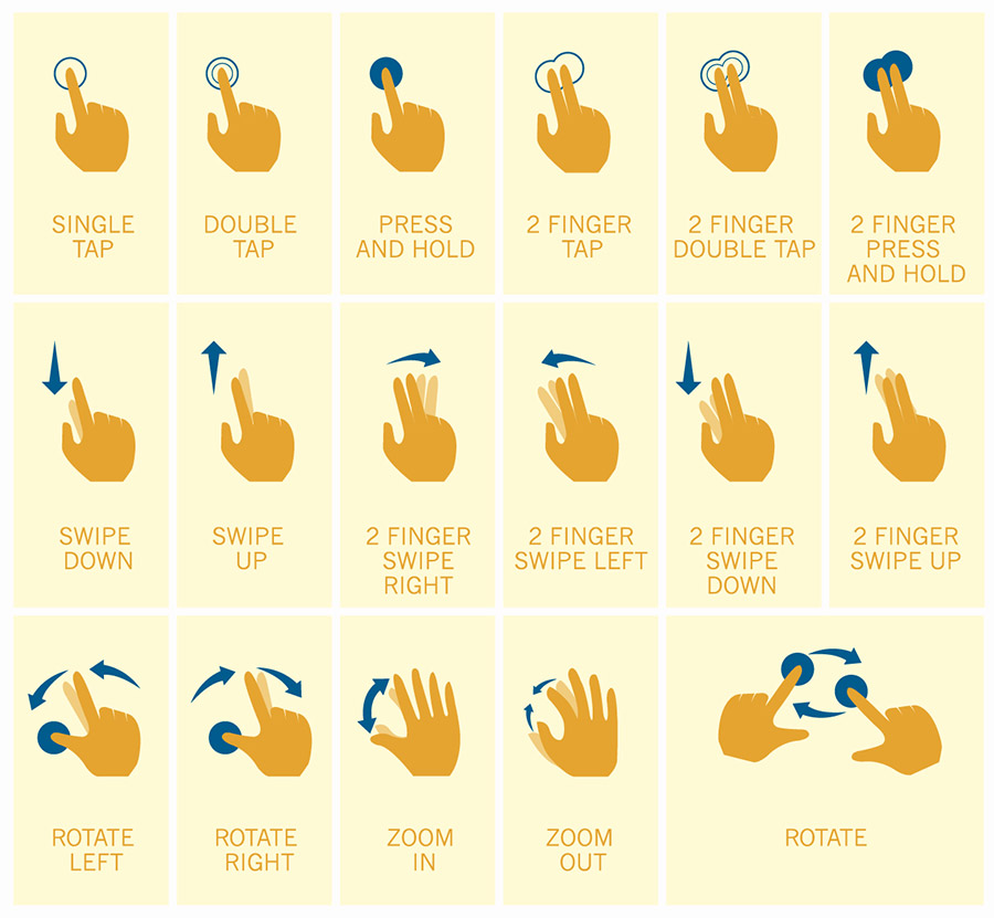
Let’s admit, gadgets have become all about touch rather than the press. Yes, it is the touchscreen centered interaction that has made the device all the more smart, private and personal. These gesture interactive devices have made the user experience more desirable. The major drawback of bars is that it takes up 20% of the screen space which could have been used for content, but on the other hand, usage of gestures helps to utilize each and every pixel and make the design more content driven.
How Gesture-Driven Interfaces Help to Outshine?
These interfaces provide the most fulfilling user experiences as users like to explore the creative product more and feel that the interactions are quite intuitive in nature. A gesture-driven interface proves fruitful in removing the clutter on the screen and concentrate just on the main point of focus. It is not mandatory to have the navigation bars as there is not a set place where it belongs. Let these bars and buttons not bind you. Gestures make the interactions easier, amusing and spontaneous. Do not hold the idea of integrating simple gestures such as tapping, double-tapping, etc. together as it will certainly result in some significant interactions ahead.
The users do not have a fixed flow in any web product. So, it is not possible to determine their behavior beforehand. Therefore, having an interface that fits and adds a creative dimension to the context is always welcomed. For instance, using the dragging feature is a bonus for the audience as they can skim the content easily and yet reach to the place they are most interested in.
Such type of interface has changed the parameters of the design. Now, instead of focusing on the screen and pages, it is more about the time, extent and animation. It is sort of fine-tuning the interactions so that the users find it easy to use and go on with the app’s flow without getting stuck anywhere. Gesture-based UI doesn’t support visual hints for the user, but nevertheless inclines the learning curve of the application. But, having said that, make sure the users are not lost and know the entry or the starting point.
Do not add all the information together, let it go in bits and pieces. Cutting the long story short, gesture driven interfaces have set a revolutionary trend and needless to say have tremendous potential, so the designers should make the most of it and redefine the ways in which people use digital content.
5.3 Responsiveness : The Right Way To Reach The Users

With the cut throat competition in the market, responsive web design has become the need of the hour. But making a site responsive, doesn’t mean compressing the page and adding it to the mobile device. It requires planning, designing and above all, building experience par excellence. The responsive web design has some great solutions in store, but in order to make the most of it, you must understand the needs of the users first. You must research on their top tasks. The users’ mindset governs the responsive design and should always be kept in mind while designing the mobile-specific websites and apps. Important pointers for a responsive web design product are:
Plan
A commendable responsive website is the one that has been designed through proper planning right from the beginning till the end. It is important to commence the process with a proper analysis of all the factors that is screen sizes, devices, operating systems, etc. Analysis shows the demand of the traffic and provides a clear picture of the industry’s existing standards. It is essential to work thoroughly on the information architecture so that the structure can be determined as per the top tasks and analytic trends. As the prototype is formed, wireframing can be done, which can be a challenging step in a responsive design as incorporating flexibility with the conventional tools can be quite difficult to accomplish. But this can be overcome through effective testing and iteration techniques. After the layout, it is the content’s march. The approach should be minimalist yet effective. That is, speaking more in less. Just churn out what is needed by the users rather than adding on to the load.
Design
The responsive design process is quite dynamic and is in tune with the evolving nature of the internet. The process gives a fresh feel to the workflows and intends on making every pixel perfect on the varied range of devices. It is important to consider the scope of every project and then define the design deliverables. A more radical approach in this regard is to craft layouts with reusable components that can be knitted together in a lot of ways. Besides working on the deliverables, it is essential to consider a website’s performance too, and prior to the development stage. Whether the downloads will be payable or not is a major part of the user experience and should be evaluated keeping in mind all the factors. Efforts should be taken to speed up the loading period so that they can make the most of their data plans and get the best and quick services on the web.
Build
After the wireframes, content and design have picked up the pace, it is the time for the development stage. Even if the development process is on, the users’ needs should never be ignored as they are the sole purpose of building the website. The development team should be aware of the research and data, governing the design and must know the basis for each decision. Having this familiarity will definitely be a good move in making the user experience mind blowing. A developer must understand the implications of each decision taken and hence be very vigilant while taking the call to action. Responsive design should also stand the test of futuristic demand. Various determinants like device, network and browser reach should be kept in mind so as to make it more universally accessible.
Iterate
After the development stage is done and a unique, well designed responsive site has taken shape and gone live, don’t let it remain inactive and hidden from the web. Keep the flow of analyzing, testing and modifying on. The changes or the maintenance does not have to be huge and tedious, even small additions or tweaks can give noticeable results. Also, keep a tab on the technical developments and incorporate testing procedure time and again to assess the usability rates. Only testing is the foolproof method to determine where the user experience is heading. Responsive design must make the most of the innovative techniques and work on making refinements as that is where its essence lies that is being advanced at the same time visionary.
