7. Finalise UX
In my previous articles, I explained the UX first step – UX Research, UX second step – UX Plan, 3rd Explore UX , 4th UX Communication, 5th step Create UX and 6th step – UX Feedback. In this article, I discussed how to Finalise UX. First always ask “Is this the best you can do?” Use of images and icons – In any UI, icons play a major role to connect with the audience. Besides, depicting the color and style, they must communicate with the users and can bring huge improvements. Font & colors hierarchy – Make a simple guideline and follow it, using colors and font sizes properly. The best visual hierarchies lead users to take the action confidently.
All these steps are part of the UX process and I categorized these steps into 9 steps, i hope you will enjoy this seventh step. Join our newsletter and we will keep you updated with next steps.
7.1 Finalise Layout : Visual Designs That Appeal
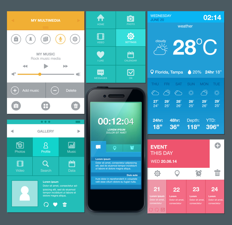
Visual Design works on the creation of a website and its other relative areas by making ideal combinations of images, fonts, colors, and other elements. A competent visual design does not drift away from the content or the function, rather it makes it more attractive in the eyes of the user and helps to build faith in the brand.
Basic Elements
The basic elements of visual design are-
- Lines – It joins two points and is useful to define shapes, allocate and give textures a form. All straight lines have length, breadth, and direction.
- Shapes – These are self-occupied areas. A graphic artist uses lines of different value, color or texture to describe the area.
- Color Palette – It uses a variety of combinations to distinguish, add depth, give stress or arrange the information. It basically works on the psychology of the users.
- Texture – It refers to the actual feel of a surface or even the known feel. Repetition of the elements leads to a texture and forms a pattern
- Typography – It includes the choice of fonts, size, alignment, color, and spacing.
- Form – This refers to the three-dimensional things and further depicts their volume and mass. It is made by joining two or more shapes and can be further accentuated through tones, textures, and colors
Rules of Visual Design
An effective visual design works on the rules mentioned below-
- Unity – Works on unifying the elements that belong together. The visual design needs to balance out unity and variety to avoid a too dull or bright design.
- Gestalt– It helps the users to get an idea of the overall design as compared to the individual elements only.
- Space – It refers to something getting placed in it. Space helps to lessen the noise, enhance readability and form an illusion too.
- Hierarchy – Hierarchy highlights the important items as compared to the least significant ones. It involves incorporating different sizes, colors, and placement on the page.
- Balance – It develops equal distribution across the page. This does not imply symmetry.
- The Contrast – Contrast makes the items more visible by working on the differences in size, color, directions, and other features.
- Scale – It defines a range of sizes. Develops interest and depth by illustrating each item based on its size.
- Dominance – This one focuses on one element as the main point and others as the supporting ones. It is done after the process of scaling and contrasting.
- Similarity – It uses direct duplication and creates the effect of continuity for the entire design. The similarity makes pieces set together in an interface.
7.2 Use of Images and Icons : Communicate Better
In any UI, icons play a major role to connect with the audience. Besides, depicting the color and style, they must communicate with the users. Icons should be clear to the users and serve as a proper visual representation of an object, area or idea else it’s very purpose fails. Icons are useful as they are easy to target and can be easily touched on a touchscreen or clicked with a mouse cursor. They lend a compact feel of the site by allowing toolbars, palettes and other icons all together on the screen. Further, icons can be easily recognized and are quite familiar to the members using them. They have a similar depiction so there is no need of translation. Moreover, they enhance the visual appeal and are aesthetically more pleasing.
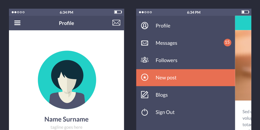
But despite all these advantages, icons do tend to pose usability problems if they are designed without proper thought. There are very fewer icons that enjoy universal recognition and can cause ambiguity in the eyes of the users. Also, there is no fixed standard set of icons so the users can fall prey to interpreting different meanings from them. Examples of icons misunderstood are the 3 line hamburger, heart, and star, etc. They cause confusion as these are used for different functions and vary from site to site. Even slight changes in meaning and functionality can confuse the user and make it difficult for him to rely on such icons.
In order to add clarity to the icons, make sure a text label is present along with the icons so that the meaning is clear as per the context. Further, as the icons connect with the user, they should be visible at all times even when the interaction is not happening. Special care must be given to the labels as they help to navigate across the page. Speaking of attention, mobile devices are compact and have fewer elements to focus on as compared to the desktop where there is a lot of content and areas that can be missed out. Let the icon have a logo, headline, single image and menu so that it gives full attention. Work on the relative size of the icons so as to highlight it as against the other visual elements.
For designing the icons, keep the design simple so as to quicken the recognition factor. Do not include much graphic detail while designing as it causes clutter. Take into the 5-second rule which states that if it takes more than 5 seconds to judge the right icon for the required purpose, it is lacking in its power to communicate. Also, make the icons run through the usability test as well as the one for memorability so as to see whether the user can recognize and remember it after some time or not.
7.3 Font and Colors Hierarchy : Visually Leveled
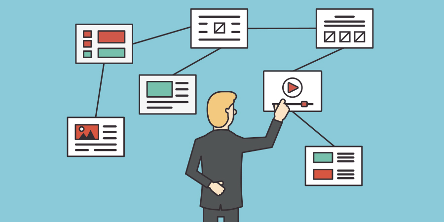
An interface must direct the user to its destination, making the journey worthwhile. There is visual clutter, though which can deter the user from going further. A solution to this problem is visual hierarchy. Visual hierarchy means that content must be viewed in a proper order that is following a hierarchy. Here, the importance of content decreases as it goes down the line. It is a tactic a proficient designer will adopt to take you from part of the content to the other. It follows a proper context with the beginning, the story and the call to action. The elements should be visually clear so that the users know where to head next in the logical order.
Weak hierarchies lack in terms of pulling the audience as they seem vague and do not have an appropriate context. They tend to leave an important piece of information, may have an irrelevant topics or can go wrong with the placement of the design elements. Weak hierarchies often confuse the users with incomplete information and leave them clueless for the next move. The hierarchy plays a pivotal role in determining the user experience as it navigates the user across the website. Thus, lacking in an orderly hierarchy will cost you the rate of positive user experience.
